@AMKYgeomjeong
philosophique's review for AMKYgeomjeong

CONS:
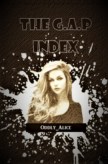
- The size is too small for the standard Wattpad cover size.
- The font choice is... very wrong.
- The black rectangle doesn't fit all too well.
- The model picture is too small, too gritty, and doesn't blend well with the rest of the cover.
- Textures look grainy, hints at using low-quality images.
- Too monochromatic (just uses brown.)
PROS:
- I apologize but I don't see anything that I can say under this part.
WHAT TO FIX:
- Get higher quality images.
- Explore more on choosing the right images and blending them well.
- Explore more fonts. Don't just use what you think is "cute". Chasing Embers is cute but it won't fit with this graphic either. Know what sort of fonts to use and/or would fit well with the mood/genre of the story. You would never see a science fiction cover with a Comic Sans, trust me.
OVERALL:
3/10 I guess it all boils down to exploring more of the graphic designing world, how each element (texture, font, coloring, etc.) come together to create a wonderful edit. So check out more edits over good sites like DeviantArt, portfolios of books on here, and keep editing :)
Bạn đang đọc truyện trên: Truyen247.Pro