
Let's talk vectors
Hiya, so plottwist: this book isn't dead! I did empty it tho, because I thought it might be confusing if there were still requests in this book even though I don't do requests here anymore.
So anyways, I'm turning this book into a "Moira behind the scenes" uncovering my emotional endeavors during my graphic adventures. So yeah it's gonna be random shit.
So I realised something.
I always thought my older graphics are just a crappy version of what I can do now. However, looking at it closely, they might not be that bad. It's just a different style. Lately I've been doing vectors in another way, but I guess that doesn't really make it the better way.
So let's see how I do vectors!
Moira, revealing all her secrets.
Dun dun dunnn.
Type 1: simple
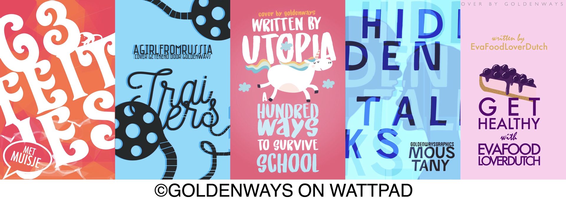
As the name says it, I think this is the easiest way to do a vector cover. I used to do vectors if it were books in the category "random". Other covers were done with photo manipulation, because vector just felt too simple. "Get healthy" is a style I did for a very long time. It became my style somewhere in the beginning of my graphic journey when I still used Word. (Not recommended). Did the account purebullshit in that style. I really got obsessed with the font Century Gothic and used it everywhere haha. For a while I even thought it was the only font that suited a vector cover. So stupid haha.
Type 1.2 Simple with a texture

So these are almost the same as the first one. Slight difference is that I used filters. I also used multiple images for "vergeven en vergeten" and "hoe ik cupido heb vermoord" to create the centerpiece. The images for "vergeven en vergeten" were the easiest to find. The toilet one the hardest hahaha. Still surprised that someone drew such nice vectors of toilets.
I remember being so fucking proud of "le cirque mystique" title. I was like wow I can combine two fonts in one title. Magic 🌈
How to do it: have a really big title and compliment it with a vector image. Or, to break the clean cut look from type 1, you can mess around with some textures. PicsArt has some great artsy filters/masks you could use, but textures from DeviantArt could work just as great. Maybe even better sinds it has a wider variety.
Pro: it's easy, works with every genre
Con: might become a little boring. And you're very limited to the images on the internet.
Extra tip: since it already has a clean vibe, to make it pop, use a bright color.
Type 2: silhouette textures
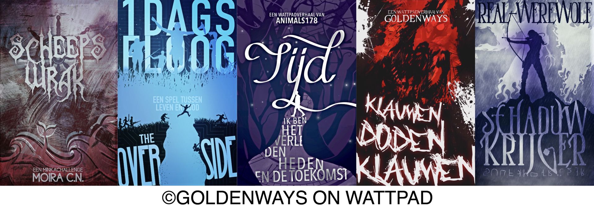
So the title sounds like it's done the same way as the first one, but plottwist: it isn't.
How to do it: i start of making the covers black and white. Then I blend a texture over it with multiply. What is black, stays black, all the white becomes the colour of the texture
Pro: all the colours always match
Con: limited colours. It also always have a really big contrast.
Extra tip: to get better colours, use the free app Lightroom. Or just regular Lightroom. Just Lightroom the heck out of it hahaha
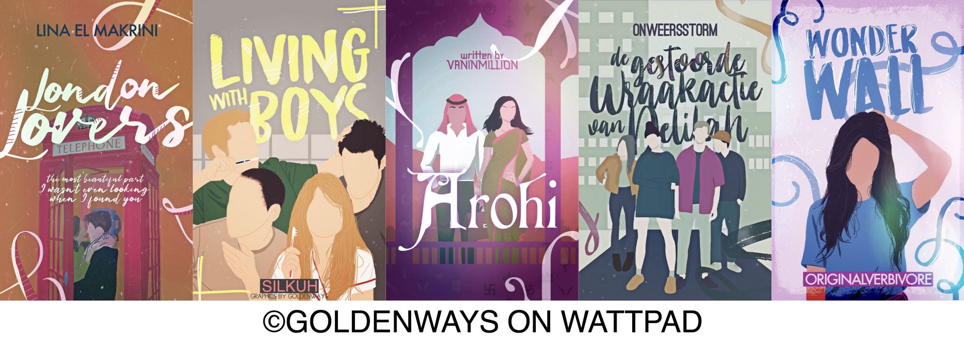
Type 3: mix it up

Who says you're only supposed to use vectors in combination with vectors?
How to do it: make sure your centerpiece is a photograph and decorate with sketch like figures
Pro: it accentuates your centerpiece
Con: it might be hard to find appropriate photographs. I mean that I'm bad at it, that's why I switched to vectors hahaha
Extra tip: focus on details to really blend the "real human" in with the background. For instance, add some lines/scratches
Type 4: vector characters
I made most of Minka's request with this style. i think pronkend finds it annoying that I don't use Photoshop and have to color everything by hand.
How to do it: quite self-explanatory I guess. So you basically draw on a photo to make it a vector.
Pro: gives you the freedom to use any color
Con: on PicsArt (since you need to do it by hand) it takes a lot of time to draw it. Tiny telephone screen, really thin lines... can be very stressful hahaha.
Extra tip: use color schemes! I find mine on pinterest! If you want to make on yourself remember the following:
Base colour (object/title)
Complimentary colour (object)
Neutral colour (background)
Lighter colour (details)
Darker colour (details)
Bring Candy Not Lettuce Danny!
(Yeah I just made that up, not the official mnemonic or something. Could work tho)
Type 5: reshape a vector

These are quite recent. I think this is my current style, although I do type 4 too still. I guess type 5 is more of an inbetween resting place to gradually go to type 6.
How to do it: instead of keeping the original shape of a vector you could use it to inspire you, and make someting new. I started out with a heart and drew the "guy" around it. The girl got a gaping hole as a mouth etc.
Pro: you can really use your imagination with an easy foundation to build on.
Con: idk, love this way of doing covers
Extra tip: don't be afraid that what you draw aren't straight lines. A messy vibe could totally work!
Type 7: start with zero
I wish to improve in this type. I think I need to buy a drawing tablet (or steal my sister's) to really master it. Drawing with my finger is just a little too hard haha. Especially since I don't even really draw on paper. I've been looking at those drawing tablets today and they're not even that expensive.
How to do it: draw everything yourself
Pro: never have the problem of not finding the right images. No copyrighted images.
Con: especially in the beginning, it's quite hard to create something without a little thing to build up from. It also takes a lot of time.
Extra tip: just practice a lot! These might not be the prettiest covers I've done, but they do make me the proudest. It's really worth the time.
—
Even though I've changed in vector style a bit, one thing is certain: I won't be going back to photography manipulation. It's just a lot less fun.
Bạn đang đọc truyện trên: Truyen247.Pro