
𝗖𝗼𝗻𝘁𝗲𝘀𝘁 𝟲 𝗘𝗻𝘁𝗿𝗶𝗲𝘀
Reminder: Please use the correct size for the cover.
I noticed some of you are not really following the form and especially about the face claim and color schemes. PLEASE do read thoroughly Contest 6 before editing. Thank you.


The last set was great of having the same photos. Good choice on that but most of the fonts were like everywhere and the size were not accurate. As I've said, I liked the happier cover on set two.
This is simple. It's neat and I really like how it is really shown as a set that I meant. The title and author is what I really like because obviously they're all on the same part of the cover. Maybe the slight glitch is the photos you chose. Good so far.

This is really different from what I wrote on the form. But thank you for the effort. Next time, please read thoroughly the form or prompt.
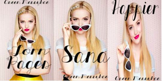
I love this one. I commented that it is what I want as a set also but it should have been better if the cover on sana has the same color with both. I love how it's simple and neat but still an eye-appeal with how the photos really match on the fonts.
It's a variety. I like the filters.

It's aesthetic. Wasn't really what I was looking for but I love the photos. Really tumblr.
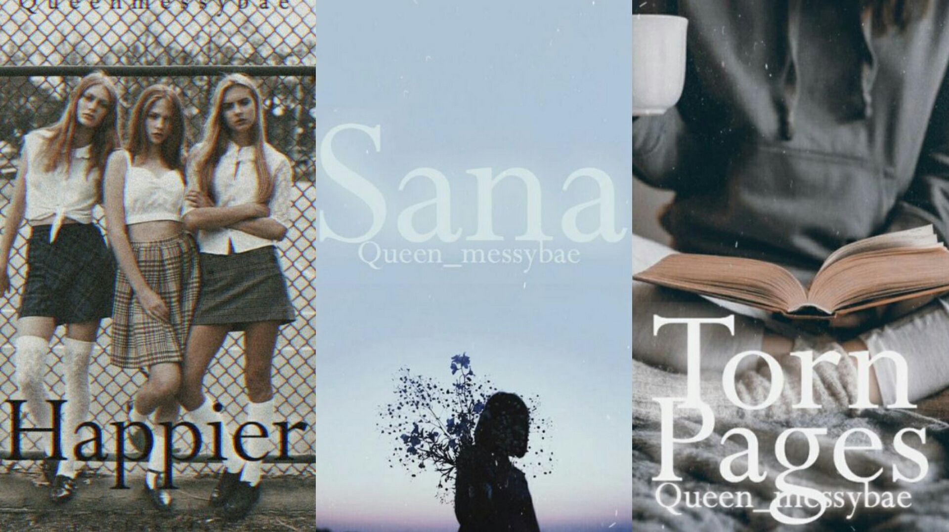
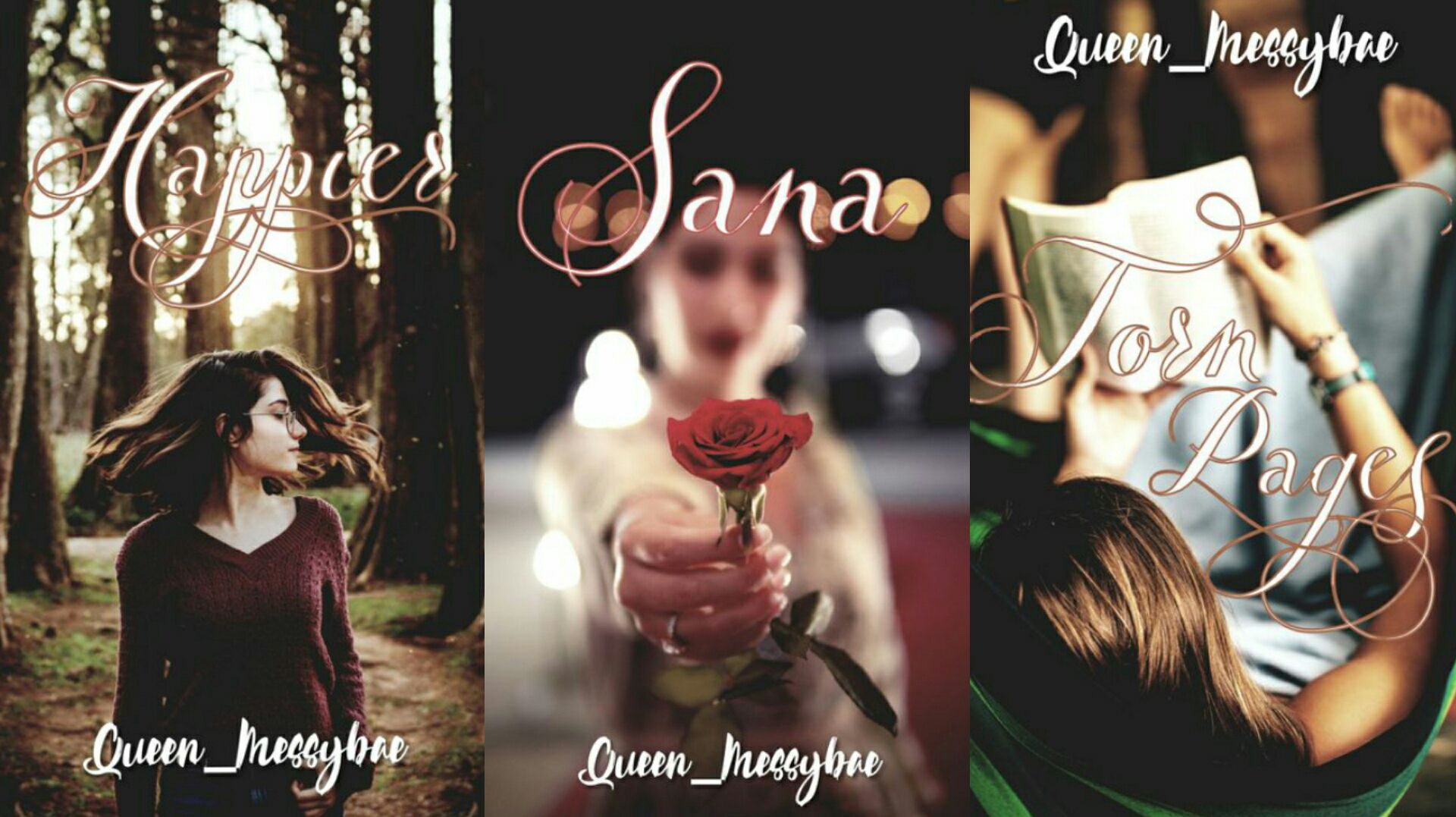
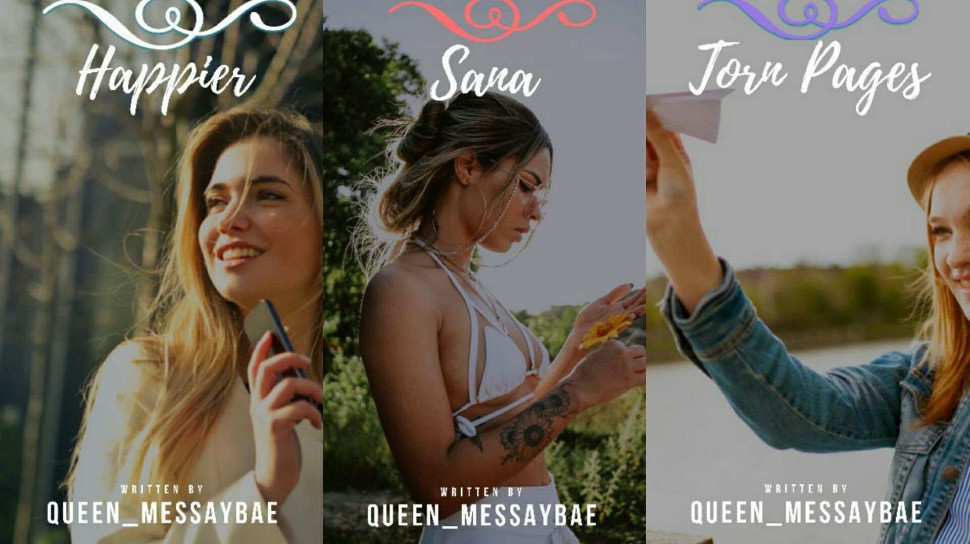
Too random. Sana cover is really different. Happier photo looks cool from a far but it just doesn't fit. I asked for a happy mood and based on the title it should have been happy. My username wasn't also correct on happier. To be honest, I love the cover on torn pages.


It's too simple. Same problem with happier. I'm really looking for a happier mood on Happier. It doesn't have any theme at all. The color scheme should have been the same with all. Good effort. I like the cover on Torn pages of set two.


Please when you pass an entry, don't do a collage because I'll be the one to edit on that especially if it'll maybe be used for a book. You did well on choosing the same photos and colors, it's a set, yes. But, the words are all over the place and it kinda becomes difficult to read.
You know I really like your covers especially some of your entries on my contest and those were like the covers I wanted. This one is really nice but the title shouldn't be cut and it would have been better if the polaroid wasn't there; but instead just the actual photo with the words, because the theme itself, color and photos already fit well. I love the fonts. Maybe it's just that it's not what I'm looking for. Well done. I love the cover on torn pages. It's stunning! It'll really be great if both were the same with the torn pages cover. (The placement of the polaroid and title itself.)

I like this one. It's really a set. I like how all the photos match with the color scheme and fonts. The slight glitch on this is that it's a bit dark on Sana especially on the face claim. Good job though.

I like the photos on Torn pages and Happier. I like the titles fonts. It's just that the author doesn't all have the same size. Good job.

Same goes for this one, I wasn't really asking for an aesthetic cover but you made me like it. I like how you edited. It's very creative. Could have been better if the background was light because I think it would fit well for an aesthetic theme. Did you add vignette of something? Good job though.

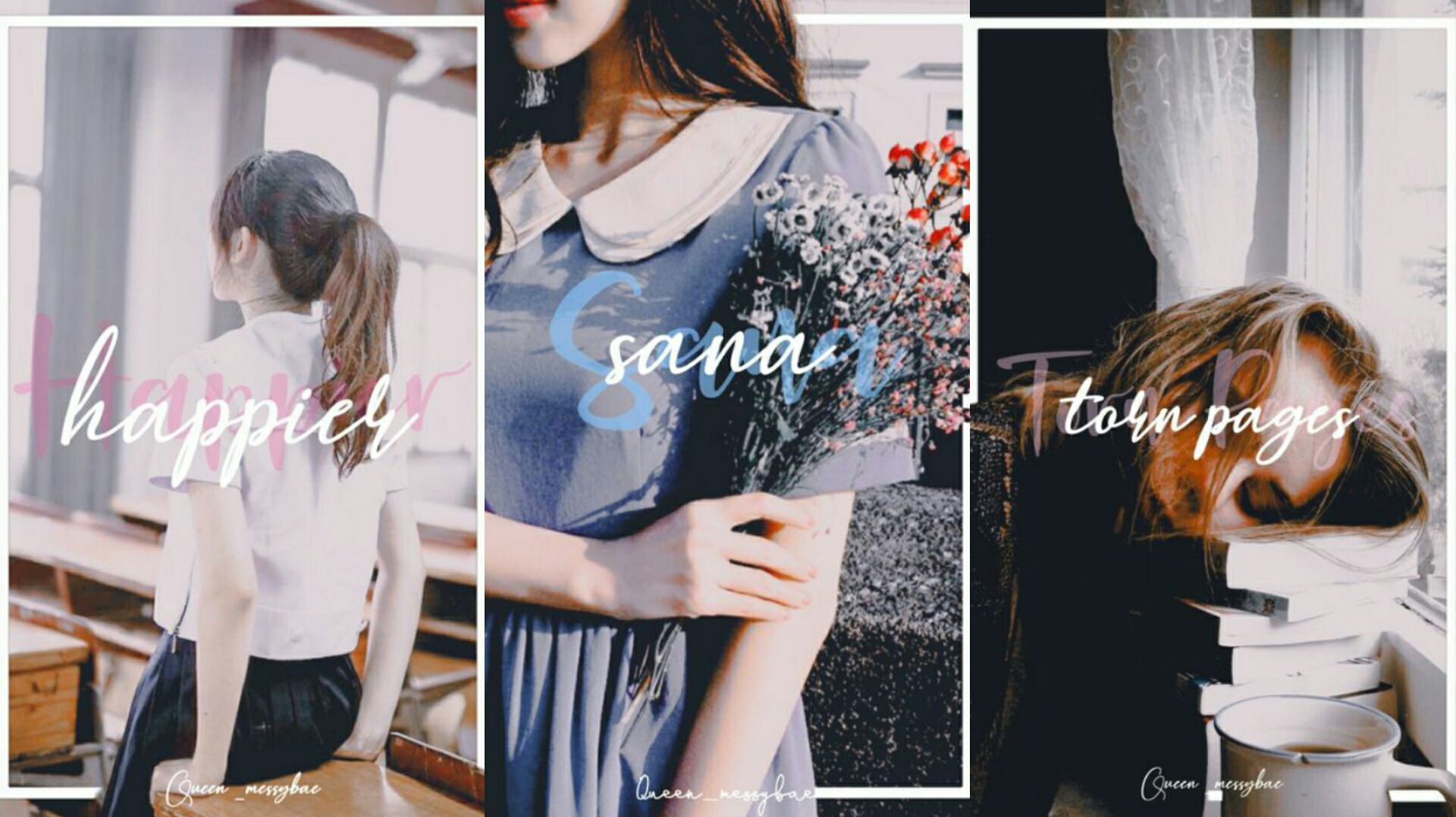
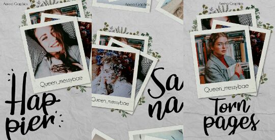
Woah this is really stunning. I love love the cover on torn pages and photo on sana.

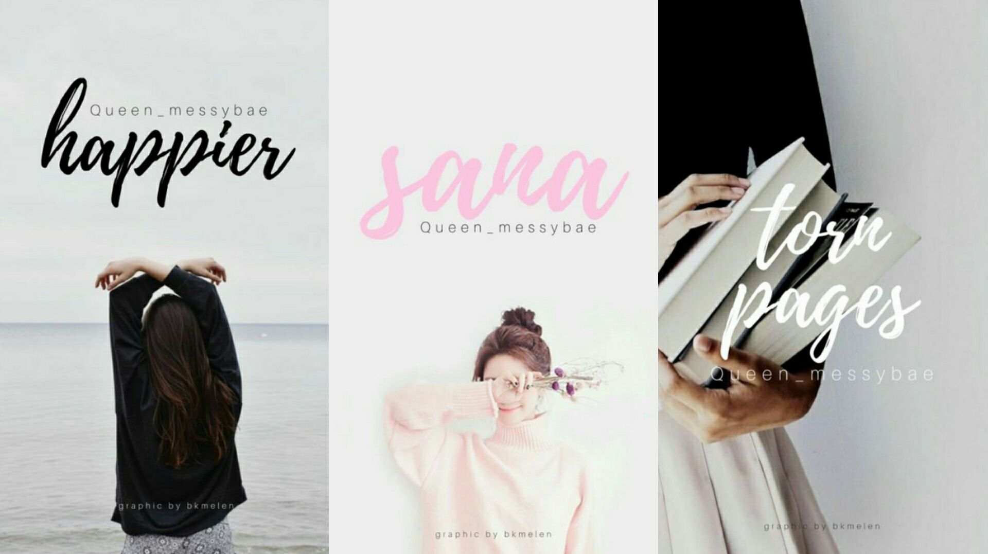
The beige color really suits everything. It's cozy and neat. The fonts used is really to my liking. I liked the torn pages cover the most and choice of photo on happier.
Bạn đang đọc truyện trên: Truyen247.Pro