
✨ typography pt.2 ✨
hi guys ! i hope y'all are doing great <3
today , i'll be going more in depth with typography covers . in the first tutorial , i took y'all through the process of me making one and shared a few tips , but today i'll be sharing some do's and don't s and more great tips . as well as fonts i recommend , images to use , etc .
i hope this helps y'all out a bit more than the first one !
requested by i forgot omg but thanks for requesting <3
apps needed — phonto , pinterest , picsart .
____________
quick tips —
• choose readable fonts
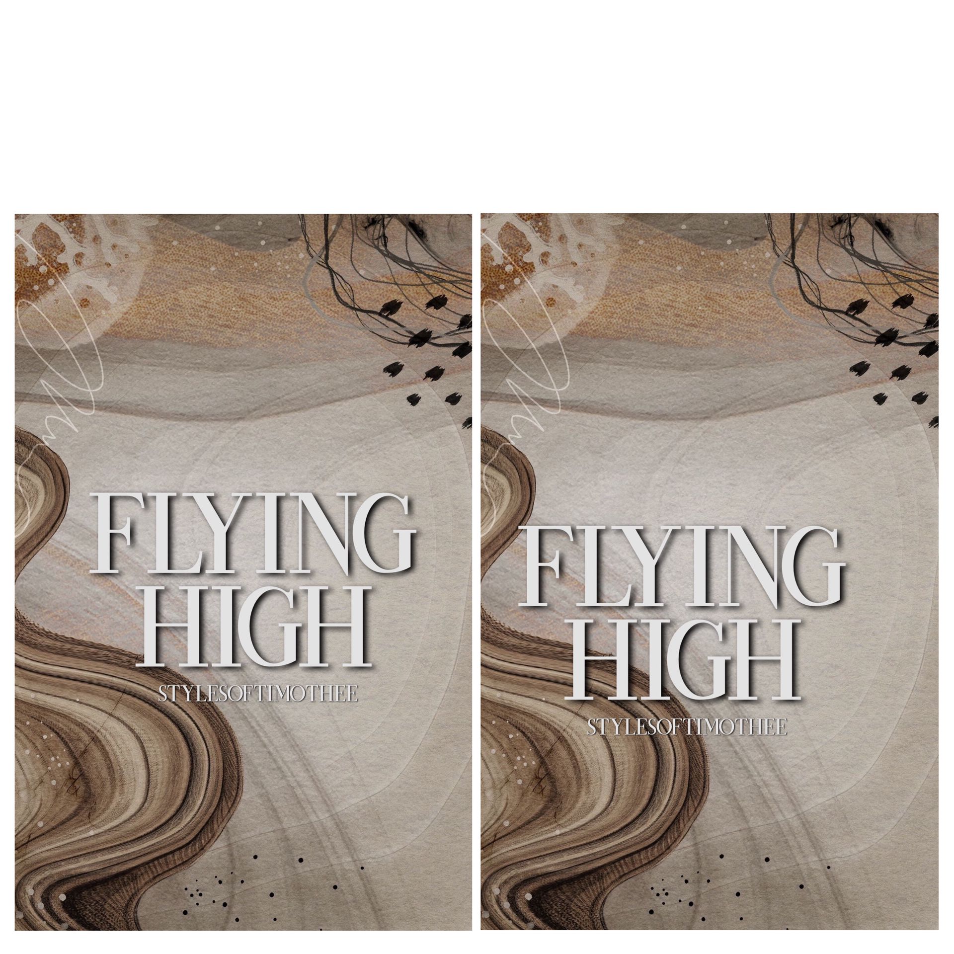
try going for bold/thicker fonts , if you want a cursive font , make sure it isn't too thin or unreadable . here's an example —
left — do right — don't (or use a brighter color so it's more visible)
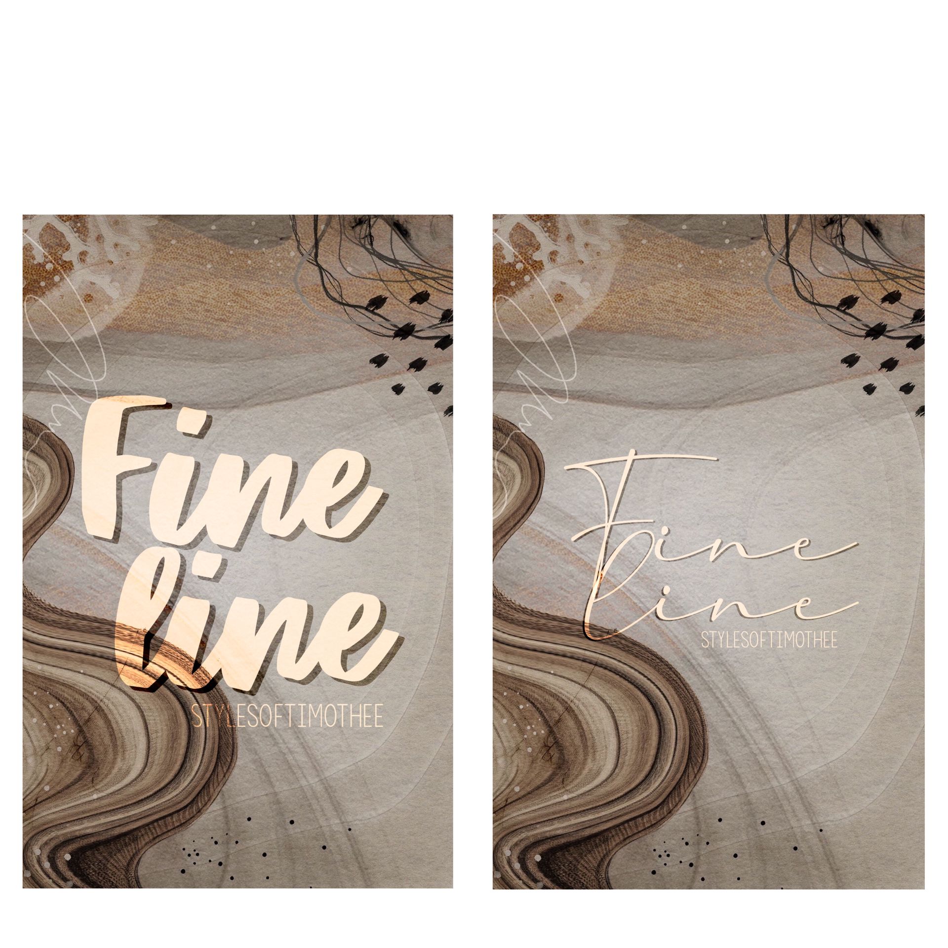
both are great looking fonts , but the one on the right is harder to read , checkout my fonts chapters if you need some good fonts !
• good pictures .
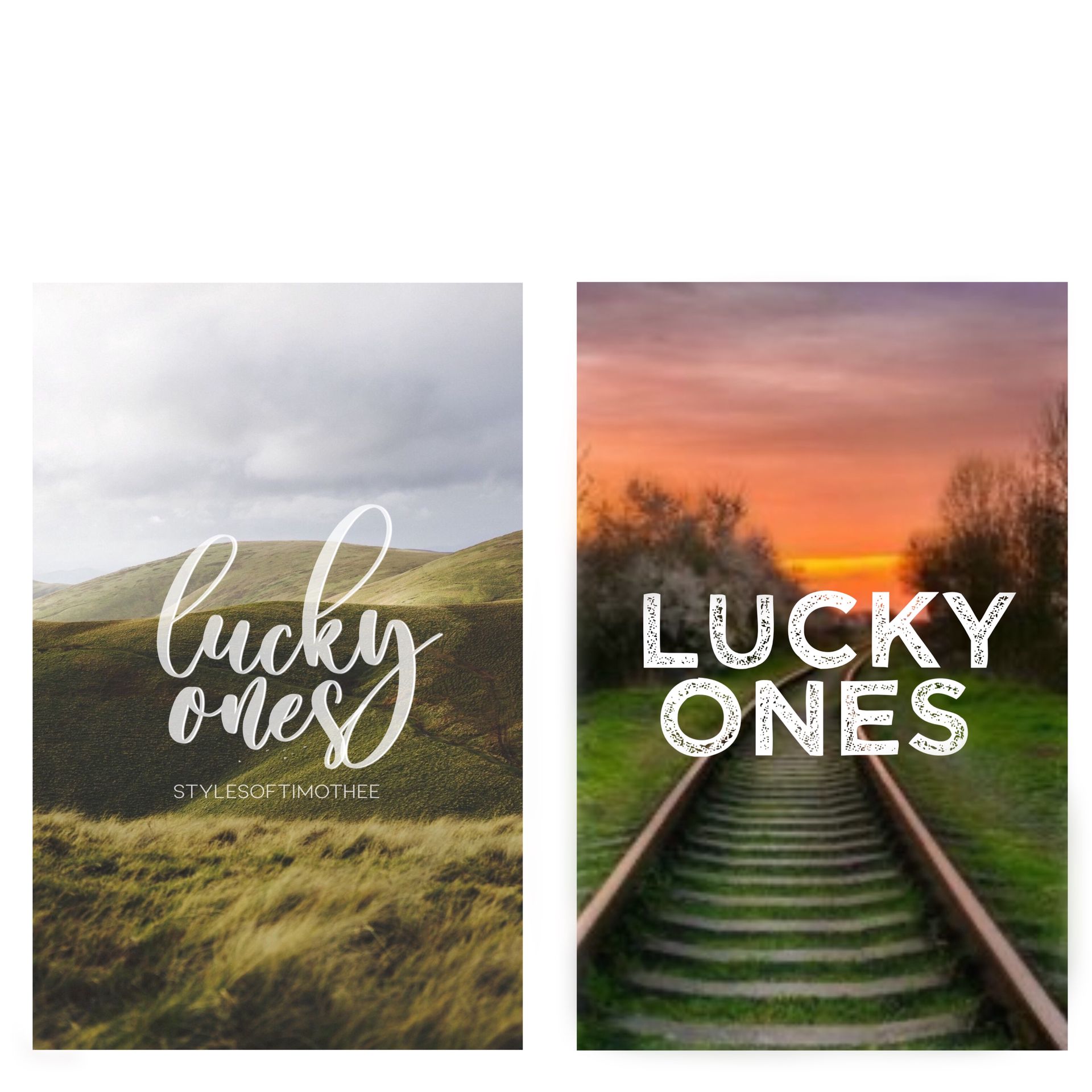
keep in mind that the main things in typography covers are the text and background picture . use high quality pictures for your background , choosing a picture that looks pixelated or blurry will make it look unprofessional and not catch the readers' eye . here's an example —
do: don't:
• play with your text .
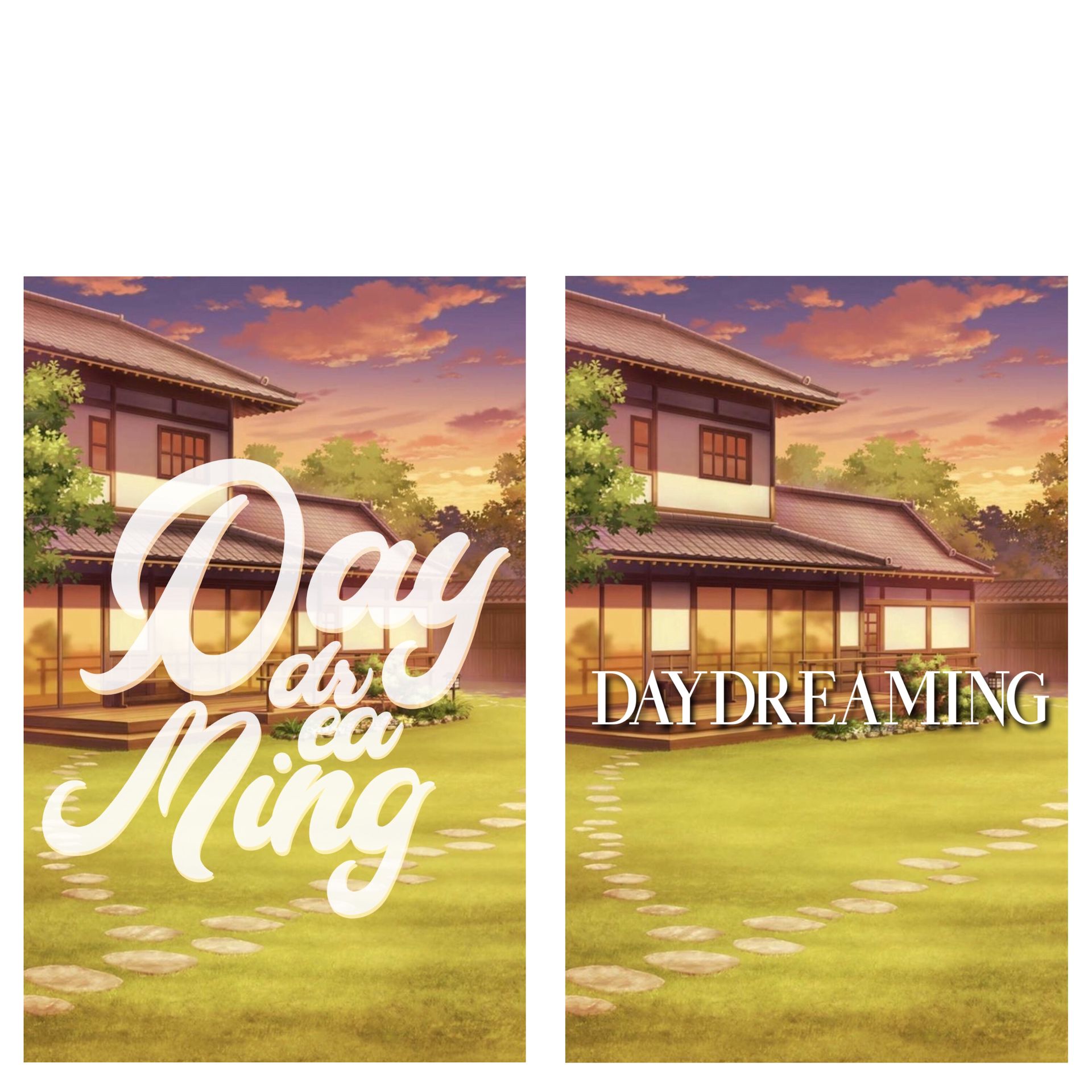
you don't have to do this one all the time , but messing around with the placement of your text , colors, etc . can make it seem more visually appealing and stand out from other covers . things like curving the text , adding shadows or changing fonts , can make the cover look more fun and less simplistic . keeping it simple is also good , but if you want to change it up then this will do it . here's an example —
do: don't:
• size .
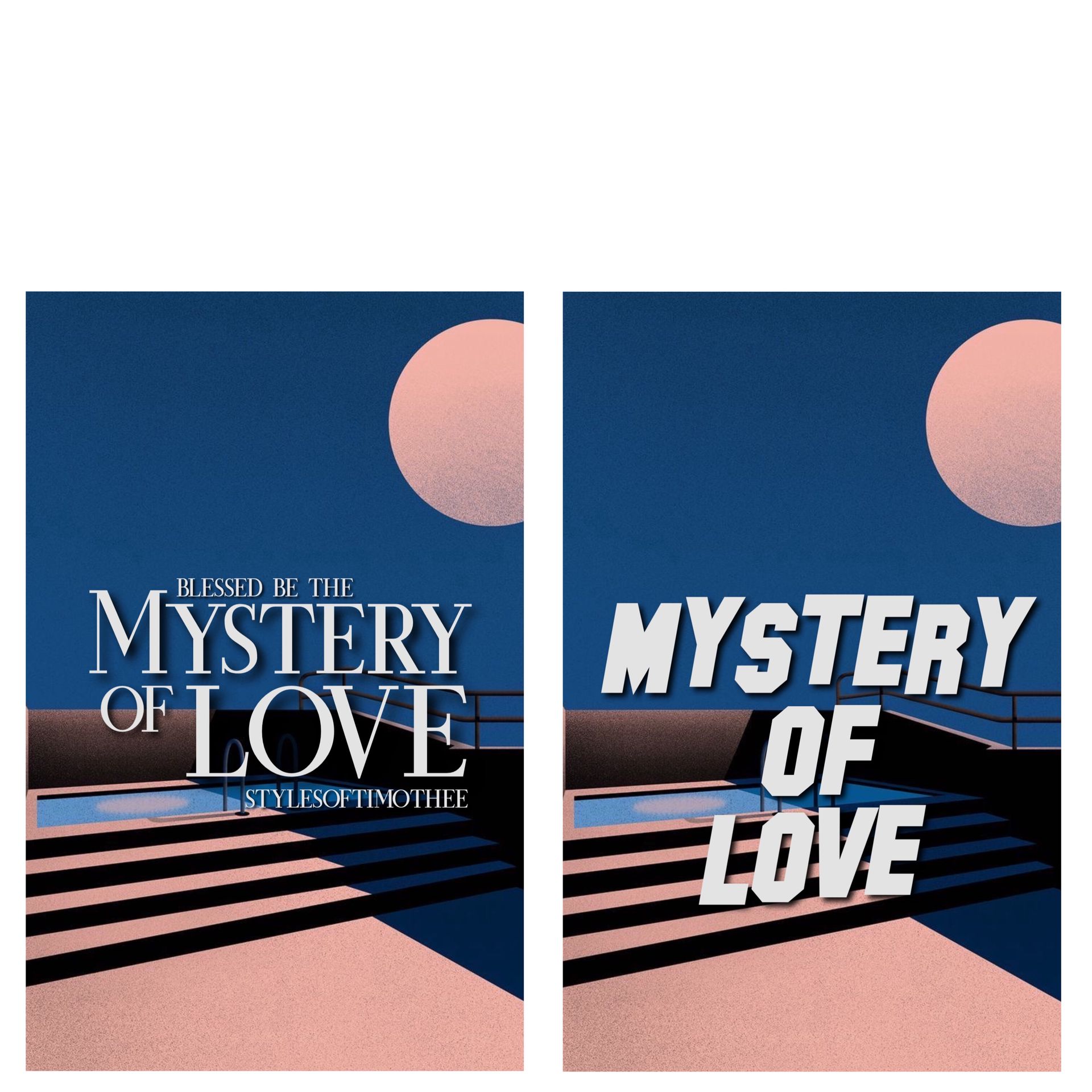
the size of the text definitely matters a lot , specially the important words . let's say the title of your book is "mystery of love" the main words are "mystery" and "love" . try making those stand out more by making them bigger , or by making the word "of" smaller . the author and subtitle don't have to be the same size as well , here's an example —
do: don't:
• centering the text
this is something i've seen so much here . a lot of people i guess don't do a double take when making a typography cover (or cover in general) and don't center their text . having the text not being right on the center will make it look funky and just not the best . here's an example —
do: don't:
(i exaggerated it a bit , but yeah center your text)
you can find more simple backgrounds like the one i used here and on other examples on my pinterest board "simple backgrounds" <3 ^
and you can find other high quality background images in other boards of mine !
__________
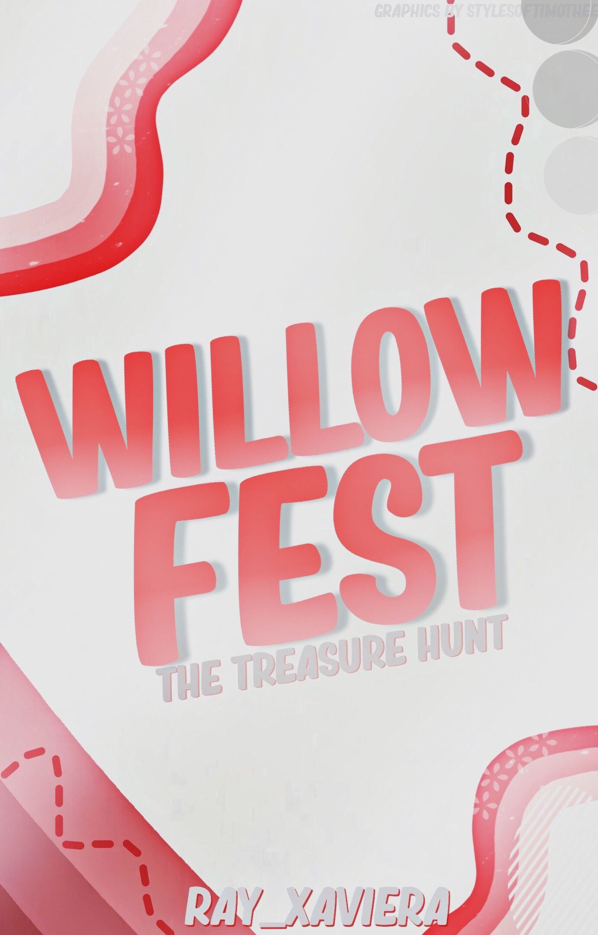
now , here are some examples of typography covers i've made in the past if you're looking for more inspiration —


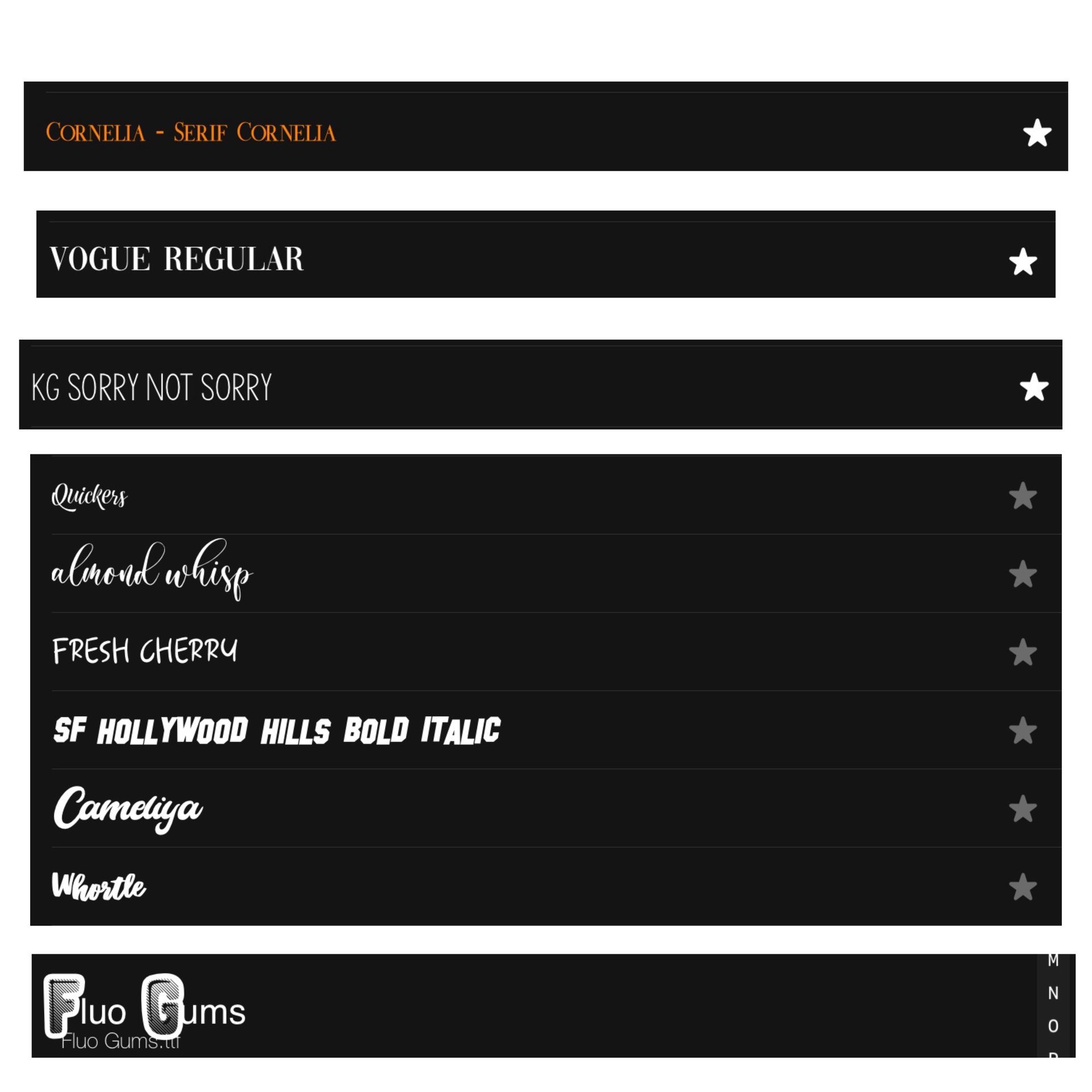
and here are some fonts that work amazing on typography work —
_________
that's it for today's tutorial ! i hope this makes typography work a bit easier , so sorry if my explaining the first time wasn't clear enough .
it looks short but the examples took me way too long for some reason haha i'll try to updated soon !
next in line —
netflix posters
textured fonts/text
see y'all then !
- 🧸
Bạn đang đọc truyện trên: Truyen247.Pro