
✨ text tips ✨
hi guys ! today i'll be giving y'all some text tips and other few things that have to do with fonts or text in general .
i made a sort of poll on my message board the other day asking y'all what y'all wanted for today's tutorial . most said text tips but others did mention face claims and neon covers so that has been added to the list ! follow me if you'd like to share your opinion next time i do a poll !
now to today's tutorial / tips —
apps needed — phonto & picsart
_____________
1 - size
something a lot of graphic designers tend to think is that the bigger the title is , the better .
nay nay my love .
the size of your title really depends on what your graphic looks like which kind of sucks since it can be very tricky sometimes . the thing you should always keep in mind though is that your title doesn't have to be huge in order for it to look good .
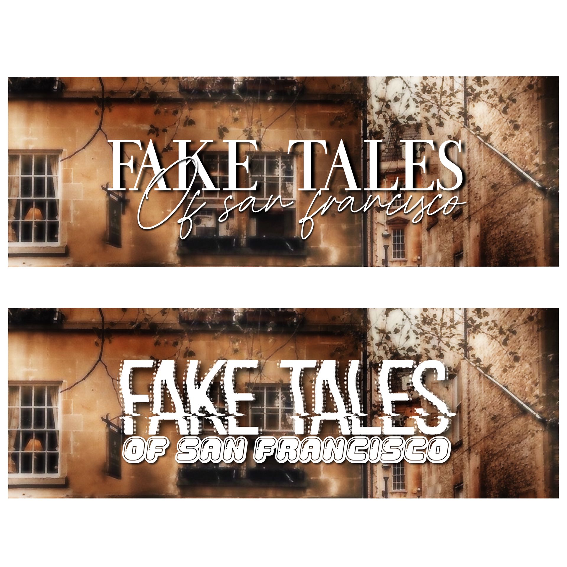
here are some examples —
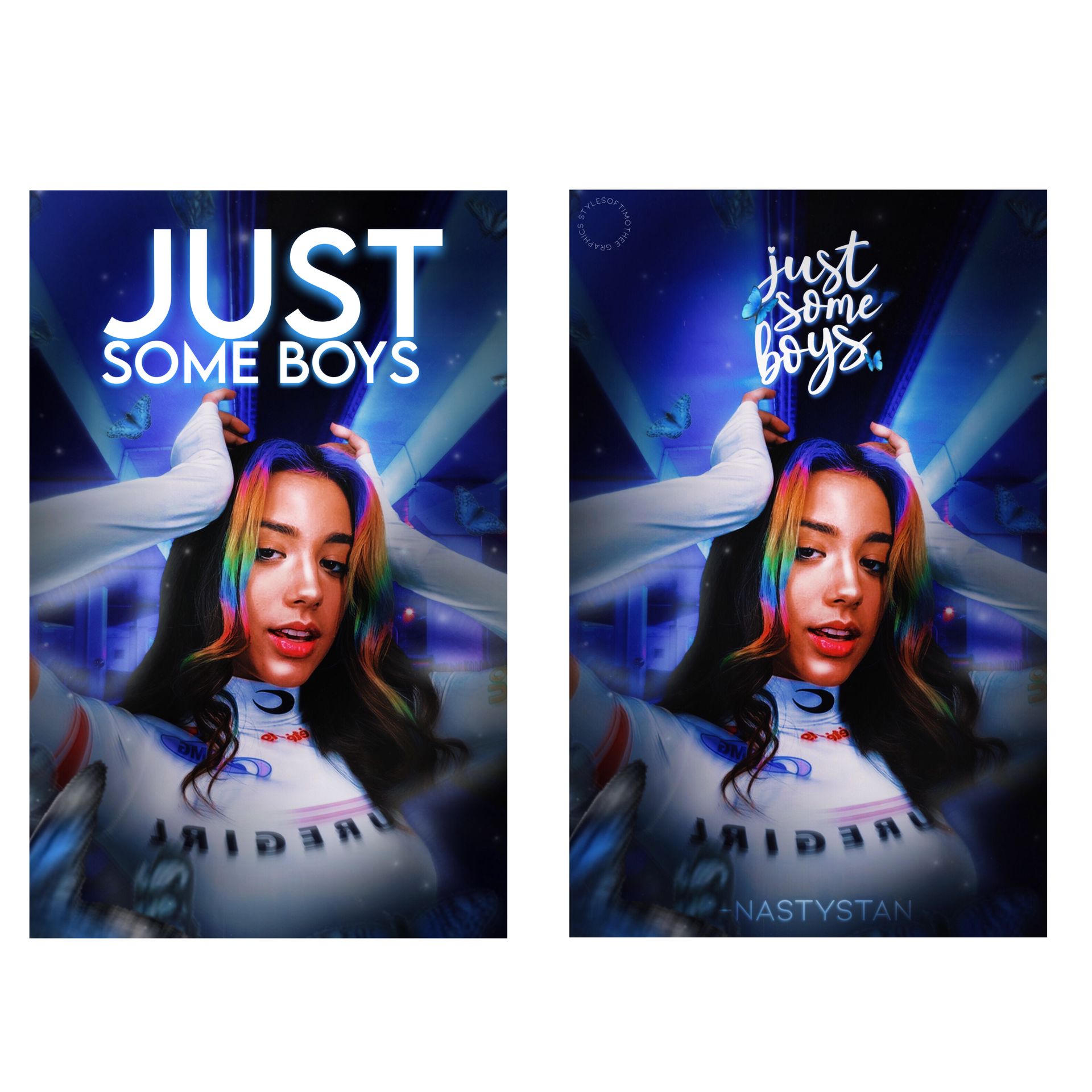
as you can see , the cover in the left has a huge title . like i mentioned previously , lots of designers do that because it attracts more attention but sometimes that attention is not good . the title is too big for that cover so it makes it look unbalanced .
now the one in the right is smaller but it looks 10x better . it looks more balanced with the other details of the cover and it overall gives it a nicer touch while giving it the right attention .
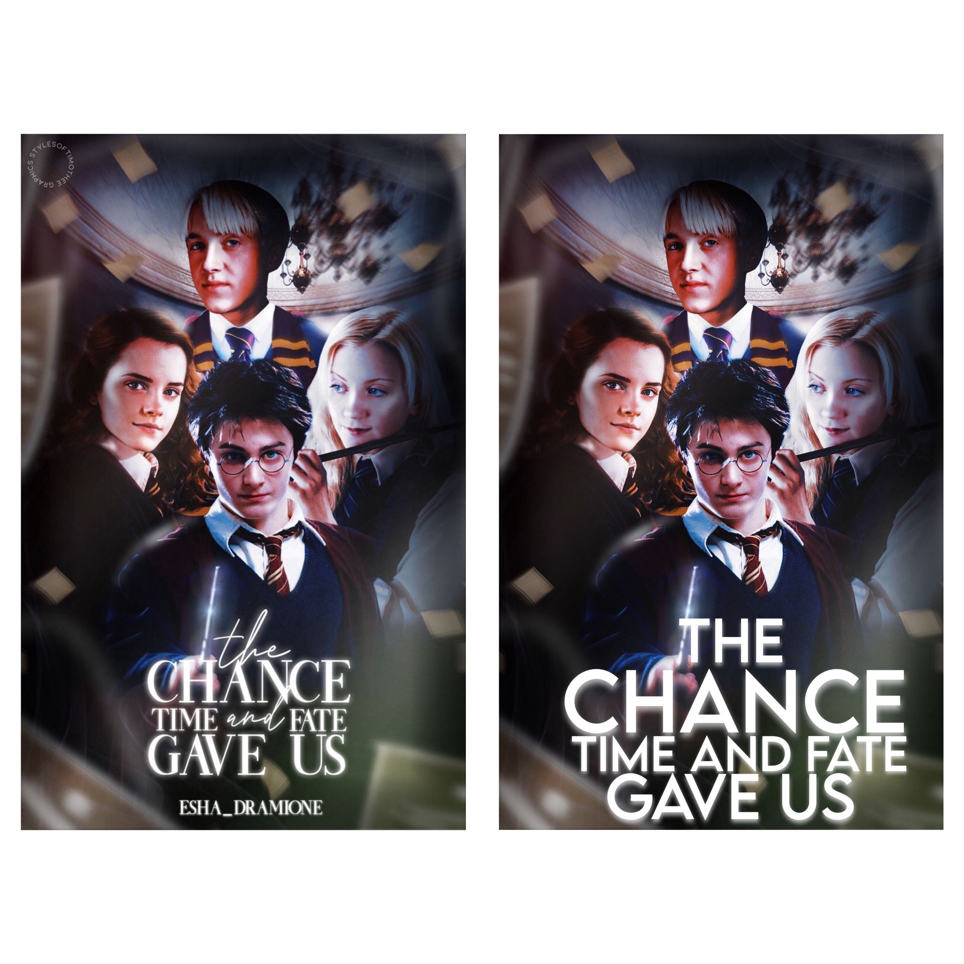
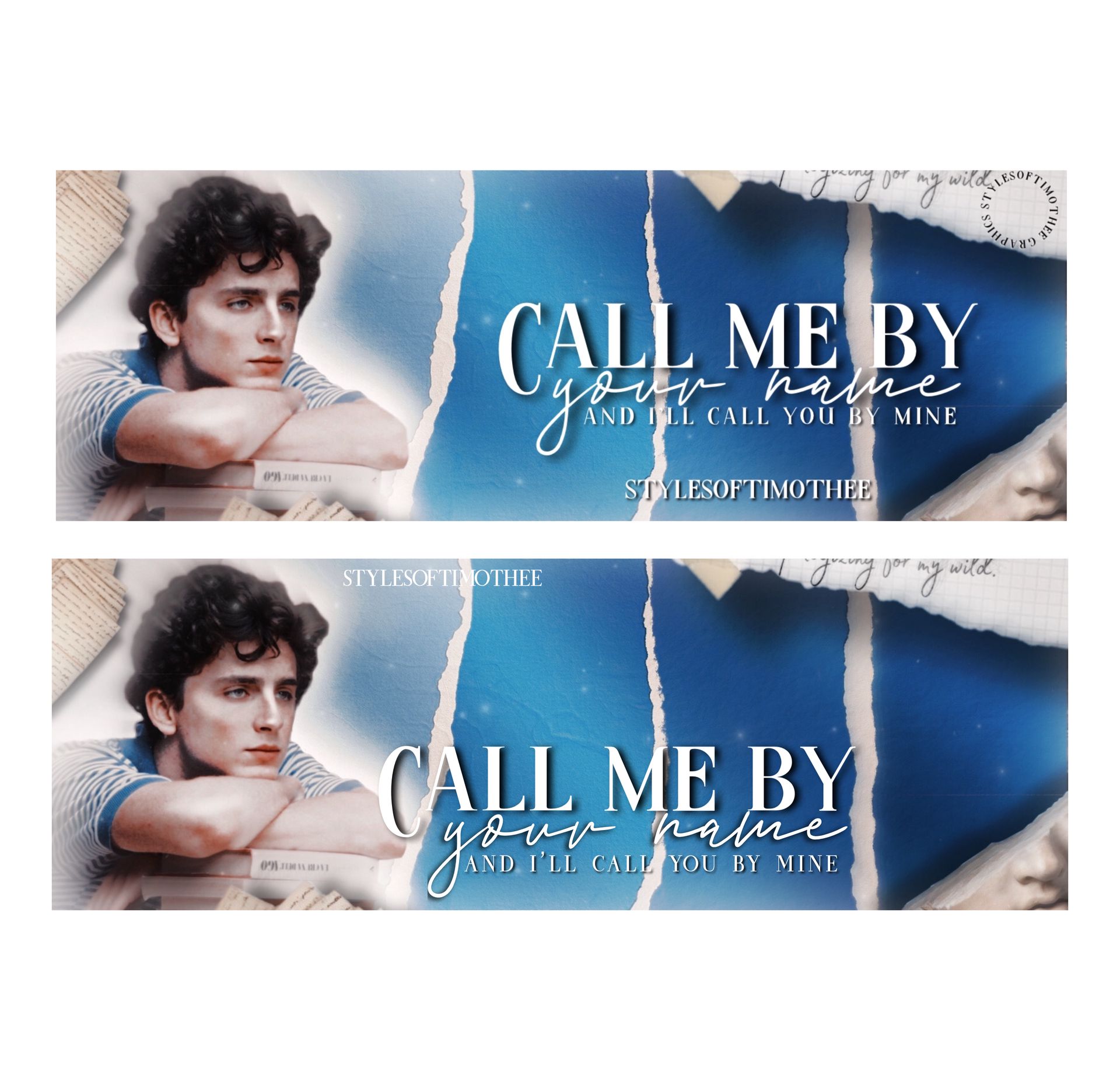
same thing with this one , the one on the left looks better even though it's not as big as the one on the right because it's balanced .
you see what i mean ?
anyways , don't think too hard about text size , it's usually pretty easy after messing around with it for a bit . do keep in mind that the title being big doesn't mean it's better .
2 - fonts
now to the one thing a lot of designers struggle with , fonts .
i myself struggle with fonts quite a bit since there's so many that it can make me feel crazy sometimes like 🤯
sadly , fonts are very important so we always need to try our best to find some that fit the graphic we've designed . i really can't get that much into fonts since they depend on what you've made but here are some quick tips —
simple fonts -
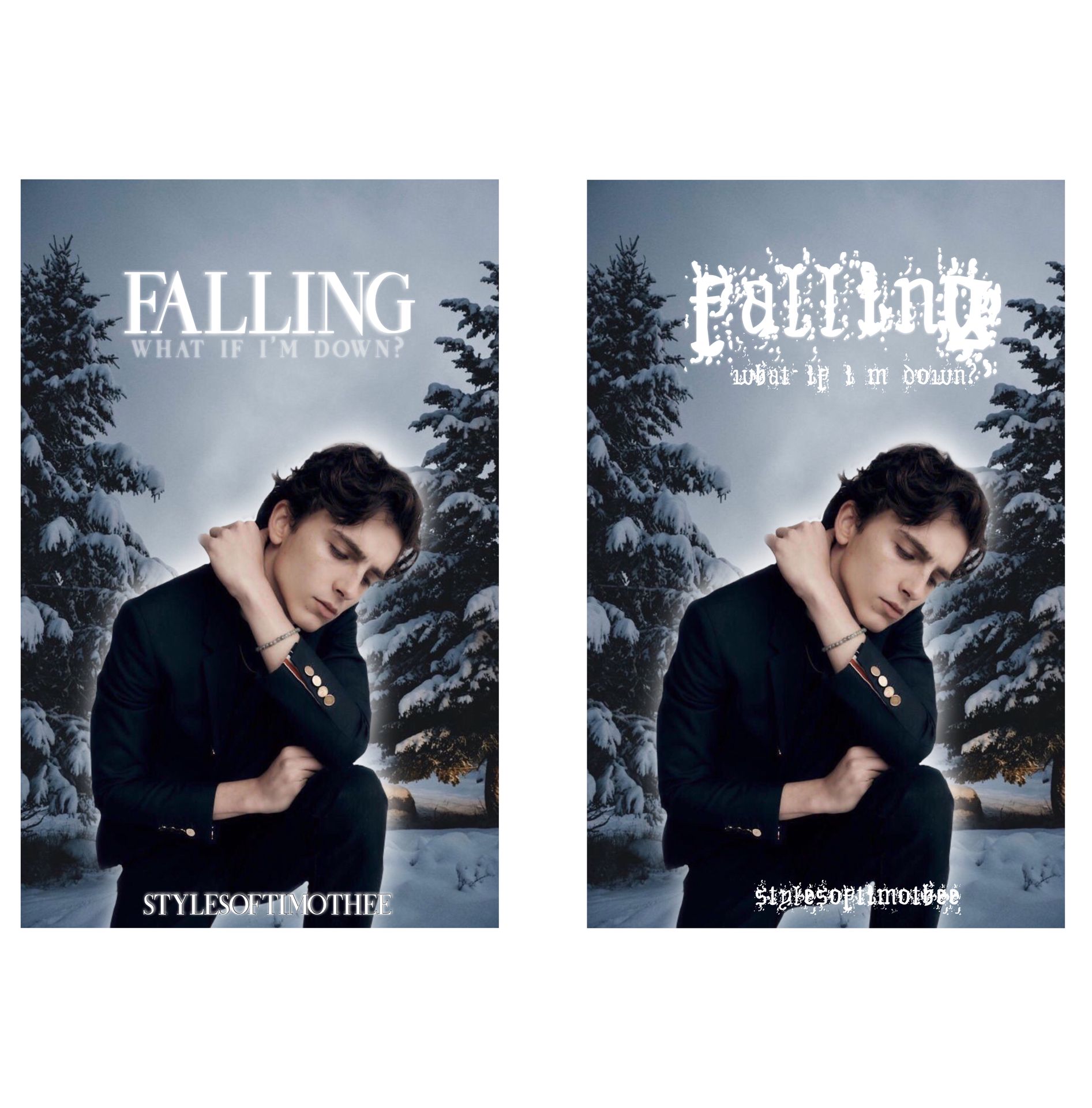
i mean cmon you can't even read the one on the right just don't do that .
using a simple yet pretty font like the one on the left is usually the way to go . you don't need to choose a super crazy font in order for something to look good . keep in mind to also use readable fonts , don't use hard to read fonts for your main text like title and subtitle .
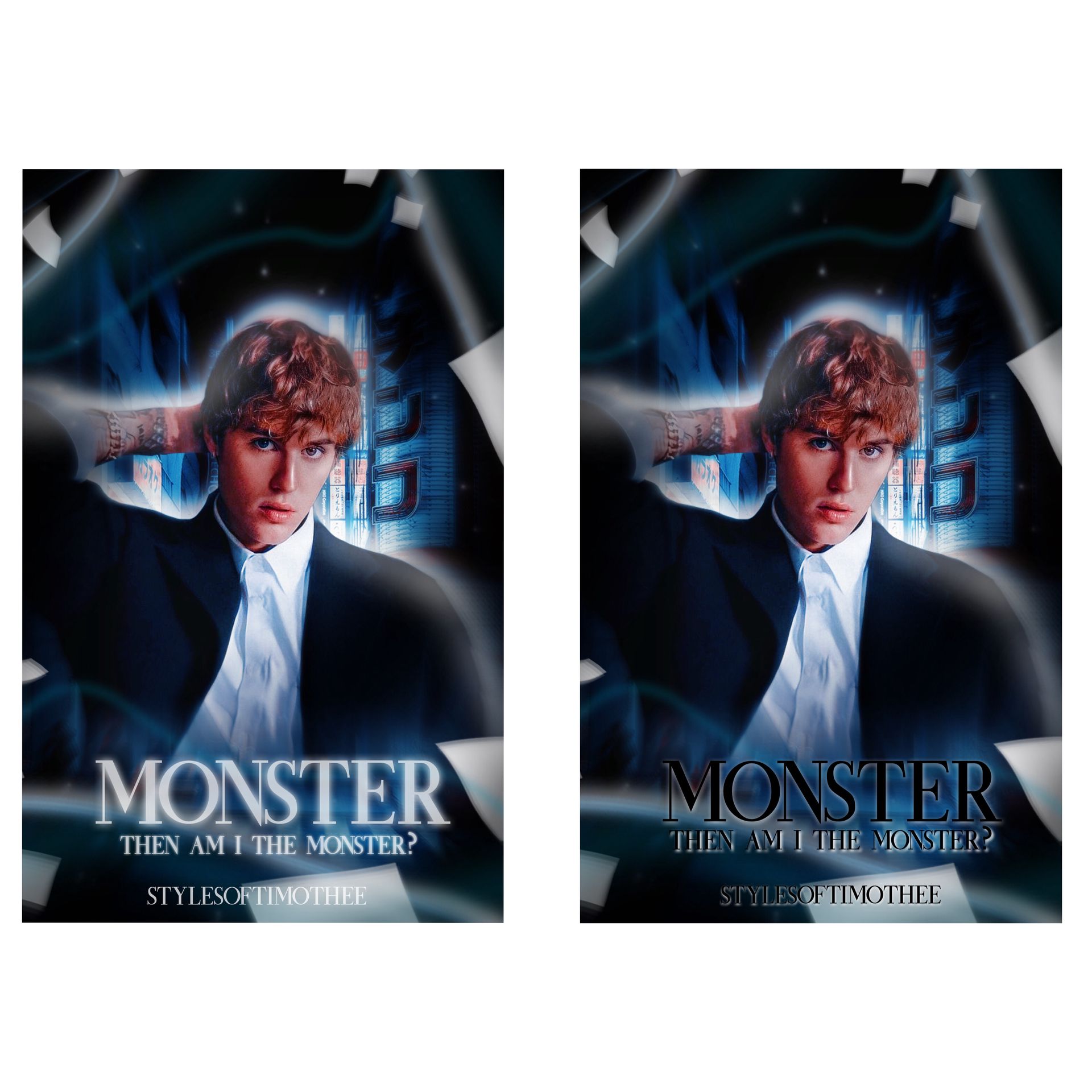
mixing fonts -
something basically every graphic designer has done is mix fonts . using different fonts in the same graphic is super fun and can give very nice results . now , that doesn't mean you should go crazy and use all the fonts you have . here's an example -
the one on the top looks very nice . it has a mixture of cursive and non cursive fonts but it looks really good . why's that ? because they both match each other even though they are completely different (aw cute)
now the one on the bottom also has a mixture of fonts but it doesn't look quite as good . the fonts don't match at all and it just gives a very messy outcome even though they are good fonts on their own (toxic relationship 👎)
3 - placement
the placement of your title and other text matters SO much , just like everything else , but this one matters a lot so keep that in mind
here is an example of good and bad placement -
so the one on the top has good placement , why ? because it's not too far down or up for it to look wonky or messy . it is placed in the middle of the empty area which gives it attention while giving the face claim and other details attention as well .
the one at the bottom is not nicely placed . it's too far down which makes the top look very empty and not well balanced . it takes attention away from the other details as well , like the face claim .
just keep in mind to make everything look balanced and not messy .
4 - colors
the colors of your text matter so much as well (yes again) . the colors of your text once again depend on what your graphic is , mainly on what the mood / genre of it is .
i usually stick to white , gray and other bold colors for my text . i try not to go too far with colors since they can sometimes blend a bit too much or just not look good . this is a personal opinion but it is also the safest way to go while still making a graphic look very nice .
you just need to balance the colors while also matching the graphic .
here's an example —
on the left , you can see the title is gray and it matches the cover since it's a darkish cover but it has a few lights here and there . it's also visible which is super important .
the color on the right is black which is not bad but it's not that visible since the cover is also dark . try not to choose colors that match way too much with the colors used in your base since that can make the text blend in .
_______________
those are some text tips ! this is one of the longest chapters i've written here i hope this was helpful !
make sure to share this with friends , vote and comment !
if you have any requests let me know in the comments !
next in line —
face claim ideas
see y'all then ! 🧸
Bạn đang đọc truyện trên: Truyen247.Pro