
TEXT-BASED COVER [Pt. 2]
.... Continued from the previous chapter.
When the message at the bottom of the screen say your fonts have been installed, press ok and close the top with the red Cross at the top right.
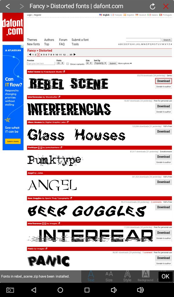
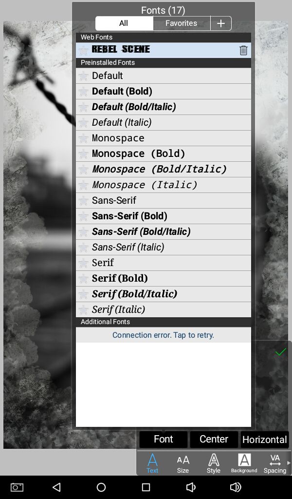
The downloaded font can now be found with your other fonts. You can disconnect your internet at this point and continue editing offline.
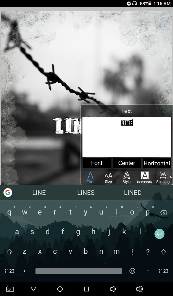
Adjust size and style, also spacing between words for your text according to your desire and ideas for the cover.
I suggest putting each word in a separate layerwhile doing text based and typography covers because each word can have to be different size and styles.
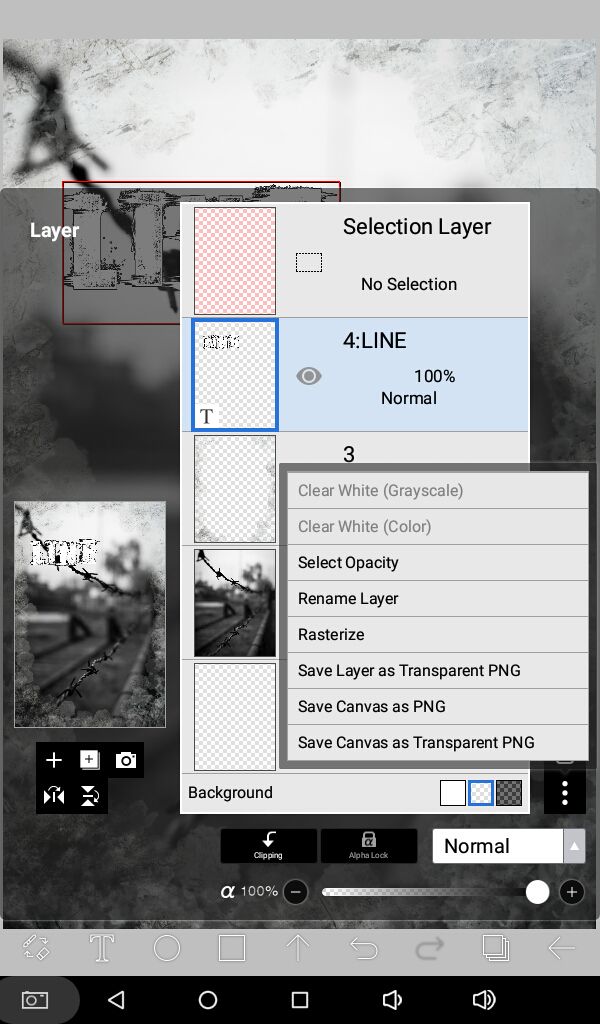
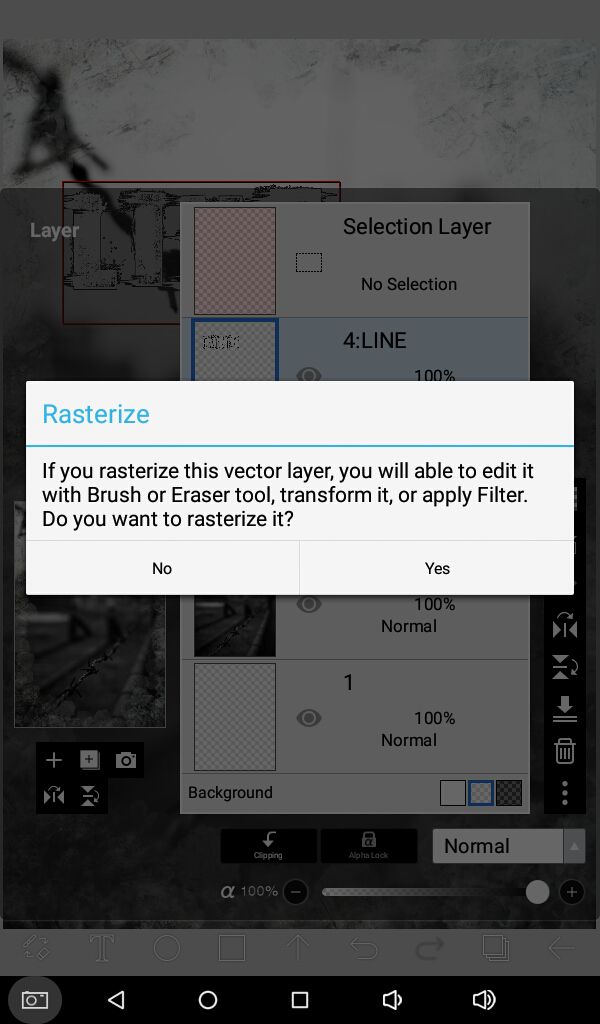
Rasterize the text layer with the vertical dotted lines icon. See image below for reference.
Press yes. Now you can erase this layer and move it around.
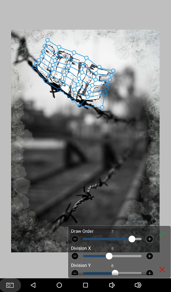
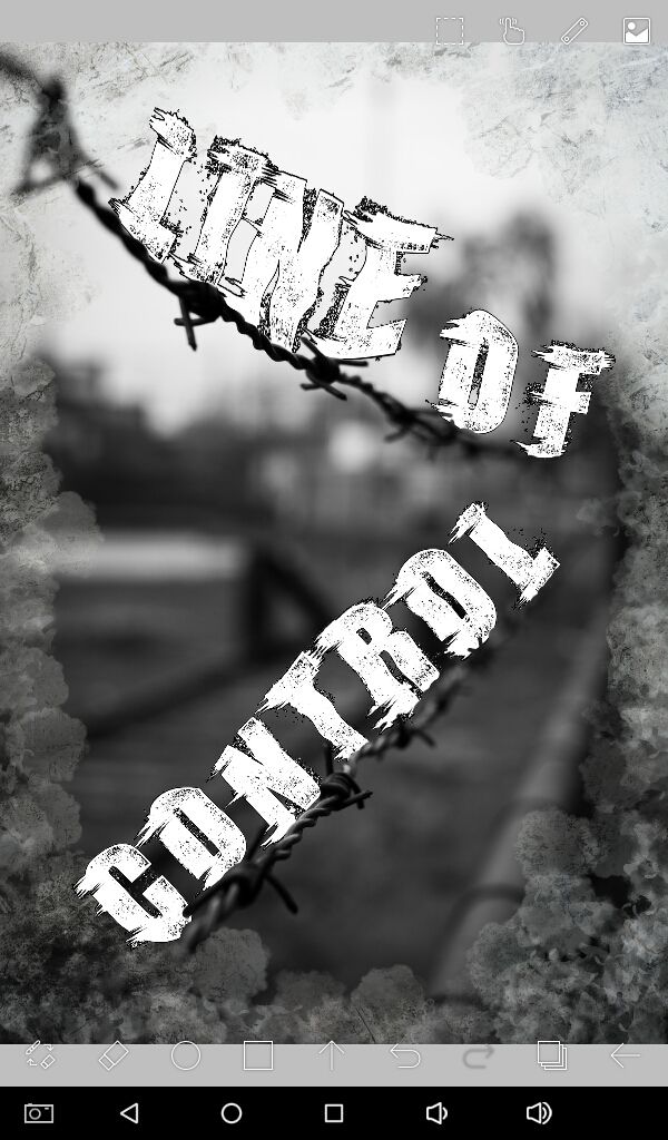
We are going to use the mesh form. With the dots, using your fingers or stylus or a mouse, whatever you use, move the layer around, you can rotate it too. My plan is to make it look like it's placed on the barbed wire.
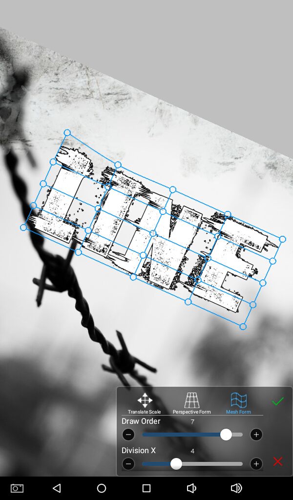
Press tick when you are satisfied with your placement. Zoom in for better precision and zoom out to see how it looks from far away.
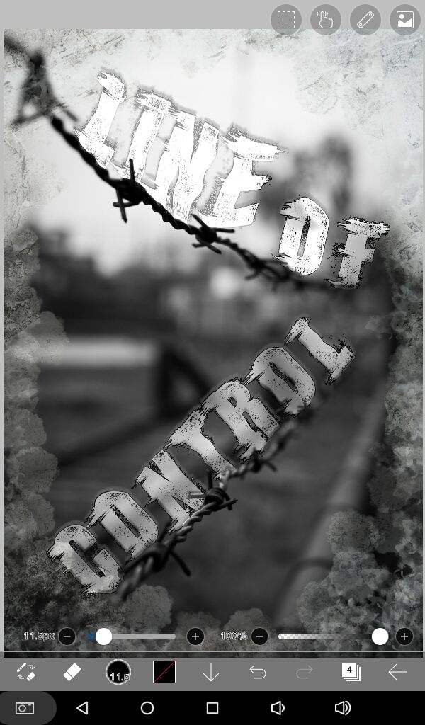
With the eraser tool and a soft brush (I used felt tip pen) with opacity and size of your choice, erase parts of the text that makes contact with the object in the base image, in this case the barbed wire.
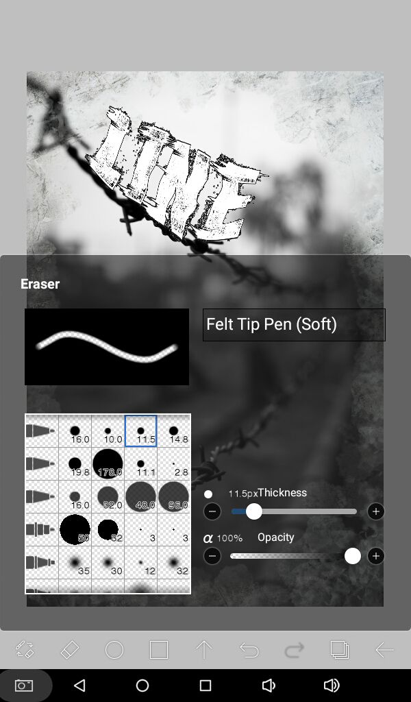
So that it looks like the text belongs to the actual image rather than that you put it there. See the difference in image below.

Add the rest of your title text. Place and erase as you may like.
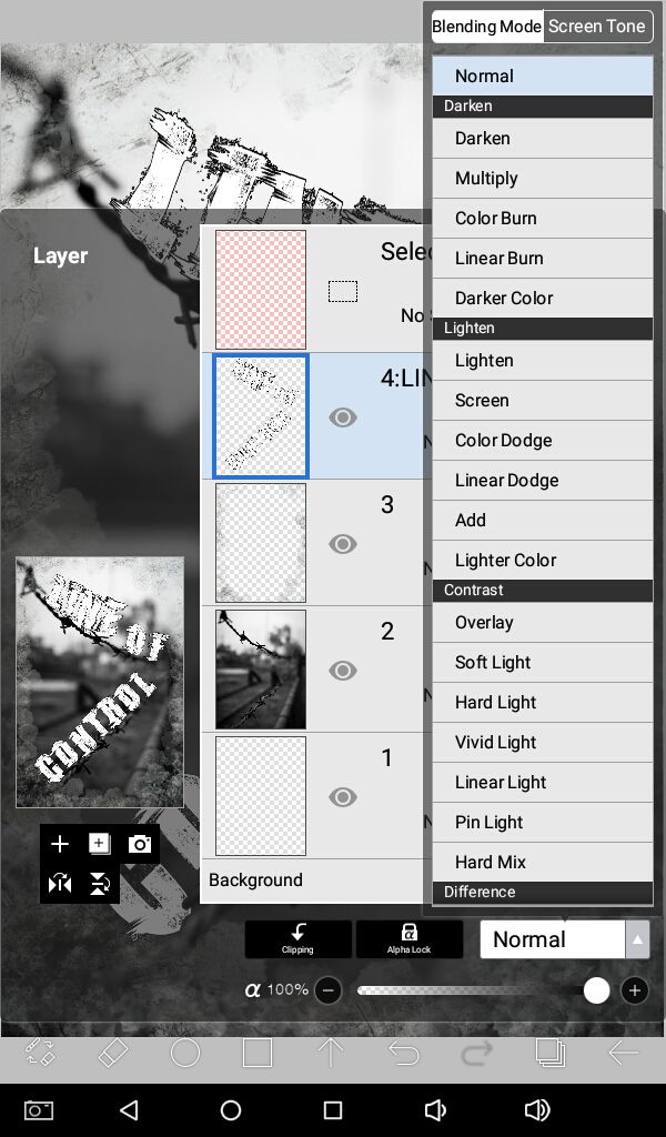
Merge all the text layers that you just created so that the whole title is in one layer.

Apply blending mode of your choice to make the title look more blended. I used overlay.
Add a new layer underneath the text later and from the filters, add drop shadow.
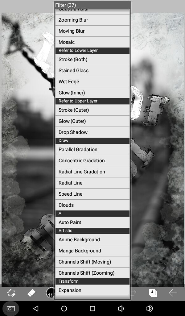
Change the blending mode and opacity if needed. I used exclusion at 40%.

Hopefully the title text is visible enough.
Add the rest of your text, like subtitles and author name in a new layer. Adjust blending mode and opacity.

Finally apply masks and overlays, as many as you'd like but please don't overdo it. Place each one in a new layer and experiment with blending modes and opacity till you get your desired result.

You can leave it here or apply filters in your favorite app(s) or program(s). I usually use Photoshop express.
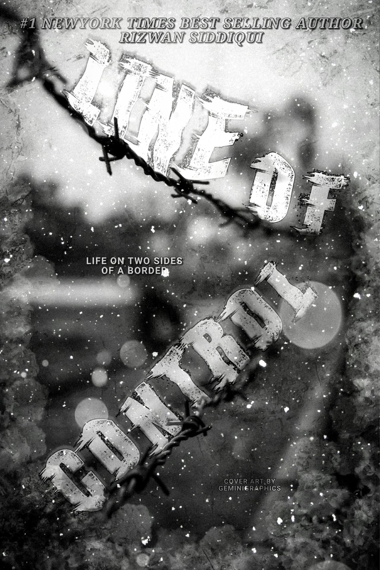
And here's the final look at the edited graphic!
Gif process in the multimedia.
This isn't the best example but you get the gist. Hopefully you learned something new today. You can find more inspiration from the internet. Keep practicing!
Questions? Comments?! Hit me up!
Have a great day y'all.
I'll see you a next time.
Bạn đang đọc truyện trên: Truyen247.Pro