COVER TUTORIAL {1}
hi guys! so i was really excited to make a tutorial ever since i've reached 5k and since we're at 10k now so why wait for longer? here it is!
i've decided to to a tutorial on 'abstract,' because so far it has the most votes, and super happpyy and humbled to say that it's the most popular cover here on this book. (thanks so much for the support!)
but instead of making the same cover again, i decided to recreate it with the same technique used. the 'abstract' cover has about 57 layers and i'm going to have a headache if i had to sort them out, so yeah. don't worry, this cover was made the same way i made abstract, just with lesser elements.
i apologize in advance since this won't be too much of a visual tutorial. so read my words then try them as you go! have fun guys c:
(i never knew wattpad had an image limit though g r r r r )
here is the finished product:
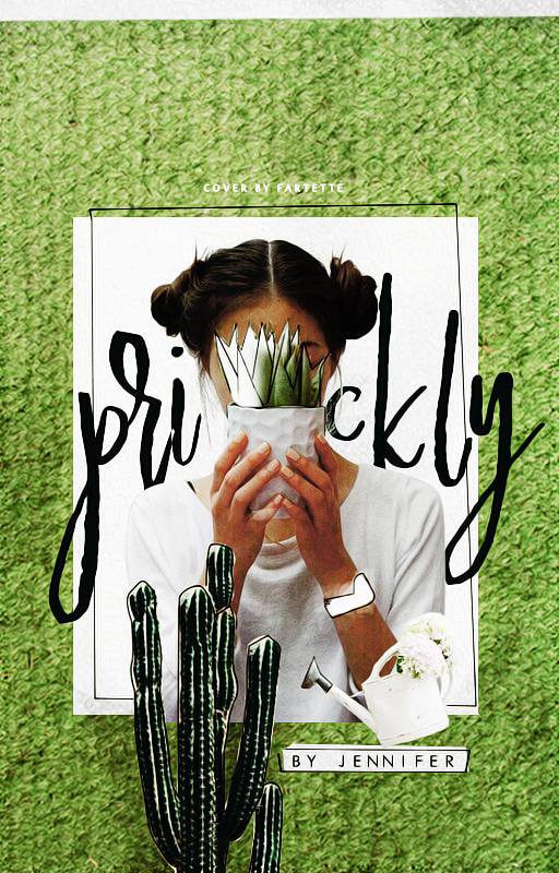
disclaimer: please do not steal
to make this cover, you will need:
-photoshop (any version)
-basic knowledge of ps navigation + the ps tools + pen tool usage
-fancy watercolor ps brushes (which you can google and download)
-lots of patience
-more patience to understand this 100% trash tutorial
-stable internet connection + access to sites like google, and pinterest
let's get started! c:
1. open up your canvas of a 512x800 size, or anything similar. all good? awesome.
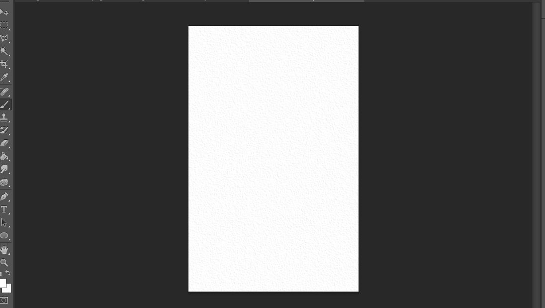
don't worry, my canvas looks abnormal because i was testing out a texture (which failed by the way) and was to lazy to screencap a blank canvas X))
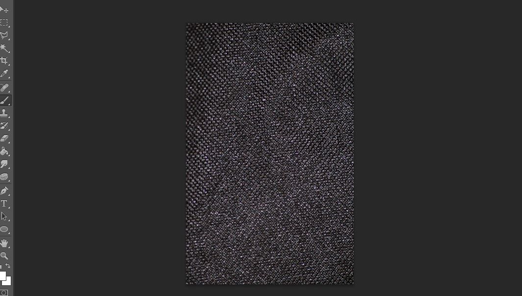
2. find yourself a nice, texture background and place it nicely onto your canvas.
i found mine randomly on google and thought it looked good :) try searching 'fabric texture dark' or something along the lines of that and you'll find the perfect one.
here is my texture placed on my canvas.
i reduced the opacity of the image to about 45% to wash it out a bit like so
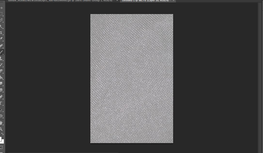
looks so cool right
3. with your watercolor brushes, splash out some "paint" onto the image.
so again, you can find watercolor brushes by google. (i recommend the splatter type because those are fun. ) once you find the perfect brush, download its .abr file.
then in photoshop, go to edit> presets> preset manager. click on load and locate the file you've just downloaded. it should appear in the window of the brushes if you scrolled down.
so using white, i just painted over the texture like so
tada! so you have a really nice unique thing going on.
4. cut out your model and place it in the center, or wherever you feel like you want to put it.
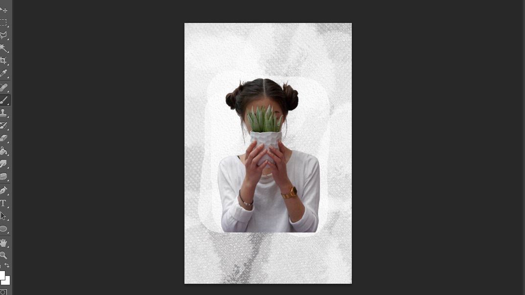
i found this aesthetic pin on pinterest and cut the girl out c:
5. on a new layer, draw a rectangle to frame the model with the pen tool.
this is an important step which you must get the hang of. why? you'll know later.
so first locate the pen tool
it's kinda hard to use at first - especially if you're trying to make curves- but eventually you get it and everything is just easier. (trust me, it took me like 1398493259134 years to get the hang of it.)
anyway, let's worry about curves later and focus on our rectangle lmao
now press crtl+shift+n on your keyboard to open a new layer. then on that same layer click on four points in the center to form a rectangle.
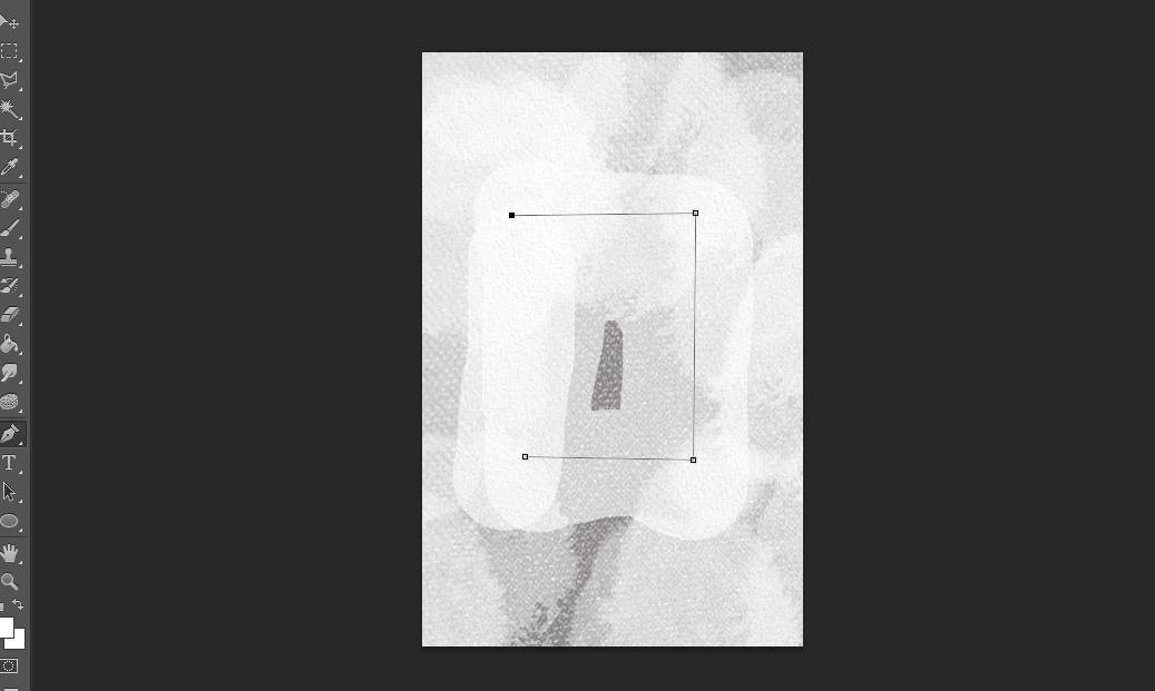
three points ready here, just click on that first point you made to close it..
6. convince yourself you've made decent rectangle
KIDDING X)
we're not done with step five just yet.
click on the brush tool, and set your brush to opacity 100%, hardness 100%, and size to 1px. make sure the color is black.
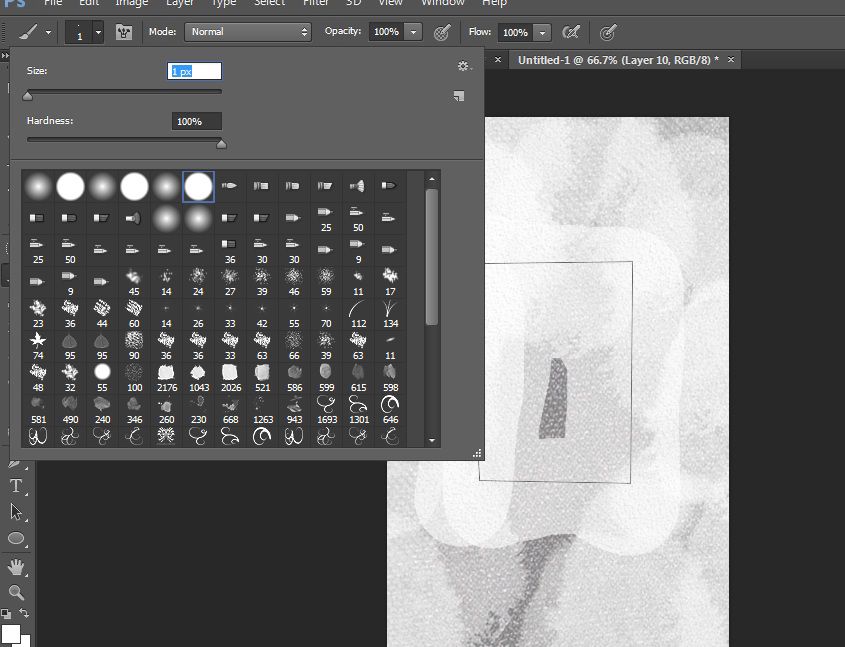
and then click the pen tool again. right click on the rectangle you made and click stroke path.
this thing should appear
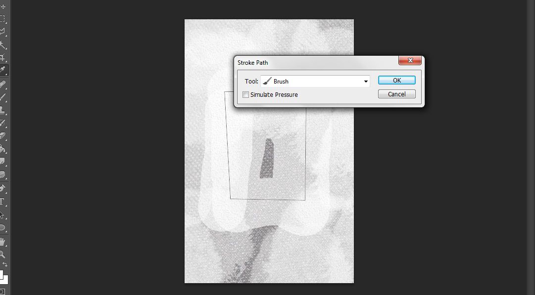
click ok, then press enter once or twice to get rid of the path you made.
you should now have a nice rectangle you can actually erase with an eraser and move and transform. i re-did my rectangle because i wasn't satisfied so here is how it looked.
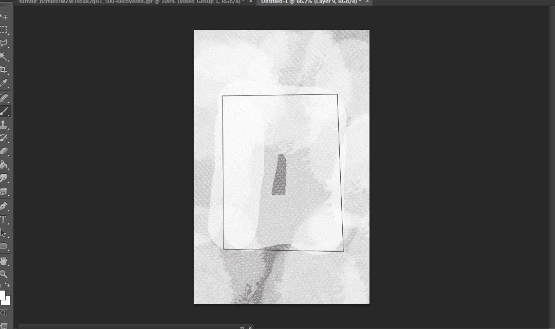
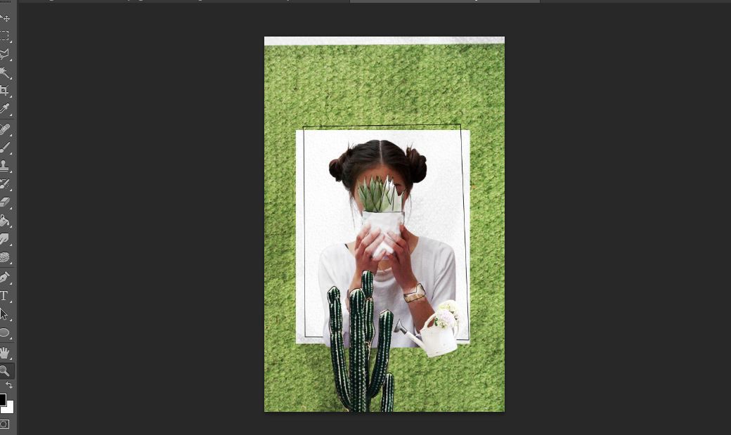
and here is how it looks with the model
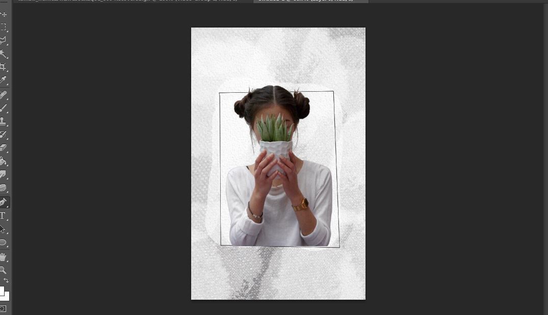
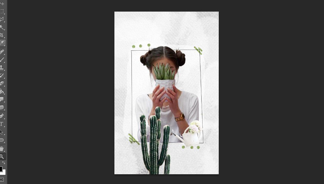
6. add your elements.
so you can now start adding elements with a specific theme in mind. do you want an ocean theme or butterfly-flower theme or books-globes-dictionaries theme?
i went with the plant theme and went for minimalism so here is how it looked after i added a sprinkly can and a cactus and weird embellishments

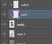
7. make a new layer over your model image.
so click on the layer of your model png, then press crtl+shift+n to make a new layer. it should look like this

right click on that new layer and select 'create clipping mask' to make it look like this

i renamed "layer 10" to "outline" so i wouldn't be confused.
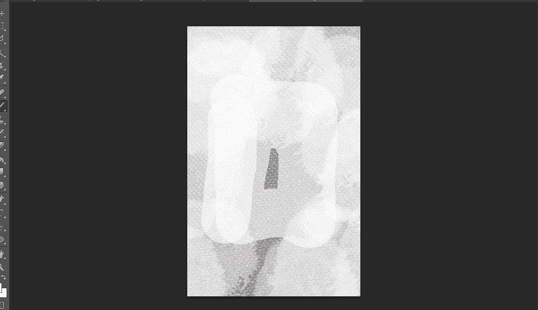
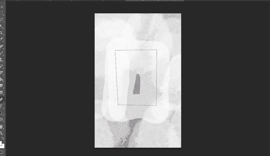
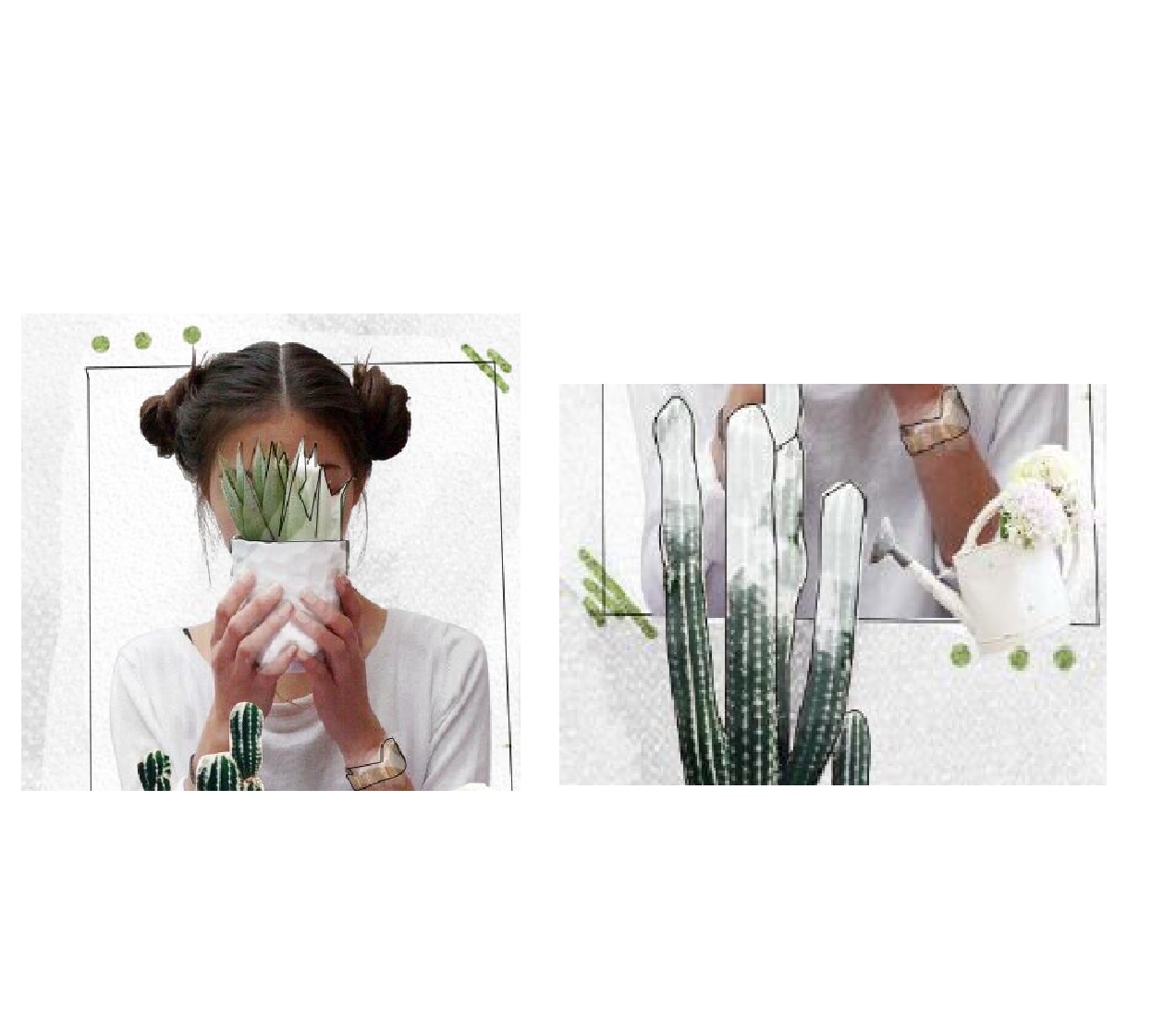
8. using the pen tool, outline the parts you want to outline on the model.
so using the same technique i taught you in making the rectangle (step 5), outline the parts of the model you want to outline by making points and connecting them. then right-click and stroke, then press enter twice.
outline. right-click and stroke. press enter twice.
repeat the process above until you're satisfied. just make sure your "outline" layer is selected, okay.
tip: you can make curved lines by dragging one point slowly to the direction you want.
so you can see i outlined the plant the girl is holding and her watch here.
9. make a new layer and place it underneath the "outline" layer.
it should look like this:
i renamed the new layer to "paint," in case you're confused.
10. on that same layer, brush on some white watercolor brushes.
paint over the parts that have the outline so they would pop and look illustrated.
use pretty much the same technique from step 3.
so this is the step where you just go crazy and paint and erase as you like. you can use watercolor brushes or just normal brushes, but to acheive the effect in "abstract" i used about 6 different brushes.
this is how mine looked up close (i experimented on the cactus and on the plant mostly)
11. once you're happy with your illustrated effect, you can go ahead and add adjustment layers and more elements.
i wasn't happy with how white it looked so i added a green texture to add contrast. then i went ahead and added curves and color balance. and i removed the effect on the cactus since it looked distracting.
in the end i wasn't happy with how washed the "illustration" effect looked so i went ahead and did it all over again. then i added a psd from raven-orlov on dA and a coloring of my own. then i added more boxes for the author name, and placed the title beneath my model using "beautiful dreams" as the font.
i added some topaz and sharpening and tada, a new cover.
i'm so sorry this tut was trashy but i hope you guys picked up some new things. if you have any questions, please don't be afraid to ask me because i will gladly answer.
plus i'd loveeee to see it if you guys tried this out! just make sure you credit me when you use my "illustration" effect somewhere in the cover, or graphic. like maybe an "inspired by fartette" or "tut by fartette" somewhere would be awesome.
tag me so i can see what better things you guys come up with ajfhgsjdf
love y'all
-andy
Bạn đang đọc truyện trên: Truyen247.Pro