BEST COVER WINNERS + REVIEWS
I know I said I wasn't going to start judging right away, but judging the mini categories is relatively simple and easy so I figured I might as well start!
Since this is a mini category, the reviews will be specific but not overly detailed. If you have any questions about your review, please let me know!
Keep in mind this is all my opinion. With covers it's hard to judge more objectively, so this is all subjective feelings. Please don't argue with me. You're entitled to your own opinion and you may completely disagree with me. That's fine, but please no hate or arguments! Remember this is just for fun and everyone will have more opportunities down the line with my future contests!
If I tagged anyone wrong, please let me know. I copy and pasted the usernames from your forms, so if there was a mistake made, please let me know.
I'm pretty sure I copy and pasted all the reviews in here, but please let me know if you don't see your review. Sometimes mistakes happen with copy pasting so please inform me if you don't see yourself!
I will be distributing prizes as soon as I can!
Here are the winners and honorable mentions of the best cover category!
3rd Place
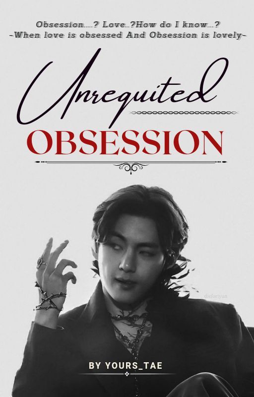
Unrequited Obsession by yours_tae
Thoughts:
Very nicely done. The blood red of the "Obsession" and the font of both the "Unrequited" and the "Obsession" is beautiful, I love it. I also love the little designs underneath both words. The subtext at the top isn't distracting and works well for the cover. Same with the author's name. I love the picture of Taehyung, it fits with the title very well. My only critique is that his index finger looks like it got a bit too cut at the top and the right side of his hair (left side from Taehyung's perspective, right from ours) looks like it got cut down a little bit since it's uneven with the other side. That's more of a nitpick since I think the cover is really good, but I still thought it was worth mentioning.
2nd Place
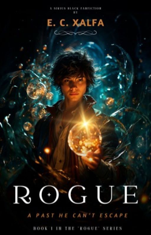
Rogue by footnoteofhappiness
Thoughts:
This is a beautiful cover with an awesome picture, color scheme, and chosen font. The vignette-like blackness on all the corners of the cover is amazing and I really like the subtext you chose to add. My only criticism is that it's very blurry. I know Wattpad kills cover quality so I'm willing to forgive some of that, but it's blurrier than other covers that also undergo the "Wattpad Cover Quality Kill." I have no criticisms for the cover itself or the colors, it's just the blurriness. I really love this cover and I think it fits the story well.
1st Place

Nightmare Assassins by kth_disneyfanatic
Thoughts:
The dark color scheme you have is really nice and I like how the white sparkles and crown make the cover pop. You do a good job adding those sparkles to the top so the cover doesn't have much empty space. I also like the reflection of the crown and the subtext beneath it. The "Nightmare" being smaller and plainer than the "Assassins" makes the title pop on the cover, and I like how you did that to add emphasis to the "Assassins." It's elegant, clean, and crisp/clear. No criticisms.
Honorable Mentions:
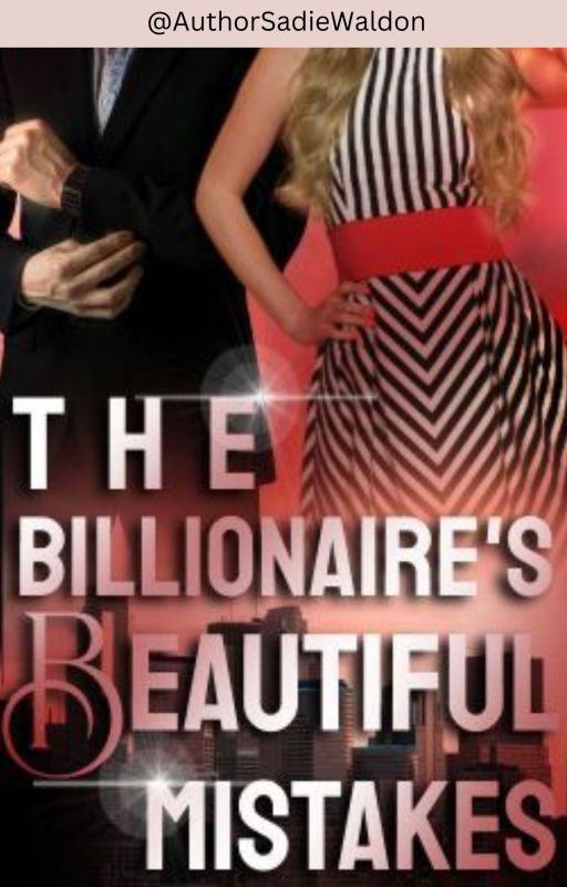
The Billionaire's Beautiful Mistakes by AuthorSadieWaldon
Thoughts:
The font is great and I really like the red and white color scheme. It blends well on the cover and I like how both the man and woman are faceless. It adds mystery to the book. The only thing I'm not a huge fan of is the author's name at the top. The beautiful font of "The Billionaire's Beautiful Mistakes" was well-selected. The font of the author's name could have benefitted from also having some flair to match the elegance of the rest of the cover. It just kinda feels like it doesn't fit and needed a different font, if that makes sense. I feel like you could have potentially put the name in the space between the M of Mistakes and the end of the cover on the left. That's just one idea though, I encourage you to play around with it!
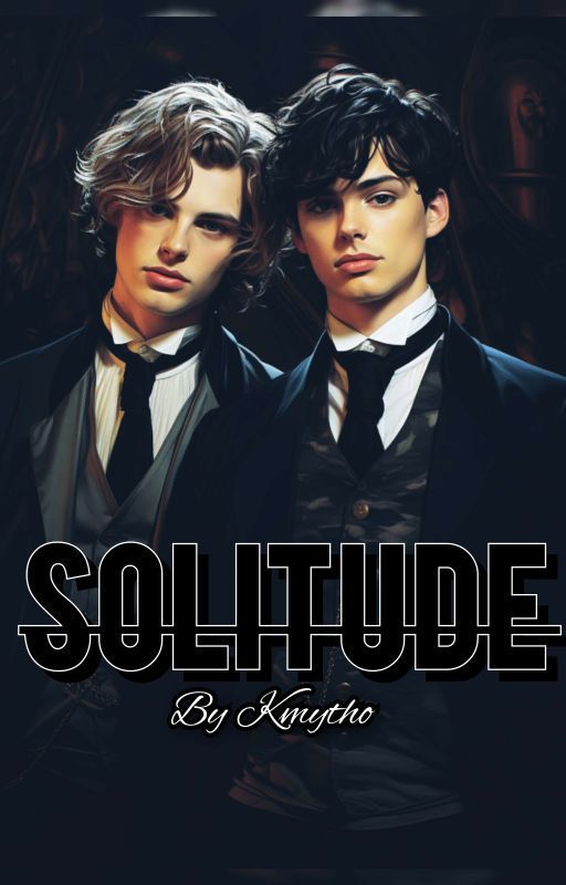
Solitude by Kmytho
Thoughts:
I really like this cover! The chosen colors are very nice and work well with the aesthetic of the story. I like the font used for "Solitude" and how there is a bar running through it. The author's name is in a nice font and is very clear/easy to read. It's a smooth cover that works well. My only criticism is that at the top it looks like it loops a bit or there's something out of place. There are like two white things that look like the top of their heads got looped, almost like it didn't fit the Wattpad dimensions. Otherwise, I like the cover!
REVIEWS:
Intoxication by m25_bookworm
Thoughts:
I like the aesthetic of the cover. It feels very "Hunger Games" and it captures the essence of the genre very well. I like the curved line underneath the "Intoxication," and I also like the chosen location of the text. A minor critique is the author's name blends in a bit with the hand, and especially considering Wattpad kills cover quality, it can make it a bit hard to read (especially the Crenshaw part). The "Intoxication" has a fringe-like effect on it and I'm okay with it but again because of Wattpad killing the quality of everything, it is a liiittle blurry, but just a little. Those are two minor things though so it's not a big deal.
Find It by KanhaiyakiSakhi9112
Thoughts:
I like the pretty visuals you have going on in your cover. The sparkly water gives the cover a sense of fun and elegance that I really like. I also like the placement of the text, the font, and the color. You managed to select a shade of blue that doesn't blend in with the background, which is great. The object in the middle being golden and with a golden peacock feather is a nice touch that makes the cover have another sense of elegance and charm. My main criticism is that it's very hard to read the text under the "Find it," and I think it could benefit from being larger. Wattpad kills cover quality, so that on top of the two texts underneath being really small makes it hard to read the second line and almost impossible to read the third line.
The Daughter Of Hell Season 2 by IfeoluwaDickson
Thoughts:
I really like the aesthetic you have. Not just on this cover, but all your covers! The art style is beautiful and I love it so much. It's very visually pleasing and sets the vibe for the story, and it's also very crisp and clear. The only thing is both of the texts on the cover are hard to read, and I'm not sure how I feel about the author's name being in that shade. It feels a little too different from the color pattern the rest of the cover has. The title is hard to read since it blends in with the image, so I would recommend moving the title (maybe place it directly above the author's name, for example) and tweaking the color to make it pop more. With that being said, I still like the cover and the art style is absolutely gorgeous!
Mafia Brothers by lilmewomewo93
Thoughts:
I like the color scheme with the purple and galaxy-like colors. I like how that contrasts with the name of the story, which sparks intrigue. The name is literally "Mafia Brothers," but the cover feels very mysterious. It piques my curiosity and makes me want to read more into what this story is about. I also like the first picture of Yoongi on the left where he's in the back. The picture is crisp and looks natural in the environment. The only criticisms I have are I feel the front two pictures of Yoonjin are a little unnecessary since the back two are already really nice and show us who the characters are, and I feel the subtext feels out of place. Considering you have a more galaxy-like theme (pinks, dark blues, and purples), the sudden red feels a bit out of place, if that makes sense. My recommendation would be to make the subtext a little smaller and consider changing up the colors to make it match more with the rest of the cover. I hope that makes sense!
Death Horizons | Ice Giant by Caitlyn-Blayne
Thoughts:
The cover is visually pleasing. Whenever I see the word "horizon" I think of Event Horizon, the science-fiction movie. So I had an image of your book in my head before even glancing at the cover, but when I did look at the cover, I thought it fit the science-fiction vibe very well. The colors mesh well together and I like how you literally changed the horizon of the word horizon. The main criticism I have is about the guy on the bottom right of the cover. The top of his head looks like it faded off. He's wearing a hoodie but the top of the hood isn't there and the top of his head kinda fades away. The right side of him is a little faded as well. He is one of three figures on the cover and the only one with the fade effect (that I can see), so I was a little confused why only he got it. This is a nitpick but the guy on top, on the bottom right side of his hood it looks like there's a white triangle there that was left in during the cutting process. That's a really big nitpick though so it's not a big deal. Overall, I like the cover and I think it captures the sci fi feel very well.
Bạn đang đọc truyện trên: Truyen247.Pro