Cover Delivery #2
I am back!!
Hehe! How are u guys!!
This is a very special delivery I had to make because the author asked for a cover plus a BACK COVER.
This is my first time making a back cover so you know I was kind of stressed about how good it might turn out.
So the request went on and on and she gave me multiple things that I could include in the covers.
It was very BIG!
But I sincerely appreciate it because she participated in making the cover a lot and even told me directly if she DIDN'T like anything which was very well appreciated my me.
The synopsis is like this.
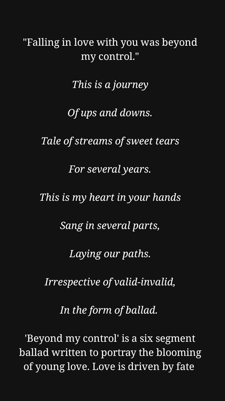
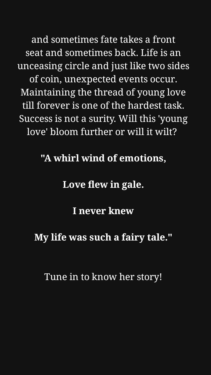
Wanna find out what happens next?
Just go to aksgiri 's profile and find out!
Title: Beyond My Control
Author: Akanksha
Subtitle: Fate turns and rolls like six faces of dice, We reunite and strengthen cutting the distance into slice.
Colour scheme: Nothing that hurts her eyes. Lol. Not fluorocent, I mean.
Face claims: should be brunettes.
Authors feedback:
The graphics you made are really pretty and eye grabbing. I TOTALLY love your choice of colour. Salute to your dedication for work. I was worried I might not really like someone else's work... But you nailed it and I am so glad that I asked you to make my covers. Thank you so much dear, means a lot to me. ❤❤
So let's get on with the explanation.
~~~~~Front Cover~~~~~
Front Cover:-

So, the background picture is quite common as you see and it's just two person. Simple yet having an adorable and calm nature within itself.
Yet it has a meaning deeper to the show. As you have noticed the couple is wearing grey clothes and smiling as their foreheads touch. This is very complimentary to each other. Grey refers to pain. So the ultimate meaning of the picture sets that even after facing pain and tough circumstances the couple survived.
The meaning of this cover also lies in the text or the text colour. As you have noticed I haven't used any fancy fonts just three regular fonts which is Porter, Nevoclara and Medusa Gothic.
It shows the simplicity of the cover.
In terms of colour of the font, the main text is red which signifies longing and passionate love. The 'balled' is in grey and lies within the red to signify... Pain is present between Love.
Other than that, I made the main picture fade out in the end to signify the purity and innocence of the love.
~~~~~Back cover~~~~~
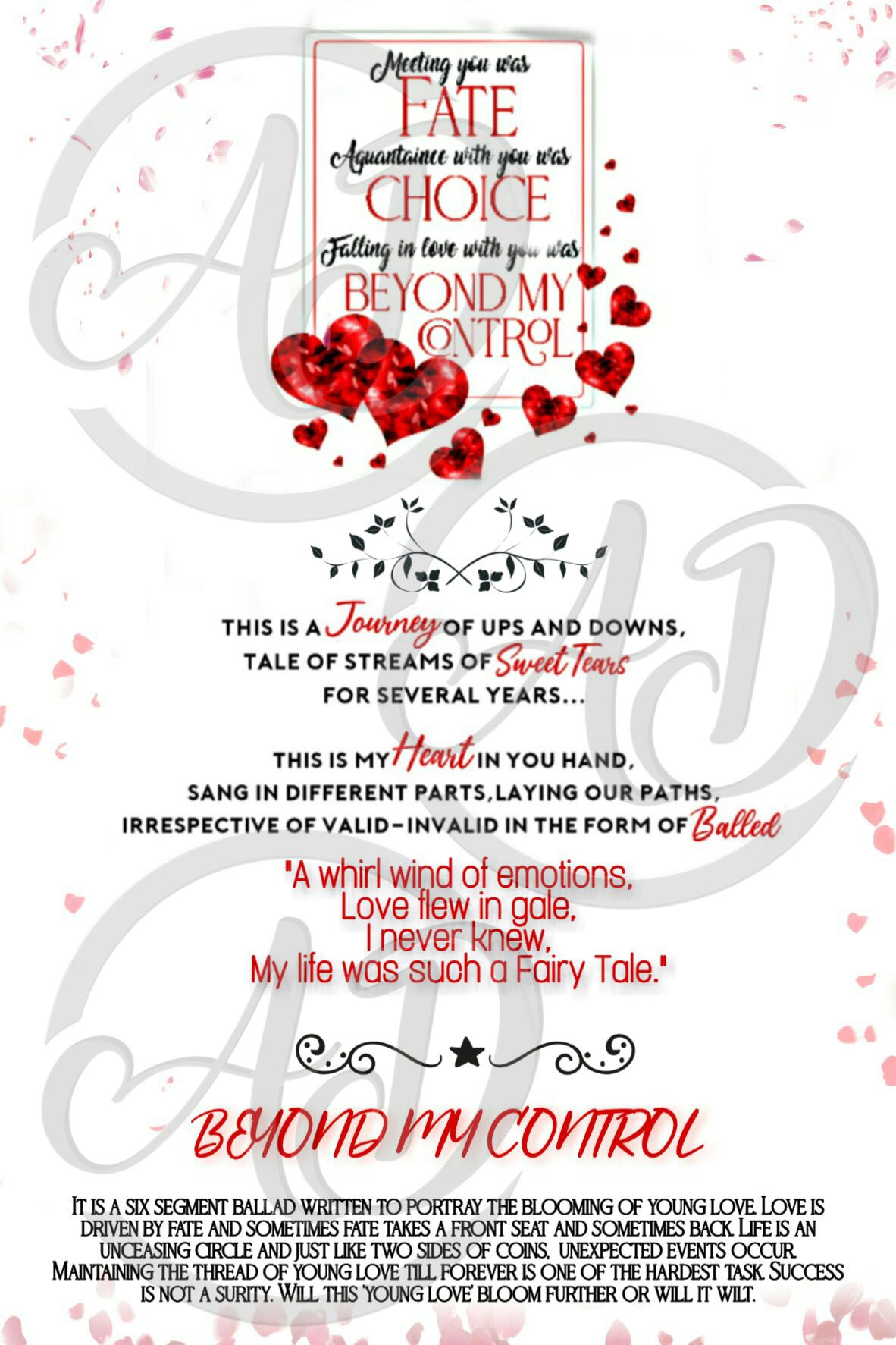
I completely have no idea how this is because most back covers are very simple and that kind of simple doesn't sit well with Wattpad.
Explaining time.
Firstly, I come to the only picture in the back cover.

This is a card with the words "Meeting you was fate, Acquaintance with you was choice and Falling in love with you was Beyond my control"
Why did I included this?
So, while talking with her she had given me many things to include in the story for which I am greatfull because things sometimes get exhausting without it.
In one of her point she mention why her book was named 'Beyond My Control' It was because in the Ballad itself the guy had gifted the girl a card, with the above mentioned line written on it while proposing. So I picked this up. Because it had a huggie relation with the story and also the Book name was kept due to it. So, I included the card and made it the focus point.
Then comes the synopsis. The synopsis with only one font looked very boring. So as to spice it up, I used red curly fonts in between.
And the end I have included a small passage about 'Beyond My love' which explains what the book is about.
Excluding all this, one thing I couldn't add that the author asked for was Barcode. Because barcode has to be authentic and I was not sure about the process of generating Barcodes and the possible outcome.
So, I had fun making these cover. Hope you liked them and found this note useful.
Thank u!!
Don't forget to vote and comment.
Bye bye,
-A
Bạn đang đọc truyện trên: Truyen247.Pro