How NOT to design a graphic
I made this 'tutorial' before the typhoon, so that's why I'm so calm in the 'tutorial' but literally scared for my life in the author's note.
GUYS
THE BUILDING IS LITERALLY SHAKING
THE TYPHOON IS SO STRONG
IM TERRIFIED
AHHHHHHHH
Seriously, I am actually scared for my life.
The building is tilting forwards and backwards.
If I don't make it, clear my browser history.
-
Instead of teaching you what to do, I'm going to teach you what NOT to do when designing your graphic.
So get ready for meaningless instructions and dumb jokes.
Basically like all the other chapters in this book.
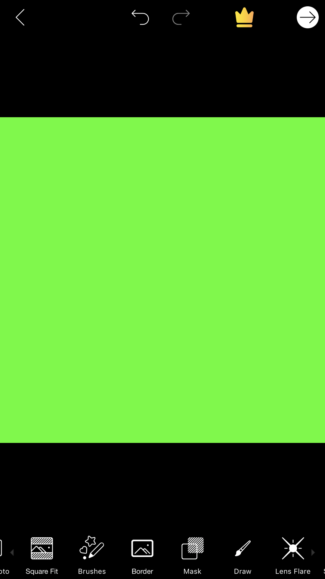
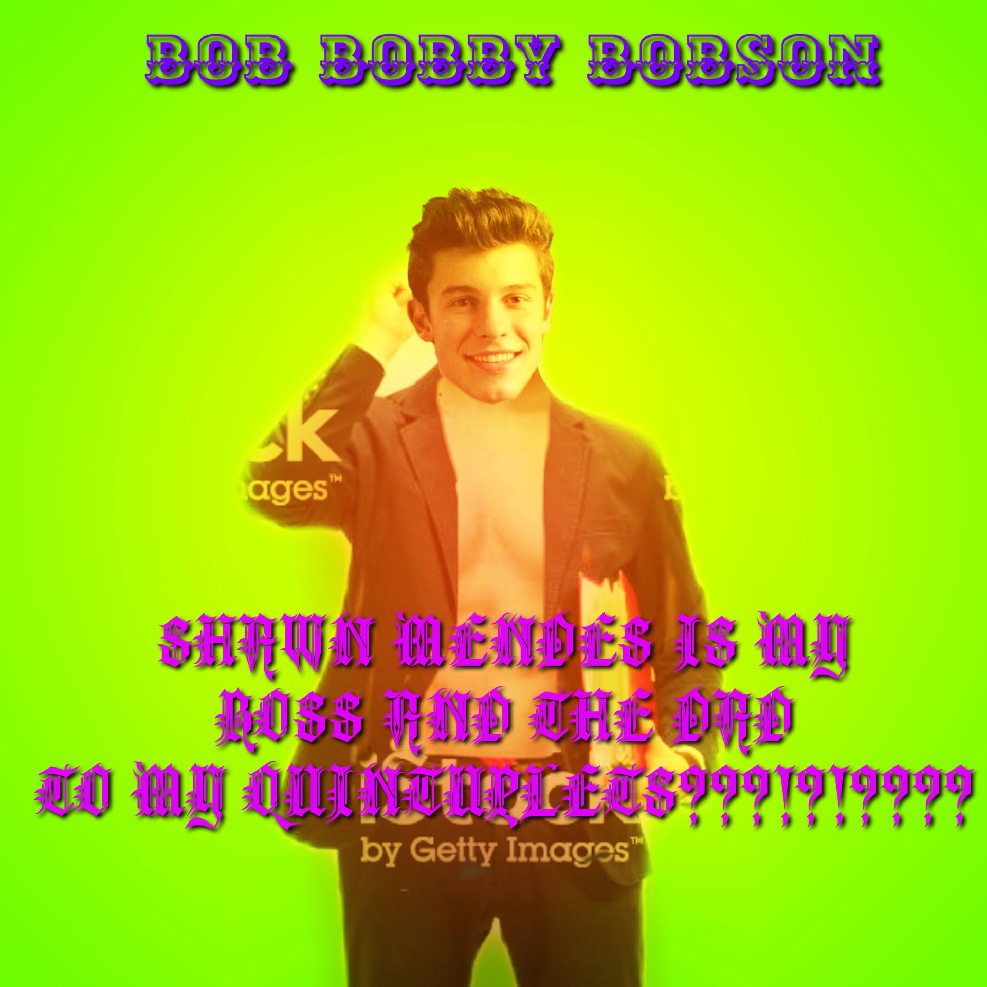
Step 1 - First, open up a square picture on PicsArt to use as your template, because who needs to keep the sizing correct and actually fit into the cover frame when you can just be lazy and have a square? Like, come on, nobody has time for that crap.

Step 2 - Chose a neon colour as your background, this is to catch the readers attention when they're scrolling through stories, and is totally not blinding!
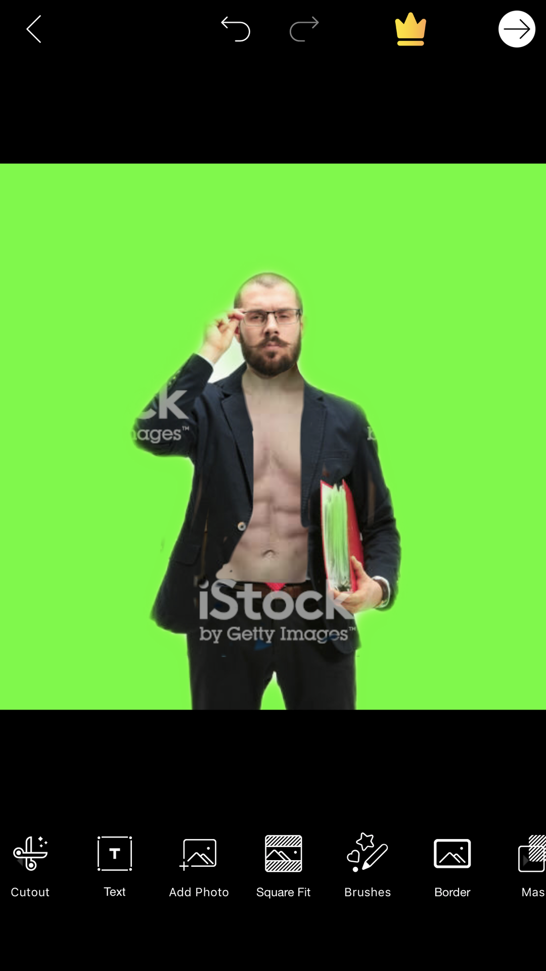
Step 3 - Add your poorly cropped and shit quality model taken from Google Images. Remember what they say, the more watermarks on the picture, the better.

Oh yeah, and he needs abs cause guys with abs are just the hottest thing ever. It doesn't matter if it doesn't match the picture or graphic itself, just add it on and your graphic will be a hundred times better!
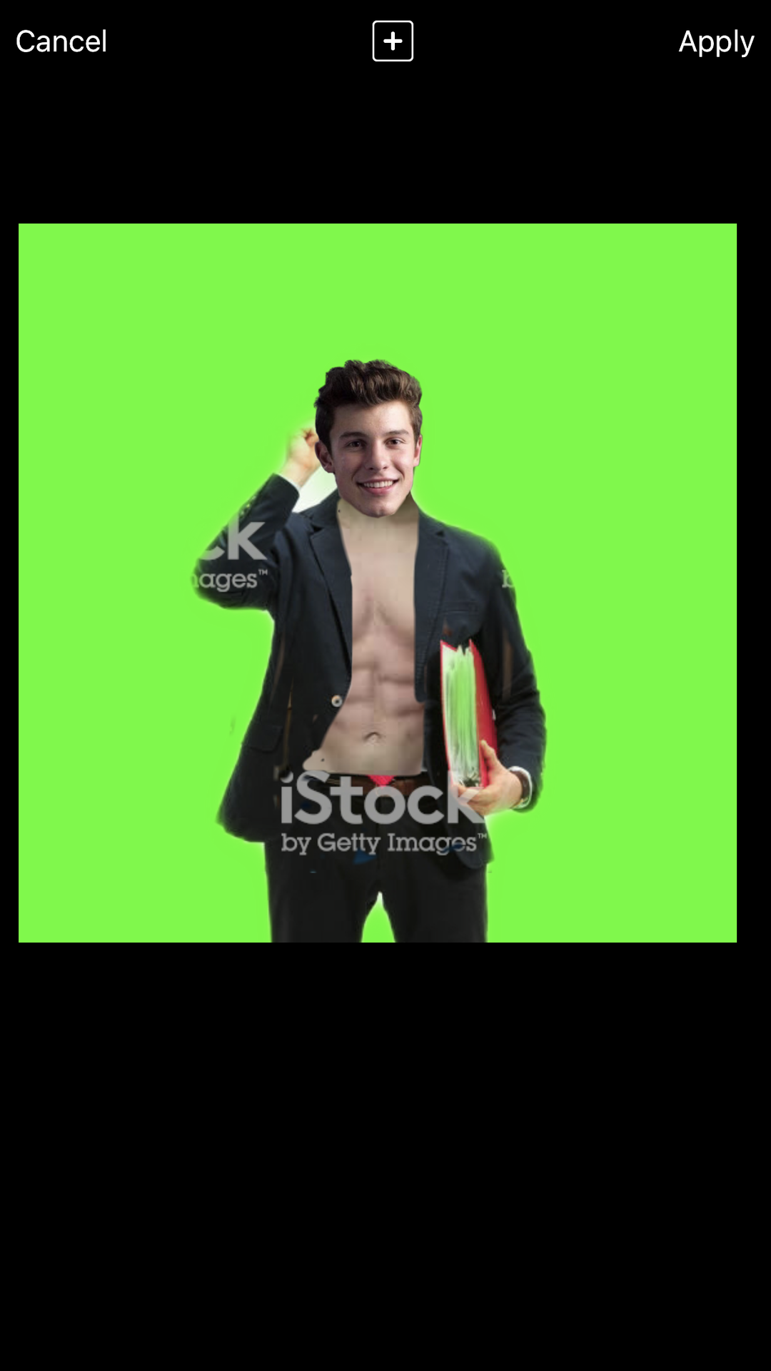
Step 4 - Add a celebrity's head onto your model, cause why not? LMAO I'm so random XDDDDDD
When you're doing this step, don't use any kind of filter at all to even try and make the head blend it, just leave it as it is! It'll show the readers how the character is diverse, different, this is a run on sentence, don't do this when you're writing, this was supposed to be a cover tutorial, but apparently it is now a grammar tutorial.
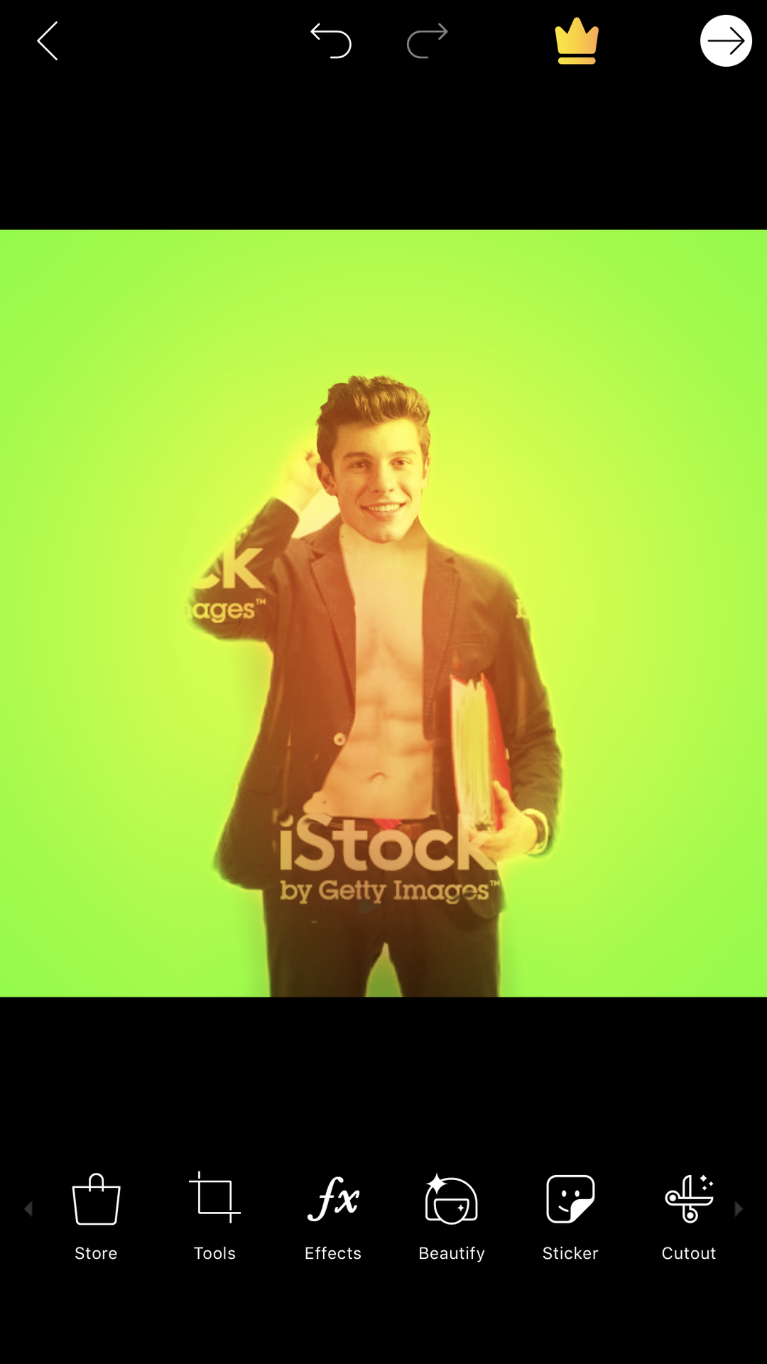
Step 5 - Add unnecessary and trashy filters! Just to spice it up a little bit!
Step 5 - Now adding our title! When putting titles on the graphic, you should always put it somewhere so that it blocks the model itself! Also make sure that the title font is ugly and the colour is bright!
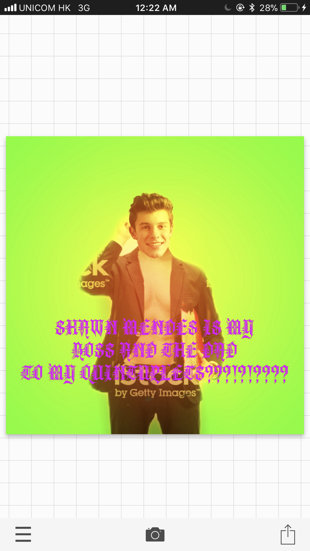
Step 6 - Now, Add your name onto the masterpiece you've just created! Again, make sure that it's bright as all hell so that it catches the readers attention!
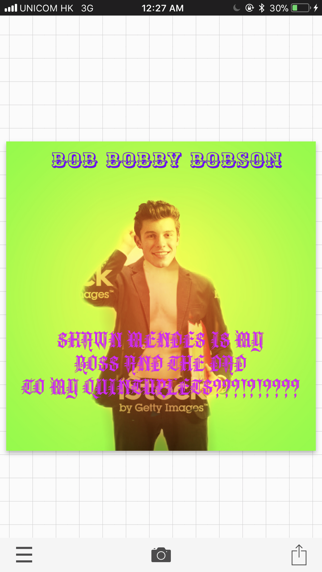
Step 7 - Now, add some shadows to your title and author! Get them to the maximum, because who doesn't love some 3D words?!
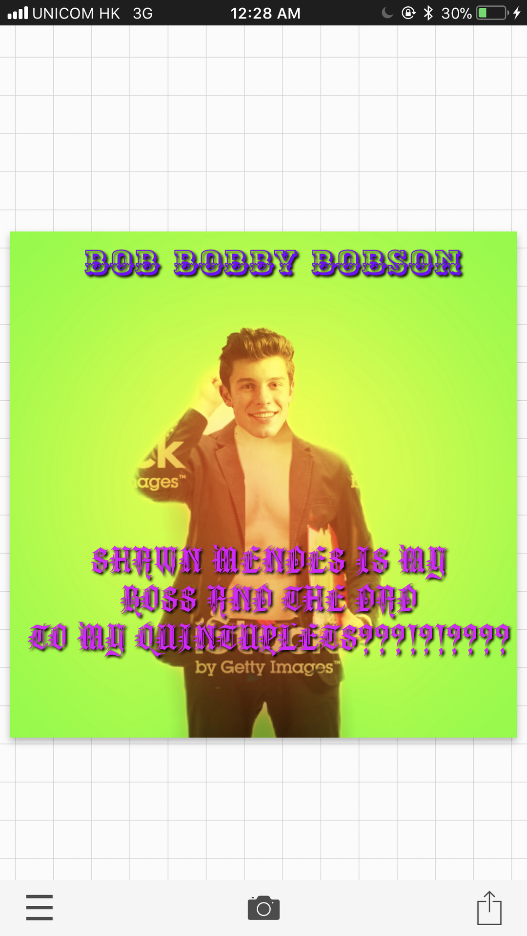
And we're done! Here's the final graphic!
Here are some titles YOU can use for your own book!
- My dentist, Harry Styles, kidnapped me.
- My step brother's teacher's friend's nephew's son's daughter's brother is BTS?!?!?!??
(Yes, I am aware that BTS is a K-pop group made up of multiple people, not just one person. It was supposed to be a joke.)
- MY UNCLE IS MY SON WHO HAS A CRUSH ON ME???!?!?!?!
None of these titles actually makes sense, but who needs common knowledge when you have drama and hot dudes?!?!?!
Okay, so back to normal now.
Fun fact, I now want to die even more than I originally wanted to after writing this chapter and making that graphic.
Which, to be honest, is pretty gosh darn amazing considering how much I already want to die normally.
As I've said in the beginning, this is not a tutorial. It is what you should not do while editing your graphic.
Now please excuse me while I burn that neon piece of crap that I made with fire.
Bạn đang đọc truyện trên: Truyen247.Pro