Simple Cover Tips
Today we're going to look at the basic types of covers. Simple covers can look just as good as manip covers in their own way, depending on how you follow through with it.
1#: For your text, use a relevant font color. This naturally goes for any type of cover buts it especially important with simple ones. For e.g.
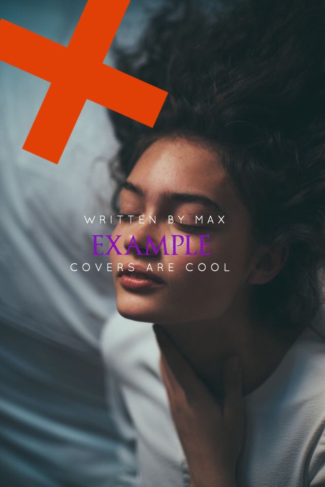
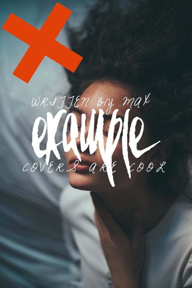
The font looks right, the text placing is reasonable, but the color? No.
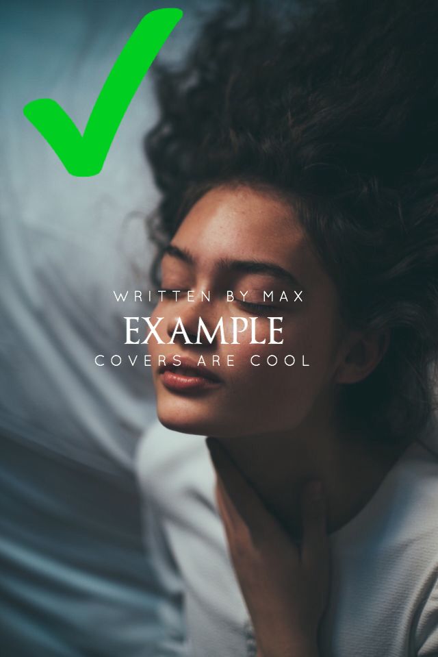
^^ you can almost never go wrong with white, to be on the safe side.
2#: Don't make your font too big - smaller text can make it more appealing. If you are using a cursive font, go for it. If it's your cover style and looks good then that's awesome :P
It can look good sometimes, though, like:
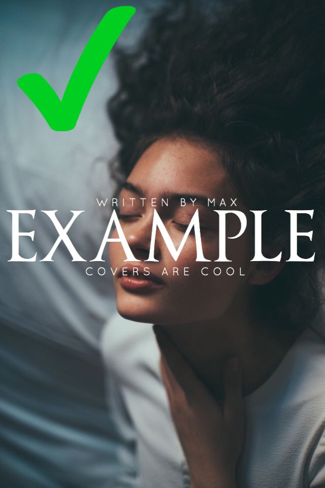
(Does it even look good? Idk)
3#: Choose a clear picture with colours that you can work with. I find most of my pics on Pinterest and Google. Don't get something like:
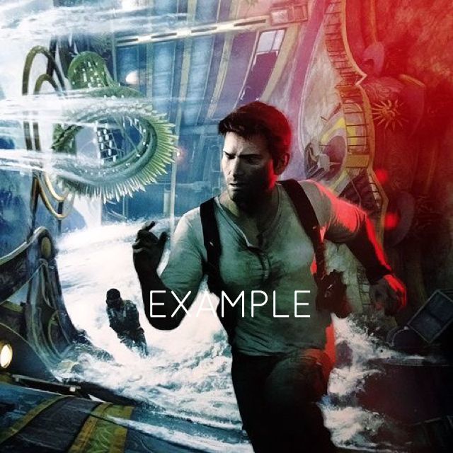
This picture is clear but it's not the right color for a simple one. Sure, Drake looks like he's ready to do anything, but you won't be able to without a color for your text.
4#: Pick a suitable font. Don't pick something completely unsatisfying and unreadable like:

Or:
5#: don't overthink your cover. It's supposed to be simple, so keep everything low key but pretty. Experiment with fonts and colours until you find your signature one. Try using fonts in all lowercase. If you see a cover in your head with a specific font and background, you can do it!
That was like a pep talk, but I hope you benefited one thing from this really crappy tutorial.
- Max (misscaulfield )
Bạn đang đọc truyện trên: Truyen247.Pro