
The More the Merrier ... Not
Generally when you make a cover there is a main focus, whether it's a model or two or an object, even text. Just as with textures, don't overdo it. It's difficult to make a cover look good with more than a couple of characters on it. More does not always mean better. Try and stick with your front and center main characters, or even just one of them. You don't want to confuse readers. If you throw every character on the cover the reader won't know where to focus or which character is in the driver's seat. Their main question will be, "Which one is the main character?" And once they get into the story, if they even crack the cover and begin reading, they might be confused as to why Mary's third cousin who appears once in chapter two is on the cover right beside Mary. Keep your focus on the characters who drive your story. Anything else will muddle things and make it confusing.
I know I use the word confusing a lot throughout this book, but it's important to keep things clear and in perspective. As I've said, your book is your product that you're attempting to sell. Everything has to come together in a way that makes readers want your book.
This goes even if you have a single character that is the focus of the story. You don't need six pictures of them on the cover. And yes, I've seen people do this. There is no reason to have more than one image of the same character on the cover. You can't force all six of those images to be the main focus of the cover, it's an impossibility. Choose one that best fits your character and go with it. A single image gives your cover focus and allows the readers to to zero in on the character and get a better idea of what the book might be about.

There's zero reason to have all of these pictures on the cover. The cover is exceptionally confusing and crowded. If your character list is too vast to comfortably fit onto the cover, you're better off going with an object-based cover.

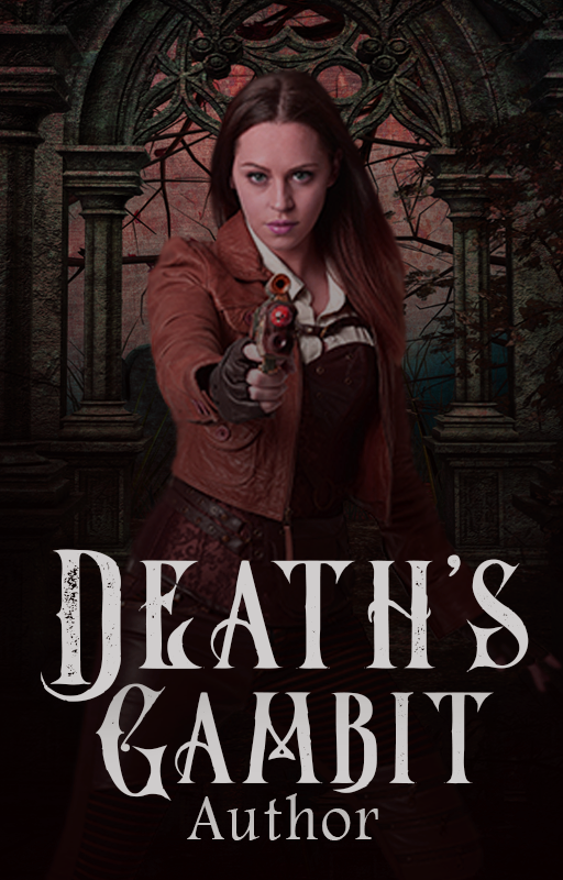
You can see this cover is more directed toward a single image of the character, your eyes are drawn to it and the cover has a definite image for your eyes to go to instead of hopping all over the place. You want the readers to be able to focus when they see the cover of your book. The cover is supposed to give them a sense or feel for the book's story. If you throw everything, including the kitchen sink at them, they'll walk away confused and without adding your book to their library.


I designed this cover for author Renee Jean for the culmination of her series that deals with different forms of PTSD. In this final book of the series, all four of the characters from the series come together. Her entire series has object-based covers but if they hadn't, it would have been a little difficult to cram all four characters onto the cover while making it look good to readers. This cover has a defined focus and the butterfly has meaning to the story.

Way back at the beginning of this adventure, we discussed cover types and one that I mentioned was collage covers. This is a totally random cover and means squat, I literally asked my friend Holly for two random words, and she gave me pumpkin and llama. I wanted to showcase this type of 'design' because I've seen some of them floating around and I wanted to address it.

This is not a collage cover. It's a collage, but definitely not a cover. This is another example of confusion. There is nothing that is a main focus, it's simply a bunch of images thrown together. The title text is also difficult to read and the title is very long. This takes zero skill to do, there are numerous online sites (or apps) that you can throw images into to create a collage. Even in Photoshop, it takes very little skill to accomplish. Most of my time was spent finding the images.
You can see that the title is difficult to read on the Wattpad thumbnail and the images are small and harder to make out (I had to put a white overlay on the full-size cover because with all the different images you couldn't even see the thumbnail it just blended in)

If your cover is nothing but mass confusion, then there is no reason for a reader to stick around and take a closer look. And if they can't even make out what the cover is on the little thumbnail, then they'll walk away because they'll believe your writing is as confusing as your cover.
Keep it simple and clean. Make certain everything is clear, the text is readable, and your genre is easily discernable.
Bạn đang đọc truyện trên: Truyen247.Pro