
Let's Get Judgey - Graphics Contests
I have lost count of how many contests I've seen of late where the judges don't seem to have a clue about design and inevitably the winner's skills are subpar and they were chosen simply because the judges happened to like the cover. There are things you should always consider when judging or critiquing a graphic. Especially if the graphic is for a contest.
Does it fit the prompt? Did the contestant do everything the prompt asked?
Is it the correct size the contestants were asked to make?
Are the images clear, sized properly and centered nicely?
Does the font fit the graphic, is it sized correctly, centered properly and can it be read easily?
If you're judging things you should be impartial, that isn't to say you can't like some of the graphics you're judging, but you must take a step back and judge based on skill not preference. You might really love 'Cover A' and want to give it good marks, but if it's the wrong size for the prompt or the images are fuzzy, or any number of other things are wrong, then you should judge it based on those things. If you can't be impartial then you shouldn't be judging, remain a spectator so you can comment about your favorite graphics.
I've seen covers with extremely fuzzy images that have comments on them saying how awesome it is and telling the designer how great they are. I tend to wonder if we're all looking at the same graphic. I'm not saying everything I make is super spectacular, but I understand the basics of design and I end up scratching my head sometimes when I see comments on some of these graphics.
The following examples are recreations of covers I've seen people make. Not everything is exact but I got them as close as I could. I got lazy with the backgrounds and with some of the titles because I honestly couldn't remember how they were done on the originals I saw. But I wanted to showcase some of the bad design decisions I've spotted in some contests.

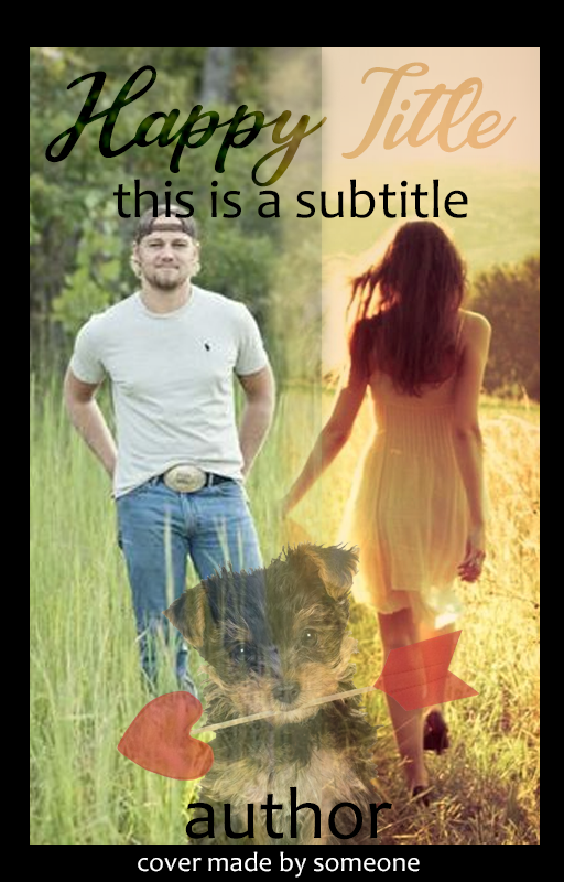
This is most certainly not a manip cover.
Let's talk about what's is wrong with this design -
1) The two images are just slapped side by side. You can see where they faded the edge of the top overlapping image just slightly in a useless attempt to make them appear as if they go together. It's very clear these are two separate and distinct images that don't go together. The woman's arm is even cut off. Either the designer didn't know how to make PNGs out of the images or they just didn't care how the cover looked. The images are also low quality and are slightly fuzzy. They made a small effort, I mean they're both in fields but I'm going to call this one "The Hallmark movie fade". This would be the point in the movie where they're both contemplating the fact they've fallen for the other one and we have a fade from one character to the other, great imagery for a movie, not so much for a book cover.
2) Just ... the dog ... I have no explanation
3) How many professional fiction covers do you see with a frame on them? I've seen exactly zero
4) the subtitle is on the dude's head and the title is difficult to read
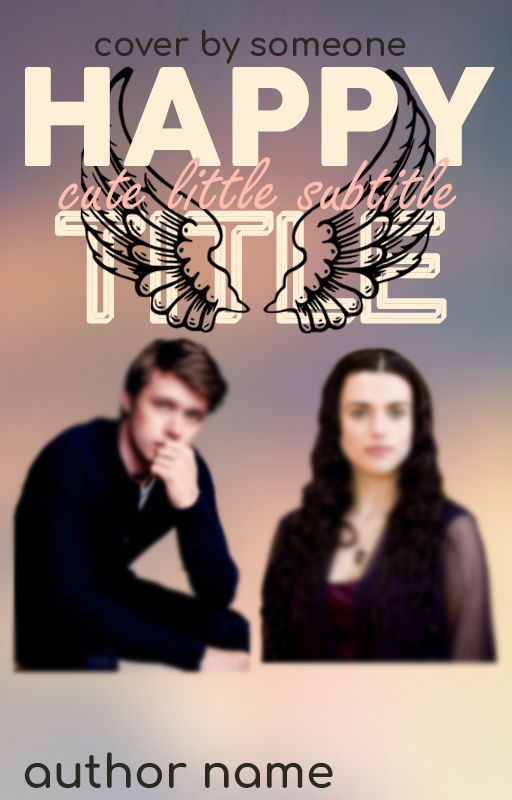
This could have been a good cover but ...
1) The designer ruined the cover by blurring the models into oblivion. I have no idea what prompted them to do this. It's a different case if someone is in the distant background, in that case you would want to blur them. But why blur the images that are the central focus of the cover?
2) The wings in the title should have been placed entirely behind the title and maybe faded a bit. They make the title and subtitle difficult to read
3) The PNGs are slapped in the center of the cover. If the designer had taken the time to find images that were larger they could have placed them closer to the bottom and filled that empty space
4) The font choices were poor. This particular prompt for this contest was a romance cover. The subtitle font is the only one I'd consider romance.

You'll remember I did a chapter on PNGs that have the top cut off. Please read it and don't do this. I don't know anyone walking around with the top of their head faded. It looks idiotic. This says you either don't have the skills to make this PNG work or you were too lazy to do the design properly. I couldn't remember how the title was on this one, I wanted to show the head cut off thing.

There's no one trotting about with the edge of their body faded (unless you're a ghost I suppose). If you're too lazy to find PNGs that will work, don't make the cover. Don't be a lazy designer. I feel like this is a bad prom night photo where they've been fixed up by their friends but can't stand one another
For the love of everything, don't stretch things out of shape. If your PNG is good enough quality then you can make it bigger without distorting it. This just looks ridiculous.
Always choose high quality images that aren't fuzzy. Try and find properly cut PNG images. Center everything so your cover is balanced and use fonts that fit the look of your cover and your genre. Make sure all of your text is easily read.
Look at everything with a critical eye and if you know you'd never use that cover on your work then you shouldn't deliver it to a customer because you aren't proud of it. If you need help there are a lot of designers here, tons of tutorials on YouTube and help everywhere if you're willing to look for it.
Bạn đang đọc truyện trên: Truyen247.Pro