
Everything in its Place
The entire idea behind a manipulated cover is to put images together so they appear as a single,cohesive image. You want people to believe in the final image you created. You want them to see a single image, not pick it apart because things aren't placed properly. It does little good if you half-ass it.
There are times you'll find that you need to add something to am image. You might have to put something in someone's hand or add something else to the image, change hair color, eye color. No matter what you need to add you have to make it look as if it belongs with the original image.
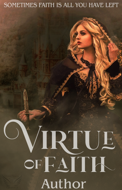
You don't want your knife to look as if the poor girl was stabbed through her hand. It's awkward and you can definitely tell it doesn't belong with the original image. I saw a designer turn in a cover like this for a contest. Though they made a small effort to erase it so it would look as if it was in her hand it was a poor effort and considering how the knife is positioned nothing about this is natural. There are times a requester is dead set on using a certain image for a cover and you can't change their mind no matter what you tell them. At that point, you can either do your best to fit it to their vision or you can deny the request.
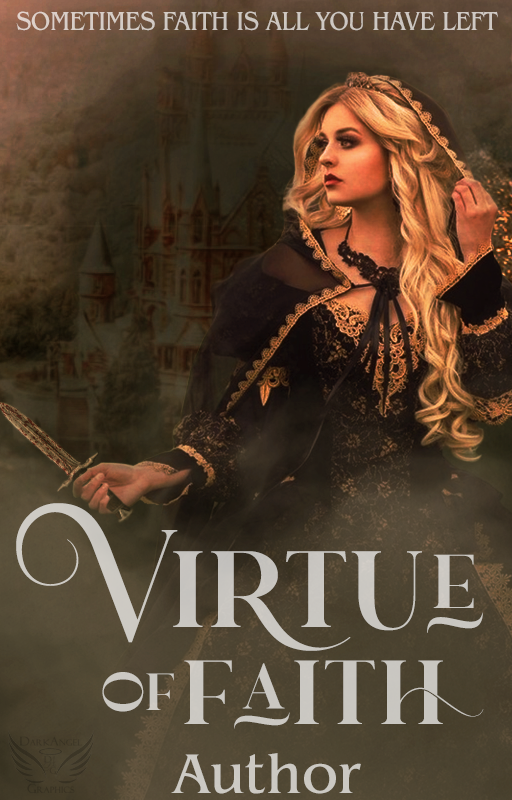
The knife looks much better in this image, but it's still slightly awkward simply because of how her hand is positioned.
It's all about getting things to look as natural as you can. No one would ever hold a knife like it's positioned on the first cover. You need to get your angles as correct as you can, and if you use a layer mask to erase pieces of an image you can make it look as if the knife is in her hand.

Not only do you have to worry about placing things correctly, it's finding the right image to add to the graphic. Crowns are a common object to add, but finding a PNG of one that is facing the correct way is sometimes difficult. There are some designers who simply grab the first PNG they find and run with it and you end up with something like this cover -
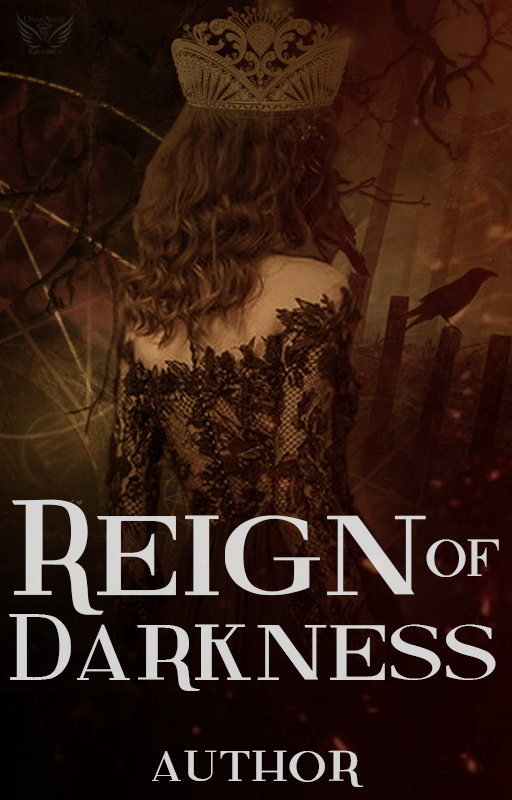
This crown image is facing the wrong way. You'd never twist your crown to the side like some wannabe with a baseball cap. This crown also doesn't fit with the genre of the cover. It's a very beauty queen type crown and awkwardly big. The best thing you can do in a situation like this would be to find a crown with no obvious front or back, that isn't huge.
It might seem easier to grab the first image you find and slap it on there and I suppose that's true, but if you're going to design then you want to do things as close to perfect as you can manage. Would you want a cover on your book that someone slapped together in five minutes or would you rather they took their time to create something beautiful that you're proud to show off as the cover of your book? Design as if you're designing for yourself, make it something you're proud to show off. If it's anything less than that, then it's not worth delivering to your customer. If you deliver it by saying "It's not my best work but ..." then it should have be trashed and never delivered to a customer.
Bạn đang đọc truyện trên: Truyen247.Pro