Color My World
Let's cover a bit more about PSDs and give you a closer look at them.
This is an example of what a PSD file might look like -

Each layer is separate and can be edited independently. A PSD file can have any number of layers. An artist I know does all his work in Photoshop and his images have thousands of layers. I am not joking. His work is beautiful and I wish I could do what he does.
But I digress, some people who make PSD coloring files will lock layers so they can't be edited so the original look of their file can be preserved. If you can unlock the layers then you can change things. I don't lock the layers on my PSD files because I know one PSD doesn't always work for all images and you might need to tweak it a little.
PSD coloring files are usually made up of adjustment layers. They can run the gambit from color balancing to exposure, and even texture layers. A PSD coloring can help pull a cover together. It can also destroy it.
I need to stress, a PSD coloring is NOT a file that will fix bad design work. If your work is subpar, all the PSD colorings in the world won't fix it. If your images don't fit together, are fuzzy, or look awkward, nothing is going to fix it.

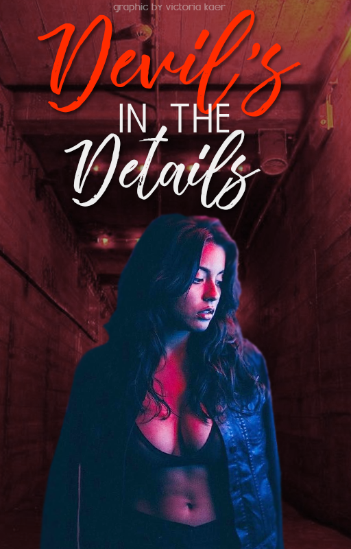
Here's an example where a PSD coloring file can assist in improving the look of a cover.

This is the raw image without any adjustments. The model doesn't go with the background and it's obvious she's a PNG and not part of the original image. The title is very bright red.

I added a PSD and it helped make the cover appear more cohesive. The coloring on the girl doesn't stand out nearly as much now. Neither does the red of the title, it's toned down. It's not perfect, but it looks a heck of a lot better.

I will stress, this is not a real cover. My friend Holly, lantea- , made it specifically for this chapter. She wanted to see how bad a cover she could make using things she has seen some designers do on Wattpad.

Let's take a moment to go over exactly why this is a poorly designed cover.
1) his sunglasses are a cartoon image and do not go with the cover. They also aren't sized appropriately to look as if he's actually wearing them.
2) her tiara is sized incorrectly and it's stuck to her forehead, it should be more on the top of her head. It's also awkwardly on top of her hair.
3) the blood on his shirt is so fake it's funny. It also is facing the wrong way to match the drips in the image
4) The flames don't go with the cover at all and they don't blend with the cover either
5) the background is so busy it detracts from things and your eyes want to focus on it (despite the rest of the disasters going on)
6) don't get me started on the stupidity of the subtitle. It's also sitting on his head
7) The title is just ... laughable (which was her point, but I've seen titles like this)

I threw some PSD files at this cover and as you can see we accomplished little. The thing actually looks worse. I tried several different PSD files but it would be useless to post all of them because the result is mostly the same. Bad.
Slapping a PSD over something doesn't fix poor design technique. If that is how you think design works or how you design, then you're doing things incorrectly. A PSD coloring is meant to help enhance the look of your design. Take your time and learn how to improve your work. You can't expect someone else to fix things for you, it's up to you to show off your work to the best of your ability.
A lot of users on DeviantArt make PSD colorings and most are available for free download. I have several on my profile. My DeviantArt is GraphicsByDarkAngel
Bạn đang đọc truyện trên: Truyen247.Pro