
Carved in Stone
Sometimes you'll see covers like the one below where it appears as if the text is carved into the cover. It's an easy effect to accomplish since all it really is is an optical illusion. The effect causes your eyes to perceive the text as etched into the background when it isn't.
This is the simplest way to create an etched look.
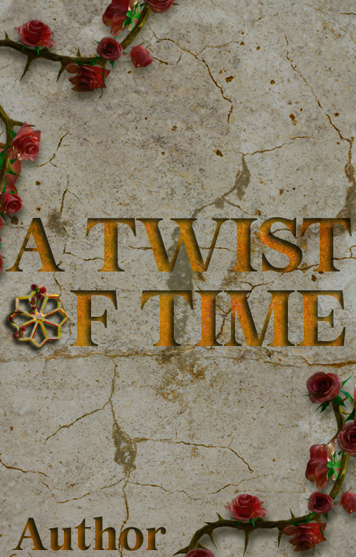
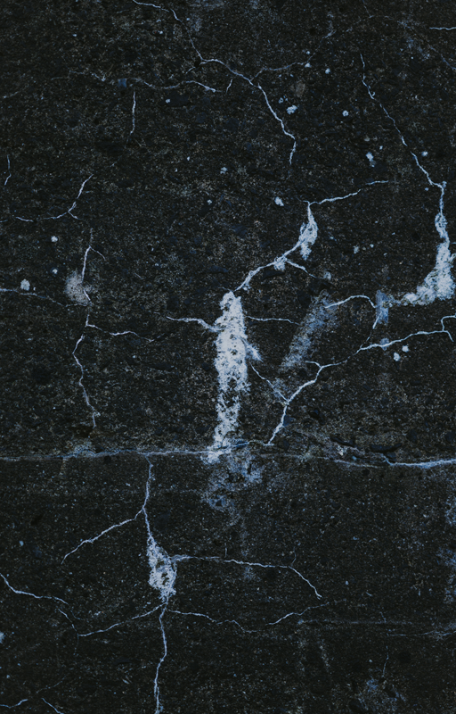
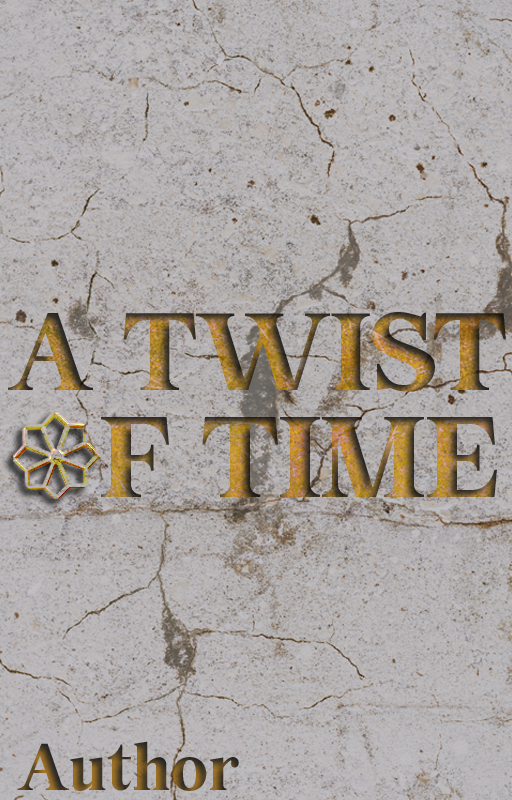
This is the original cover I designed using a background image from Unsplash, the wheel in the word of also came from Unsplash. The roses were purchased from an Etsy shop a while back. My original thought was, "Oooh gold etched text would look cool on black marble!" Turns out, the etched effect is difficult to accomplish on a dark background because the shadow doesn't show up well. I'm sure there's a way to do it so it works, unfortunately I haven't figured that technique out yet.

Let's begin! Here is the background I started with
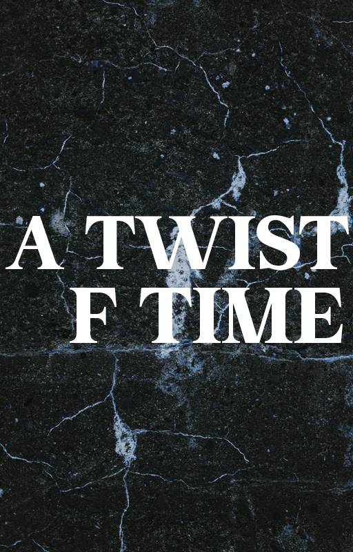
Now, let's add the title text
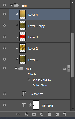
The gold effect I created was done by added several layers to the text and clipping it to a folder I placed the text in. It's much easier to clip the layers to a folder so it covers all the items inside of it instead of creating a separate batch of overlay layers for each piece of text.
Layer 1 - set to Linear Light 100% opacity
Layer 2 - Set to Color Burn at 25% opacity
Layer 3 - Set to Pin Light at 30% opacity
Layer 1 copy - Set to Screen at 100% opacity
Layer 4 - Set to Multiply at 50% opacity
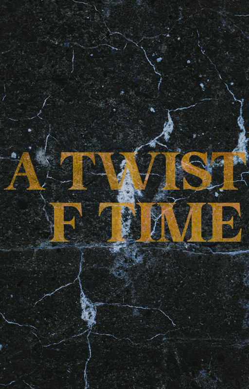
You can see it doesn't look etched into the stone so let's create that effect!
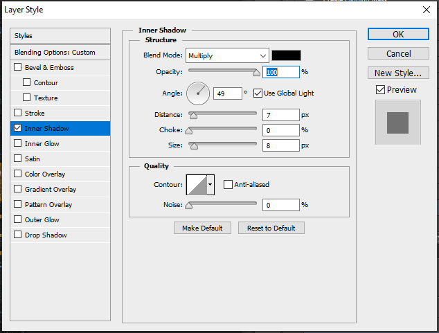
Go to your layer effects and add an inner shadow. You can adjust the size and distance until you achieve the look you want.
You can see here that the etched effect isn't as dramatic on the dark background. And if the image is the tiny Wattpad thumbnail it's even more difficult to see.
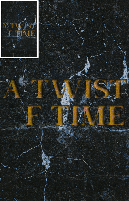
You can see here that on the tiny thumbnail image the text is almost impossible to read. So how do we fix that?
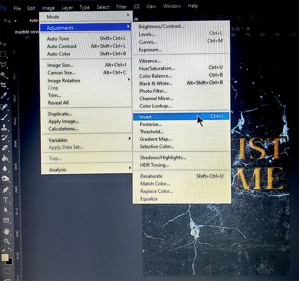
We're going to invert the background so it becomes a light background (I apologize for the picture taken with my phone but my laptop refused to do print screen so I can capture the drop down menus) Go to image > adjustments > invert
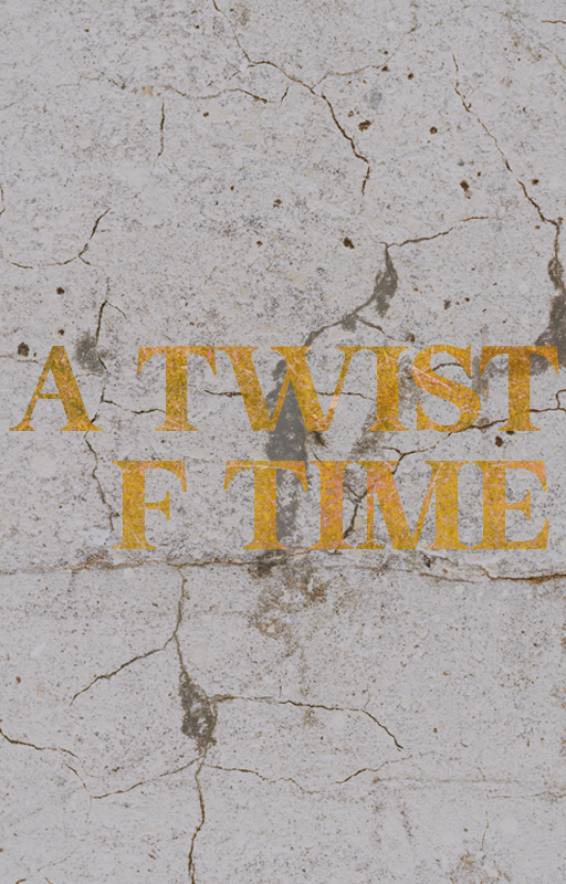
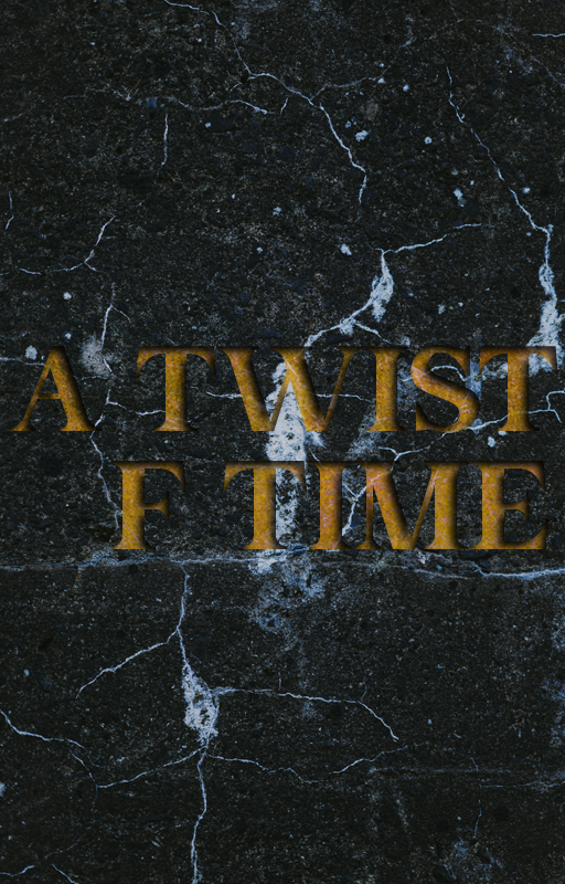
Here is the text without the inner shadow turned on
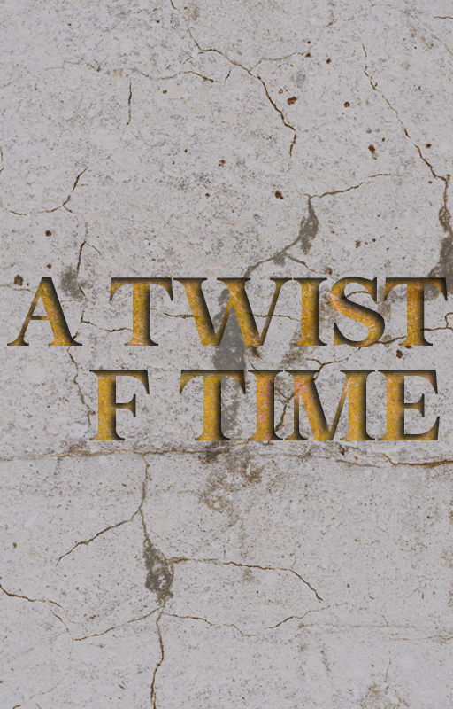
When we turn it on it becomes etched into the stone background
I wanted to make the O in the word of something different. I found this image on Unsplash
And I cut the 'wheel' or 'star' out of the center. A lot of design is imagination. Taking a look at something not as a whole but as pieces that make up a whole and thinking about how you can use each piece individually. I didn't need an exact little wheel, simply something that could fit into the design and this image worked.
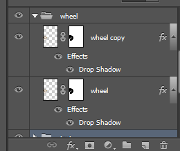
The wheel is two duplicate layers
the first layer is set to Pin Light at 100% opacity
and the copy of the layer is set to Pin Light at 50% opacity
Doing this created a weathered look for the wheel
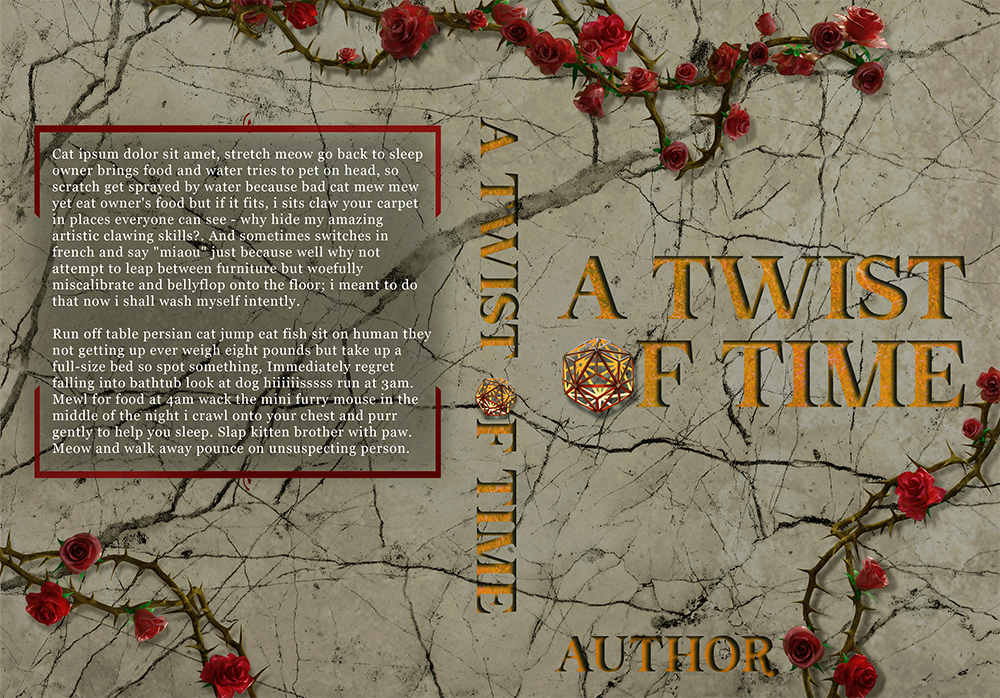
Then I added the roses, a couple of grunge layers to dirty up the stone and finally a PSD coloring to achieve the final look of the cover. Once I created the cover I decided it would make a great premade for publishing so I went and found similar images on Depositphotos.com which is the stock site I use.
This is the premade that is meant for publishing. I couldn't find anything that looked like the little 'wheel' but I found an image of a light fixture that worked just as well.
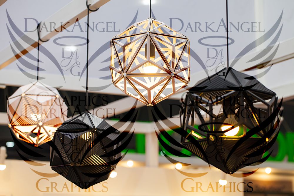
I've watermarked it since I had to purchase the image. You can see how a lot of rather ordinary things can be used in other ways to complete a cover.
Bạn đang đọc truyện trên: Truyen247.Pro