
Adjust That
I've done a couple of chapters on PSD colorings. They are definitely a game changer and can help your design look its best. PSDs are an adjustment layer file. The designer who made it did the work for you so you don't have to play with the adjustments yourself.
As I mentioned in one of the previous chapters, PSD layers can consist of a lot of things. Color adjustment, hue/saturation, it can even be a solid color adjustment or a texture layer.
The thing with PSDs is that there is no correct one to use for every design, your final look is going to depend on the base image you begin with. A PSD that looks awesome on one image might look hideous on another one. And you may have several PSDs that look really good on one image, which will make it difficult to decide which one to use. It all depends on the look that you're going for in the final design. One PSD could give your design a soft romantic look, while another makes it appear more like a dark, mysterious image. As with a font, you need to consider your genre and the look you're going for so everything meshes well.
Lets take a look at how PSDs give an image a different look
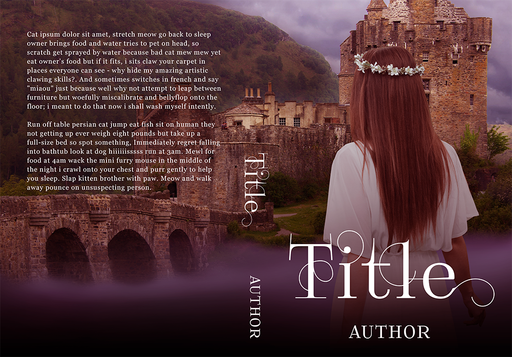
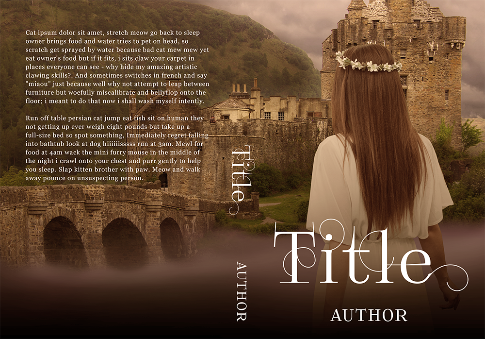
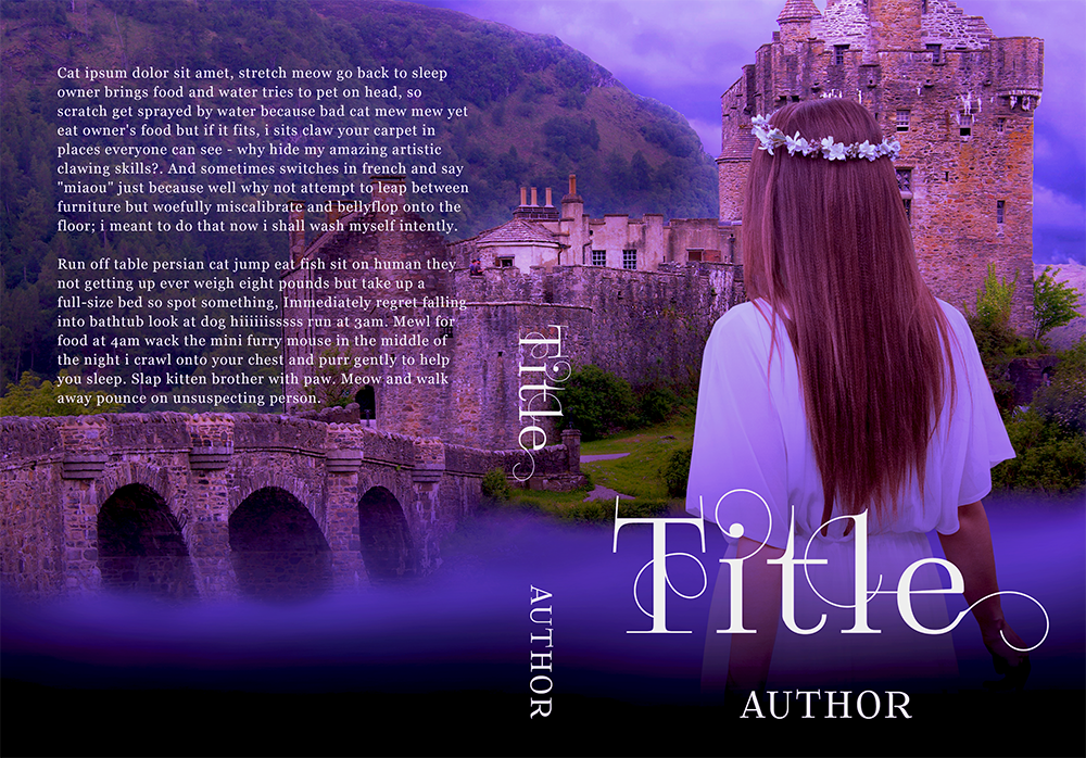
All three of these covers are the exact same base image, all I did was put a different PSD file on it. You can see how different each is. The first is more of a dark feel, while the second is a little lighter and softer, and the last is very vivid.
Play with your adjustments and see what works for you and your design!
Bạn đang đọc truyện trên: Truyen247.Pro