⇢ DEVIL'S GATE ENTRIES

contains: devil's gate entries
— listed below are the works of the 17 lovely participants of devil's gate! thank you so much for joining, everyone; we greatly enjoyed looking through everyone's interpretation of the prompt!
disclaimer :: the critiques below are meant entirely just to substantiate the scores we gave each entry according to the specified rubric in the next chapter. we'd like to mention that each entry was absolutely stunning and our scores or critiques do not devalue their worth whatsoever <3
01. NEARLYS.PNG
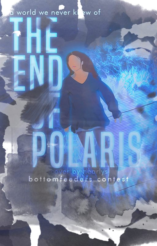
CREATIVITY, ORIGINALITY & THEME — going with making a vector was a good idea, really, for it's not something people will expect when looking forward to a sci-fi cover! so thank you for taking up that challenge. however, even if the idea was ingenious, it kind of didn't work out with the elements you surrounded the vector with. the blue flare didn't fit with the visual of the vector, so it looked awkward all in all. also, we'd like to ask why the model's wearing a sweater? we were hinting for a dystopian theme in this graphic, so the model wearing a sweater didn't make much sense. kudos for your concept, though!!
TECHNICAL WORK — the typography is good, actually. i think you had problems with the placing of it, since it left the bottom part empty and was too aligned to the top right side. also, we didn't like how it was too faded out, and as said previously, the blue flare was kind of unclear though we do have an idea that it was a galaxy or a star, which fits the prompt, so good job! but it looked random, so it couldn't really pull off the color scheme. it's definitely good that you stayed consistent on your color palette, though!
OVERALL WORK — to sum it up this is a wonderful concept and we appreciate the originality very much! the colors are cohesive, so yes, we love that. there are quite a few flaws on the technicalities, but that could be worked on! it's also great that you delivered this with a good image quality. thank you for joining, you did a great job!
02. ASTRODUALITY.PNG
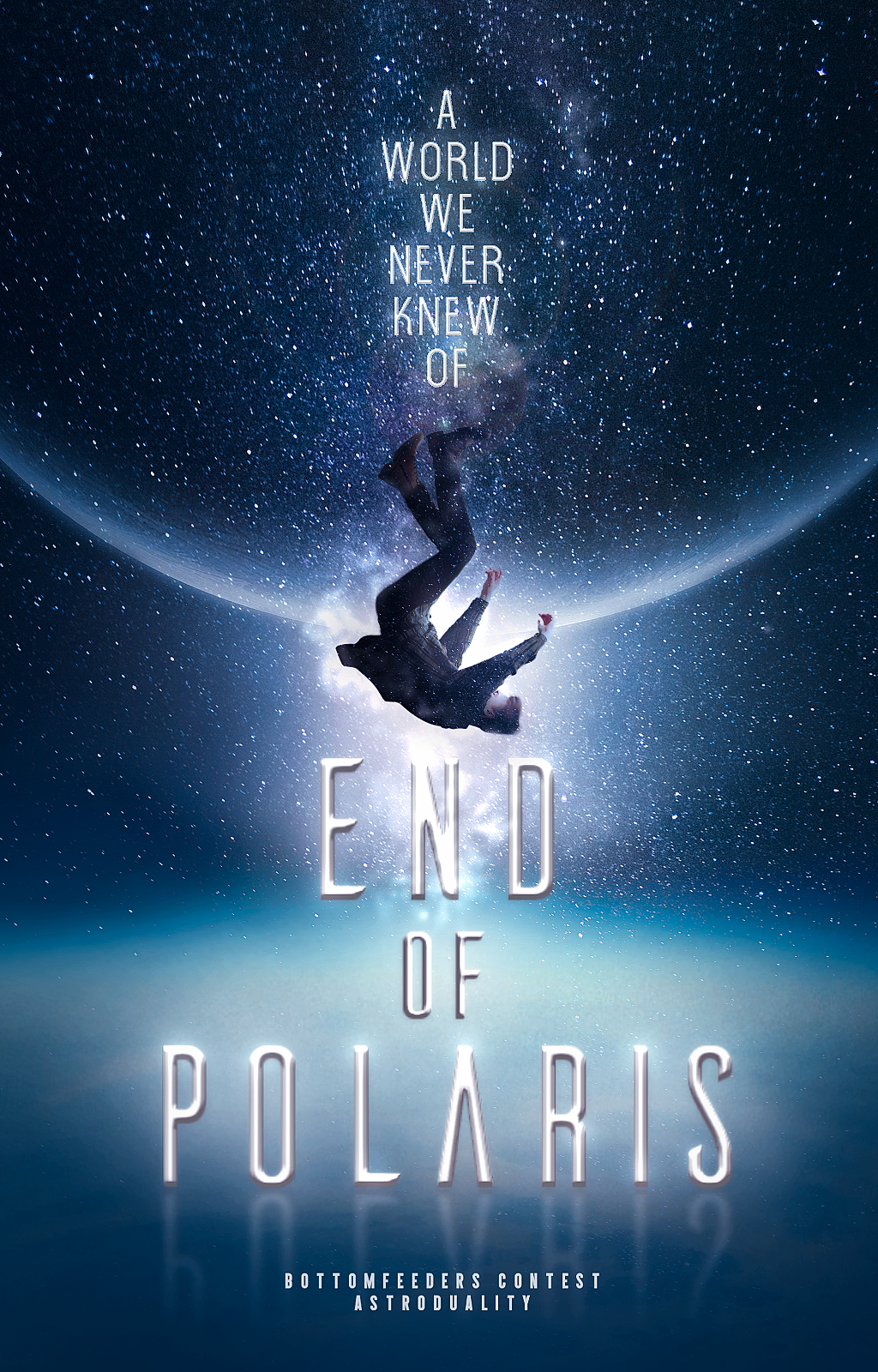
CREATIVITY, ORIGINALITY, & THEME — first of all, we really liked how the concept fit in with the prompt as well as how it had a clear theme. although the overall concept was good it wasn't exactly the most original. it felt like something we've seen plenty of before. we'd also like to question the subject's choice of clothing. overall it was very fitting to the prompt kudos to you!
TECHNICAL WORK — as much as we loved the overall look of the cover we couldn't help but feel thrown off by the soft bevel used for the main text. it may have been used for the sub-texts too however it is not as obvious and looks better in comparison. we suggest you just leave it white and add a glow. an alternative would be adjusting your bevel settings to make it fit more. the reflection of the text could also go. anyways the text still fits the cover very well! your font choice is also very fitting. another thing we noticed was how there wasn't proper lighting for the main subject. there is an intense glow behind him however the lighting on the subject does not match. your choice of using that pose or position for your model was a great choice it added to the concept and overall feel. we would like to commend you on your placing. the elements are well placed and centered which is great!
OVERALL WORK — overall, the cover screams scifi and we love that! it is actually interesting and eyecatching. the only think that kind of dragged it was the main text and how the subject could have blended in better. nevertheless, it is still a very good and well conceptualized sci-fi cover. i'd read this if I somehow stumbled upon it in a bookstore.
03. OXYDAHLIA.PNG
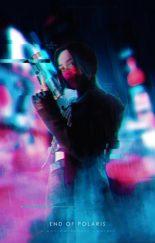
CREATIVITY, ORIGINALITY, & THEME — okay, so first of all: your concept was really eye-catching! we really loved how unique it looked and how this perfectly matched the genre of the prompt we provided! it's a lot of sci-fi and has a lot of action elements to it that we enjoyed a lot! this well-thought-out concept really added to its charm <3
TECHNICAL WORK — not only did you have a great concept, but you executed it well, too! the color scheme is cohesive and well-thought-out; everything is smooth and polished and looks like everything was meant to be there, assuming that you've manipulated the little things. it really blends in naturally with the surroundings and we love that about this! the only thing that we'd maybe want to point out is the lack of a text—this graphic seems like it'd look a lot more put-together if you had added the title like you would in a normal cover. it looks a bit empty around the bottom portion of the graphic! it's still pretty overall, of course, but it would have looked a lot better if you had added one. in addition to that, the little effects you included in the finishing touches were really unique and interesting! we quite rather loved the glitch effect, but there's just that one rectangle on the top left that looked a bit iffy. maybe if you had distributed the glitch further around the graphic with the same contrasting element to it, it would have looked a lot cleaner, in a sense. it looks a bit out of place, and that's why we pointed it out.
OVERALL WORK — overall, we loved it a lot! put together, the color scheme was very eye-catching and the manipulation was very smooth. the image quality is great too, which adds a lot more appeal to the image. perhaps one thing we noticed was how hazy it looked—if the model had been more emphasized and less blurred out, it would have been perfect. otherwise, though, it was amazing and this entry was absolutely gorgeous. thank you for joining!
04. A1RYEN.JPEG
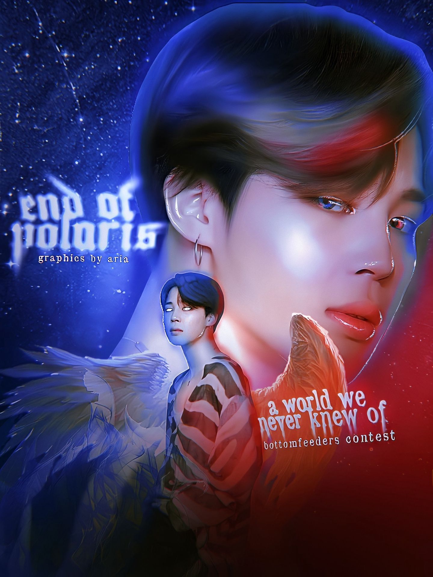
CREATIVITY, ORIGINALITY & THEME — we'd first like to say that the concept looked really good. that is, if this required a fantasy genre. we allow other genres as long as the sci-fi/dystopian was the main focus, however, we couldn't find that here. this primarily affected the scoring since it's a vital part of the rubric. it looks great, definitely! but as for the creativity of it? that we can't say much about. it's sort of an overused style, one you see a lot these days, so it didn't really give that shocking feel. it had its rightful appeal, as it is wonderful — but not what we were looking for.
TECHNICAL WORK — the manipulation is amazing! kudos to you for that. the wings looked nice as well as the highlights themselves. some little detail though, the glow can be found on the hair but there are no highlights on it, so it was kind of iffy. also there's a glow as well in the left eye that isn't very much clean since it mostly just stops under his eye. the wings were also sort of confusing, because it gave more of a fantasy feel than a scifi one, as mentioned earlier. as for the typography, well, that's also something we didn't know where to focus on. the text resolutions don't match and they're both sequestered to the sides; therefore you won't know where to look at first. the title could also have been made bigger than the subtitle as well. this was a really well made manipulation though, and had only a few little details to correct!
OVERALL WORK — it's an amazing graphic and everything works seamlessly, so kudos! the main reason why the score isn't higher was because of the theme and genre. it leaned more towards fantasy than what the prompt entailed. also a few typography errors, but those could be easily improved! all in all you did a good job!
05. DEMONGLOSSED.PNG

CREATIVITY, ORIGINALITY, & THEME— so first of all, we appreciate that it has a slight dystopian vibe that partially fits into the prompt. we, however, also thought that the dystopian and sci-fi elements weren't as obvious as we would prefer. the background was the only noticeably sci-fi element in the cover. it leaned more towards the action genre and had a hint of fantasy from how the subject was dressed. there were also elements that were a bit confusing e.g. the octopus/spider (we can't quite identify what it is) in the sky. its relevance isn't really clear—it looks a bit like it was just slapped on there just for the sake of it. still, good job!
TECHNICAL WORK — the first thing we noticed was that the graphic didn't look well blended. the model didn't really match with the background and the smoke in the foreground could use some work. however, we do appreciate how you built the background from scratch. it does look well put together, but the lighting on the subject doesn't really match that of its surroundings and we believe it could still be improved in that manner. the color scheme is a bit messy and the typography doesn't really match the cover. maybe another font or style could have done the trick! in addition to that, maybe adding a dark vignette could have helped give the graphic a bit more depth. looks pretty good nonetheless!
OVERALL WORK — since the elements were rather mismatched and the graphic looked flat, it didn't have a strong impact. the face claim, however, grabs your attention with her intimidating facial expression and unique clothing. overall, great job!! thank you for joining!
06. PEACHSTAIN.PNG
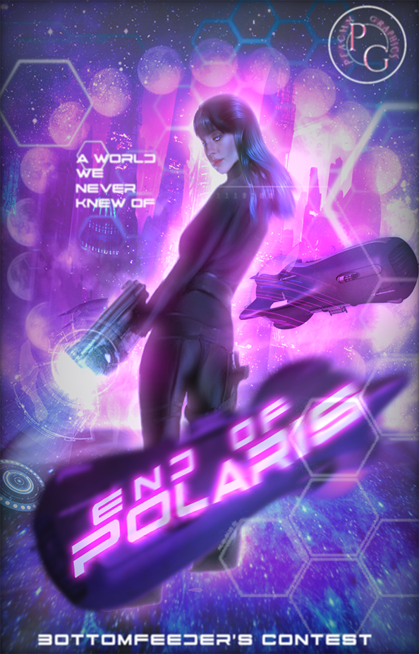
CREATIVITY, ORIGINALITY & THEME — okay, so first of all, we loved your concept! we really liked seeing how you used torpedos for a sci-fi/dystopian graphic. it's not the first thing you'd think of when hearing "sci-fi" but somehow it's still true to the genre and reminds us of a sci-fi action movie. you incorporated a lot of sci-fi elements to it as well, one of which is that hexagonal sci-fi texture that's almost always in a science fiction graphic.
TECHNICAL WORK — on the technical side, though, we'd recommend making your watermark a bit smaller. with how it's placed on the upper right, it's a bit distracting, and not only that, but it's almost as big as your title, which should not be. moreover, the blending of the background is a bit messy. at first, we didn't realize that those circles around the model were moons - maybe you could still try and emphasize those a bit more if they're truly necessary. many textures also look out of place, which could definitely use a bit more work. otherwise, though, we loved the cohesive color scheme and how you placed the model!
OVERALL WORK— overall, while a great graphic, we couldn't help but notice that the graphic was a bit on the lower-quality side. while sometimes it can't be helped, quality is incredibly important in graphics as this is somewhat people's first impression of the graphic. it looks pretty cohesive though, good job!
07. _BECCA_BOO_.JPG
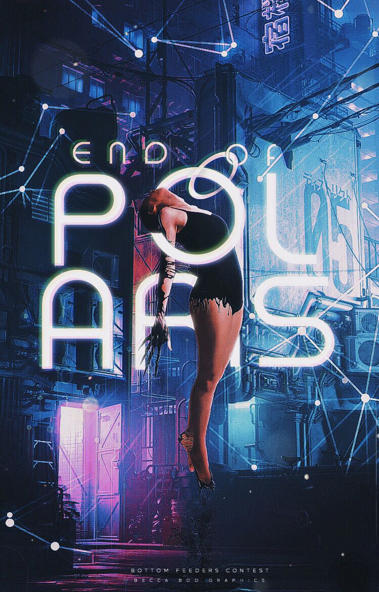
CREATIVITY, ORIGINALITY & THEME — the idea you came up with definitely fit what we were looking for, since the cover turned out as an obvious scifi. it gave a minute feel of a dystopian theme, though not much, and although we would have appreciated it if the dystopian part of this prompt was also given notice to, it's alright. we especially loved the creativity incorporated to the model, and how you seemed to loop her around the typography. the fact that the model appears to hang in the cover was also a nice touch!
TECHNICAL WORK — the typography was surely something we all loved, since it fit in the cover and didn't seem like a last minute text-slap. however, you could have moved the 'of' part of the title somewhere else where it could be properly seen, since at first we didn't even see it and thought only 'end' and 'polaris' were in the cover. that's how much it blended to the background. also we noticed the ring that was linked to 'of' and it looks kind of iffy, so the ring could have gone. good work on how the subject was intergrated into the text, it's definitely an eye-catching trait in your graphic! the edges could be smoothened out more, though, since they seem too sharp. you could have also put some shadow below the model, to at least make her floating more realistic. also the lighting didn't look much accurate, considering how the text is glowing, so you could have also adjusted the lighting on the model.
OVERALL WORK — this cover all in all was a well crafted graphic, and also has quite an appeal! although it needs some improvement with the technical work mostly, they're all just errors in blending or lighting, and can be remedied with enough attention and practice. great job!
08. CORVUMS.GIF
CREATIVITY, ORIGINALITY & THEME —first of all, we would like to commend you for making a gif graphic with a storyline. your concept was unique and definitely stood out concept-wise. we loved how there was a well-thought-out storyline and the way you presented it was well-done. it fit into the scifi/dystopian genre perfectly and we couldn' find any flaws in this category. it was original and creative. well done!
TECHNICAL WORK — as much as we loved the gif and storyline, we thought that it looked very slapped on e.g. the declassified stamp. it's rather simple graphics-wise, other than the gif aspect! the introduction portion looked a bit bland, and at first glance, it would look like you just put text on a couple of images. otherwise, though, it was amazing! well done.
OVERALL WORK — overall, the storyline and the way it was executed really made this graphic shine. the story had a really big impact on us when we first saw it so kudos to you for that. aesthetically, it isn't anything special however it's the concept that really pulls you in. it was absolutely amazing! we're sincerely hoping for part 2.
09. LUNAISHI.GIF
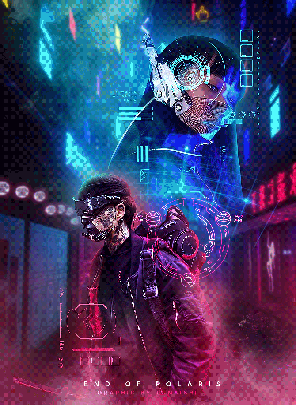
CREATIVITY, ORIGINALITY, & THEME— this graphic is stunning! you got the genre right to the dot and the concept looks very cohesive and straightforward. all the sci-fi elements stand out starkly and it's honestly really pleasing to see, almost like a story is playing out in front of your eyes. great job!
TECHNICAL WORK — in the technical aspect, we really appreciate how you made it a gif entry! we love how there's rain in the back and how the sci-fi element is just turning in the middle of the graphic. it immediately draws your attention! however, maybe one thing about the technical work here we'd like to point out is the subtitle. it blends in a bit too well with the background; at first glance, it's almost like it isn't there. it could have been intentional or not, but if not, we believe it could be better if the subtitle would have either been in a different color or a bigger size.
OVERALL WORK— overall, this is a beautiful, very impactful graphic. it draws your attention almost immediately, and the blending is very clean and smooth. great job! thank you for joining!!
10. BEAUIOR.GIF
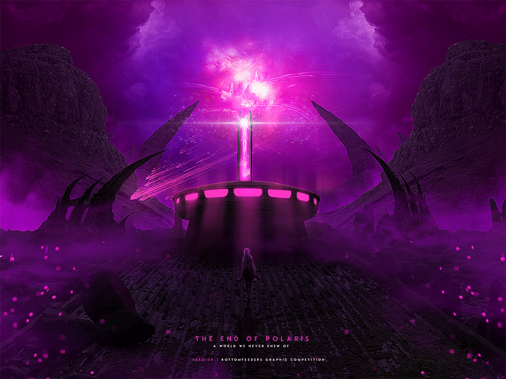
CREATIVITY, ORIGINALITY & THEME — to start this off we liked how you didn't make it a cover and made it landscape, for it was a fresh vision out of the repeated covers. also the fact that you focused on a scenery-based graphic instead of a model one was well appreciated and separated you from the rest of the entries, so good job! we loved how it looked very dystopian most of all, and how it looked like something was actually ending, which is, of course, the point of the title. perhaps we deducted some points, but that's only because the scifi on this graphic was a little muted, but nonetheless, we loved how creative and in line with the prompt everything is!
TECHNICAL WORK — this is almost flawless, technical-wise, since all elements work together seamlessly. the typography also wasn't a problem since it fit with the graphic's overall look, and if it was made bigger or bolder, it would have overwhelmed how the graphic looked like and wouldn't have come off as appealing as it is currently. the manipulation in this was insane, as well, for an honest lack of a better term, since something like this could only have been made from scratch, and everything else were just adjusted and blended together to look like how it does now. the only problems we had for this were the gif on the bottom part, and how it seemed kind of thrown in to fit the graphic, and then the model that could've been blended more to make her more naturally incorporated, but seeing as this isn't a model-based graphic, we wrote that off as a minor error.
OVERALL WORK — this is a breathtaking graphic, to sum it all up, and definitely a strong candidate. at first glance it almost looks like an illustrated desktop wallpaper you'd see everywhere, and we loved how big on photorealism it is. there's not much more we can say about this, since we seem to have covered everything in the previous criterias. overall, this is an amazing work!
11. PIG-CITY.JPG
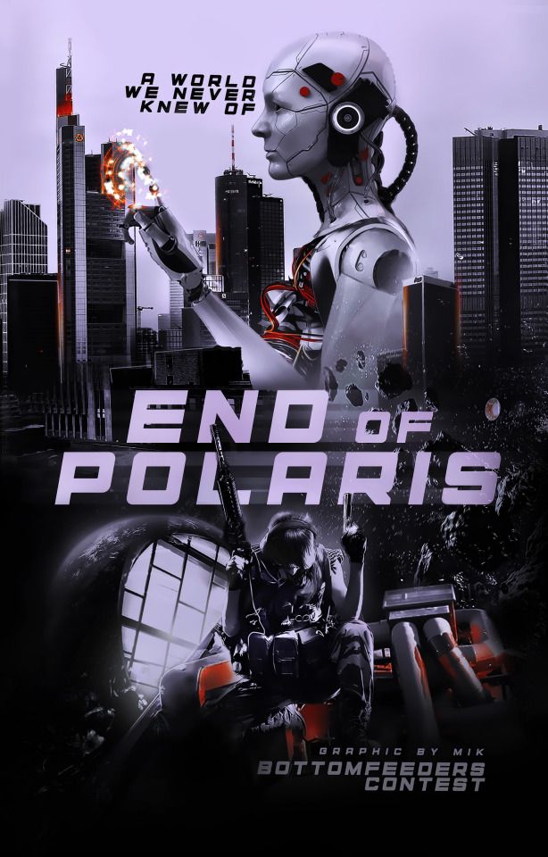
CREATIVITY, ORIGINALITY & THEME —we love how there is an apparent sci-fi theme going on throughout the cover. the robot helps set the mood and the city background further emphasizes the sci-fi theme. if there's anything to point out it may be that the concept you used isn't exactly unique. yes, it perfectly fits into sci-fi (props to you) but there isn't much that sets it apart from other sci-fi concepts. still, great job!
TECHNICAL WORK —first of all, we really liked the placement of the elements however we can't help but feel iffy about the font? maybe you could have written it in a different font or tried some text styles. the psd coloring also make the graphic look flat so maybe you should've played around with the adjustment layers or tried matching different psds. there is also this thing at the tip of the robot's fingers which we think could've blended in more. i like the rocks that are floating behind the title but i feel like they could also blend in more with the rest of the graphic. they are still a nice touch. great work!
OVERALL WORK —because the psd made it look flat it didn't have much on an impact however it does have an apparent sci-fi theme. the object placements also add to the graphic. overall this was a great entry! thank you for joining! <3
12. ARDENWILLCRAFT.JPG
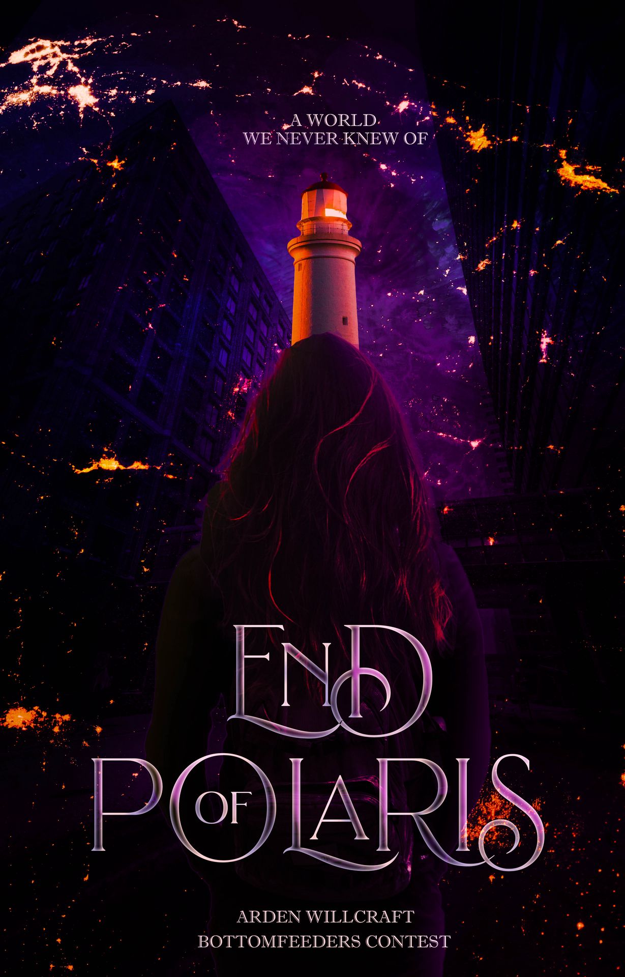
CREATIVITY, ORIGINALITY, & THEME — when it comes to your overall concept, we'd have to acknowledge that it does match with the dystopian part of the genres we've provided. however, some of the elements don't quite make sense. for example, the lighthouse. while there probably would be a meaning behind it if there had been an explanation, at first glance, it looks rather out of place. the lighthouse looks off perspective-wise, too, as it's in the middle of a city (as can be deduced from the buildings around it) and the lighthouse is usually beside a large body of water.
TECHNICAL WORK — as for the technical aspect, one thing we'd like to point out is how the back of the model (we're assuming that's the model) looks a bit like a mountain. we hadn't noticed that it was the model at first, and maybe by outlining her in someway or making her clothes blend less with the color of her hair could be a good place to start. the typography is beautiful, though, and we love the text style and its placement! great job nonetheless.
OVERALL WORK — we'd like to applaud you for how cohesive the color scheme is and how put together it looks! as stated in the other criterion, there are some things that could be improved on, but overall it looks pretty great. thank you for joining!
13. YOURLOCALIDIOT.JPG
CREATIVITY, ORIGINALITY & THEME — at first glance it doesn't look like a scifi-based cover, but more of a fantasy blend. that's only at first glance, though, since if you look at it for longer than that, the scifi elements would be visible, counting the circles and all the scattered hud elements all over the cover. it matches the genre in that way, so that's good! though it has an obvious lack of a dystopian-like theme. if we were able to decipher the objects in this cover though, perhaps we could have given it a higher score.
TECHNICAL WORK — the cover looks messy, all in all, since the elements in it looked kind of thrown in and their placing were almost all off, with the hud elements scattered in the top part of the cover only, and the moon, assuming it's one, in the right corner beside the model, looked awkward. maybe it could've been better if the moon was placed in center behind the model, the curve fitting her head. the placing of the hud element in the center was good, though since it complements the placing of the model! we also weren't much of a big fan of the typography, since a plain serif on the bottom part of the cover just didn't cut it. perhaps you could have looked for more modern fonts, it would have definitely matched this better! the model could have also been blended in more smoothly, since she just looked semi-transparent at this point. kudos for the coloring, though, it's definitely eye-catching!
OVERALL WORK — although this cover needs work technically, it also had potential to be really good, if only the placing of the elements were adjusted and the typography more thought of. on the other hand, we loved the color scheme and how it worked out in the cover, as well as the idea of the graphic. you did a wonderful job, nonetheless!
14. SHINSAKE.JPG
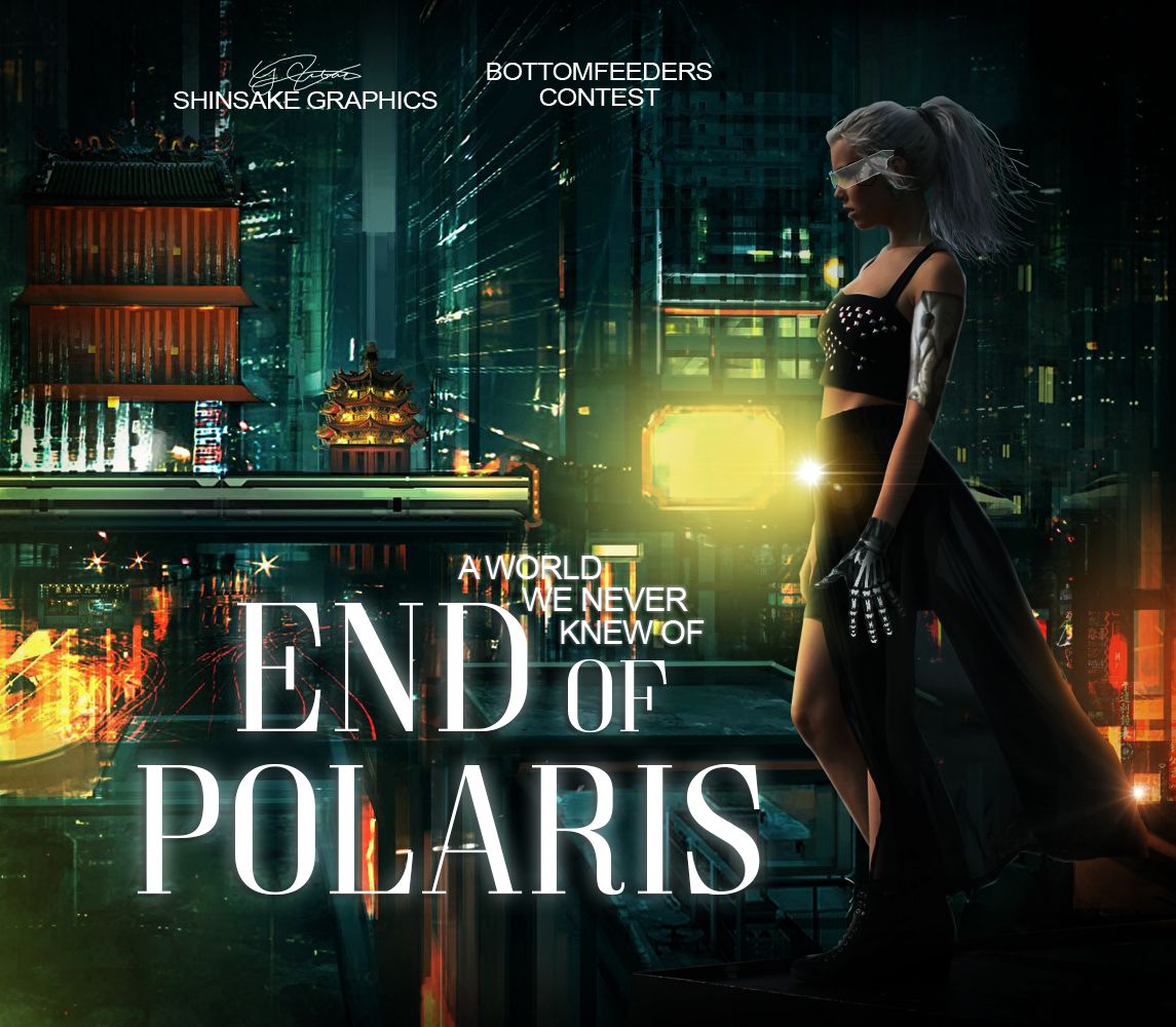
CREATIVITY, ORIGINALITY & THEME —first of all, we would like to commend you for fitting into the theme. second of all, your choice of background and model really emphasizes the sci-fi and dystopian themes in the cover. the way that the model is standing on top of a building is what gives the graphic a hint of dystopian.
TECHNICAL WORK —if you look closely at where the model is standing, you'll notice that the model is scaled waaay larger than the building. the glasses the model is wearing also look rather detached as if it wasn't supposed to be part of the model. there are also parts of the model where you decided to place metal parts. we wish you would've made them look more realistic. the one on her arm and the one on her hand don't match which makes them look rather awkward. the lighting on the model is great though! ut's one of the first things we noticed and we wanted to commend you for that. as for the typography, we think the subtitle may look better if placed somewhere else e.g. in a straight line below the title. your watermark and 'bottomfeeder's contest' also look rather awkwardly placed. we like how you had a cohesive color scheme with the background, kudos to you.
OVERALL WORK —the lighting really gives this graphic some impact but the text styles and placement kind of take away from that. the bg and the model placement really gave this a dystopian feel. overall, you did a great job! <3
15. SEODREAMS.PNG
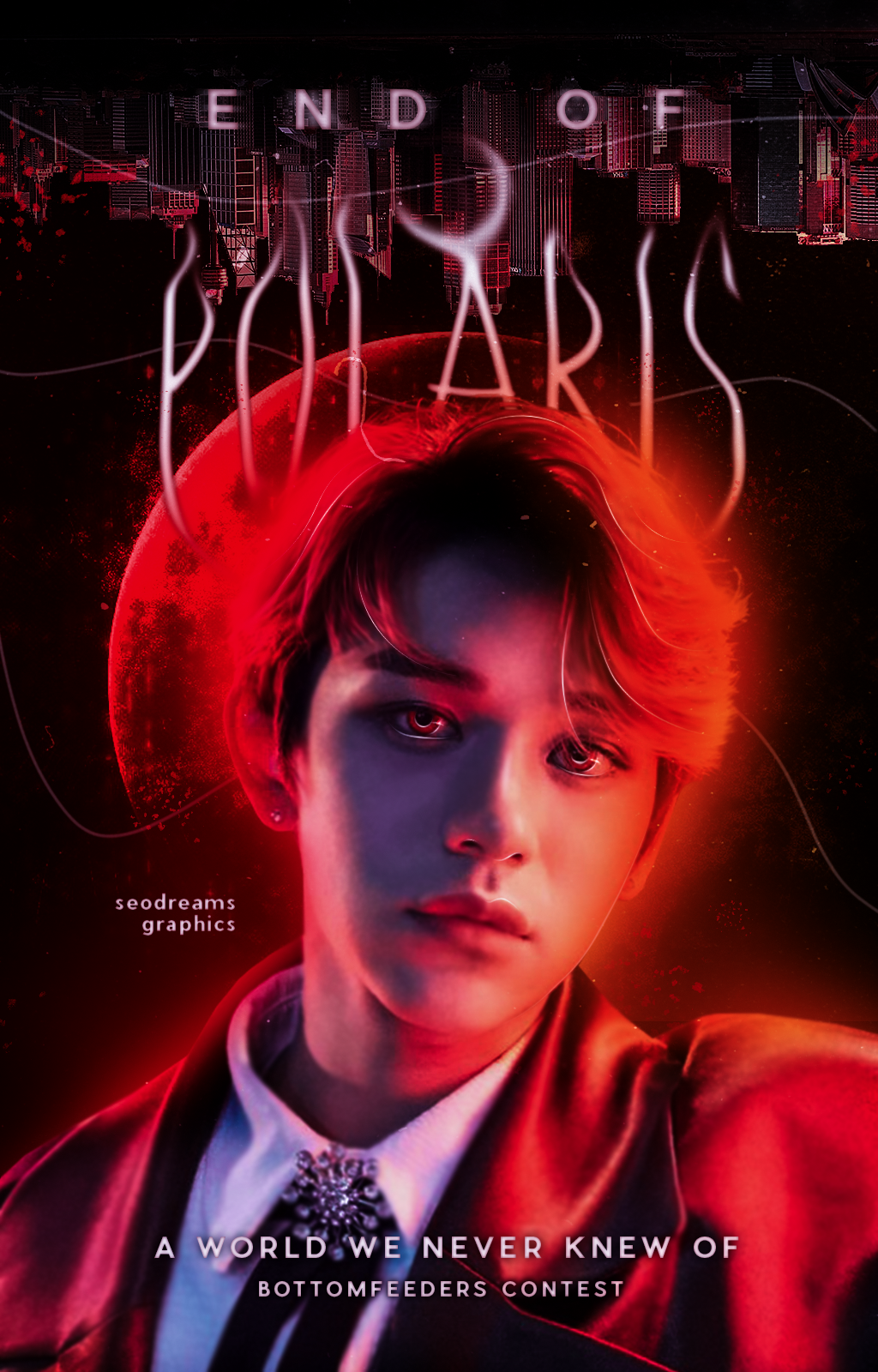
CREATIVITY, ORIGINALITY, & THEME — at first glance, this was very pleasing to the eye! maybe one thing we have to point out though is how it looks a bit fantasy-like in some ways. while it definitely has a dystopian feel to it, the saturation of the red and the moon behind him makes it a bit feel like a different kind of cover. otherwise, though, the cityscape in the background kind of pulls it together.
TECHNICAL WORK — in the technical sense, the typography and the blending is great! we really loved the moon over the letter A; it was really unique and really eye-catching! the subtitle placement was also pretty good. perhaps one thing we'd like to point out, though, is how his head kind of blends into the mood behind him. because of the red glow and the red moon, his head is kind of dwarfed (eaten up) by the moon behind him and the edges of his head are kind of blurry.
OVERALL WORK — overall, it's a really cohesive piece! it has a very clean color scheme and everything is smooth and pleasing to look at. as mentioned in the previous criterion, it may look a bit more like a different genre, but it's great nonetheless. thank you for joining! <3
16. ATHENATED.JPG

CREATIVITY, ORIGINALITY & THEME — the idea of making your entry a faux published book cover was very creative, and a fresh visual for us to see! how it seemed to greatlt differ as well from the usual scifi manipulation was also something noteworthy. we just didn't see much of a dystopian feel in this, and felt that perhaps the cyborg narrative was overused, but that's alright as well, since of course, it is with a scifi genre.
TECHNICAL WORK — we loved the hologram touch in the typography, first of all. the title was also creative, and fit the cover surprisingly well. perhaps some of the letters turned out to be awkward, especially the 'r' and we are aware that it was made to be abstract, of course. the typography on the watermarks was also something we weren't that much fond of, considering their opacity and spacing. perhaps if you made it more solid and had less space, it would look better! the fact that the main model looked illustrated (was it? or was the model just manipulated to look as such?) was also a very nice touch, and embraced the book cover look a lot more.
OVERALL WORK — this is definitely an eye-catching and unique entry! what perhaps brought it down was the image's quality. it comes off a bit pixelated, you see, and it diminished the cover's overall look. nonetheless, this was a wonderful work, and something we would pick off the shelves if it was ever published as a cover for an actual book!
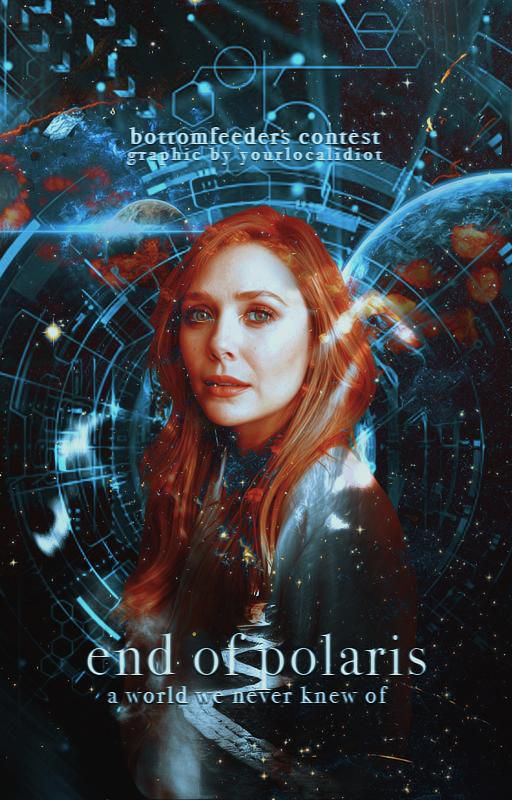
17. ROSYKUN.JPEG
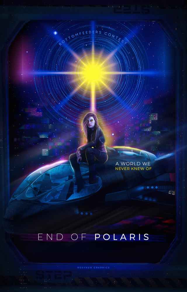
CREATIVITY, ORIGINALITY & THEME —we realky liked the concept of her being in outer soace and sitting behind a star. we also really like how you incorporated a star into the graphic since polaris is actually the name of a star. it has a very strong sci-fi vibes. kudos for fitting into the theme!
TECHNICAL WORK —honestly, this is close to perfect. if were to pick anything out it would be the star and the lighting on her leg. the rings around the star look a bit awkward. the lighting on her leg could also be blended more. maybe blur or smudge it? the glow around her also looks a bit iffy. we love the colors you used the glitch effect was really nice. the border or frame you used also matches the graphic really well. the typography, although simple, looks great and compliments the graphic. the 'bottomfeeder's contest looks like it could be arched just a bit more. the graphic is also well blended and manip-ed.
OVERALL WORK —overall, it looks amazing! the colors are stunning. it's edited very skillfully and the glitch effects really add to the overall effect. great job. this really wowed us! <3
Bạn đang đọc truyện trên: Truyen247.Pro