Best Cover RESULTS (Part 1)
The reason the results shall be extended up to 2 or 3 parts will be for the image limit. As a designer, I evaluated the cover by the resolution, typography, space, and lighting (color balance).
•《○》•
Typography: 5pts
Resolution: 5pts
Color balance: 5pts
Spacing: 5pts
Total: 20pts
《○》
Wait! I Wrote That? by CroodsGirl
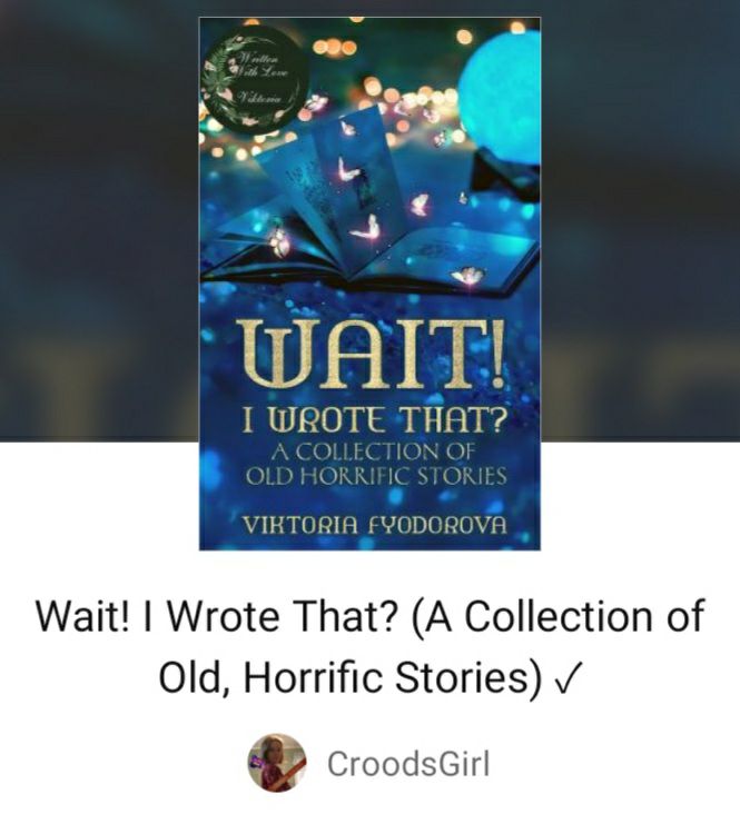
Typography (5/5)
Resolution (5/5)
Color balance (5/5)
Spacing (5/5)
Total: 20/20
“I was impressed when I looked at your cover at first glance. The typography chosen for the title makes the cover look majestic and the color chosen moreso. The butterflies surrounding the book adds a nice effect to make it look magical. If the story is just as astonishing as the cover. Then it deserves to be read.”
Wolf and Keeper by TheSquareCheese
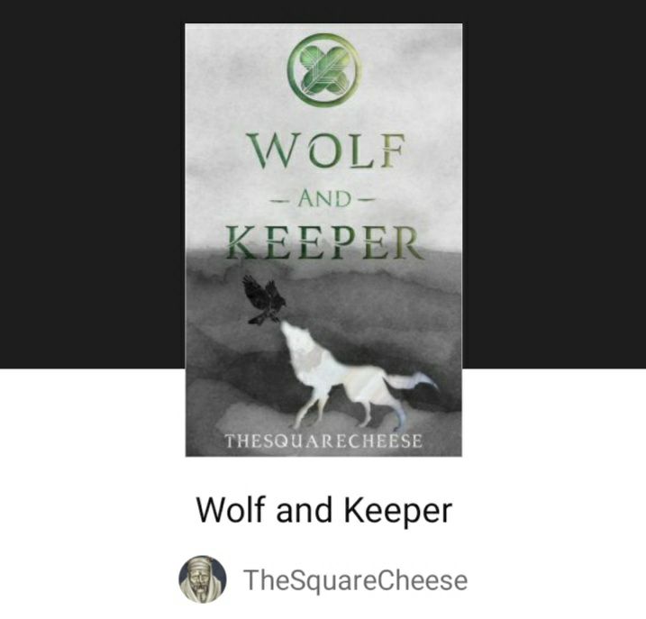
Typography (5/5)
Resolution (5/5)
Color balance (5/5)
Spacing (4/5)
Total: 19/20
“The cover is nice and simple. The green title serves as a great contrast to the neutral image chosen which indirectly conveys the impact the characters have in the story. The emblem is what ties the cover together. Well done!”
Rhodoreef by SuVida777
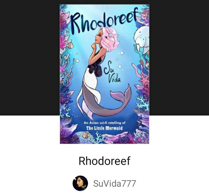
Typography (4/5)
Resolution (5/5)
Color balance (5/5)
Spacing (3/5)
Total: 17/20
“Despite that it looks like a children's book, or a cover fit for a comic. It has a nice whimsical touch that piques the curiosity of a potential reader. If the depths of the story are deeper than the cover leads on to believe than there is no doubt that a curious reader would take a nose dive to read this story. Though the reason your cover lost points was because the author name is getting too close to Dea's belt, and the title above looks a little crowded with the marine life surrounding it.”
All Capes Are Bad by Intricist
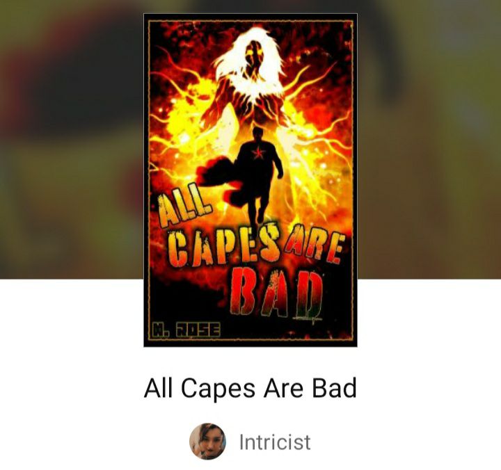
Typography (5/5)
Resolution (5/5)
Color balance (5/5)
Spacing (4/5)
Total: 19/20
“What I like about this cover is that it has edge. Attitude. It's explosive! The typography expresses how action-packed the cover is. The only point that it came close to perfection is that the name of the author is nearly hidden. Regardless, it makes me want to read it.”
A Realm of Magic and Mayhem by AdrielleReina
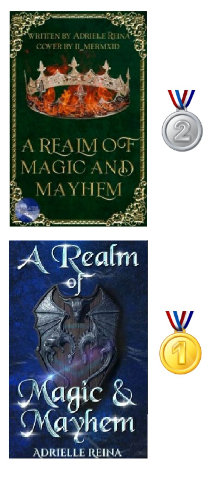
Cover 1 of 2
Typography (5/5)
Resolution (5/5)
Color balance (5/5)
Spacing (4/5)
Total 19/20
Cover 2 of 2
Typography (5/5)
Resolution (5/5)
Color balance (5/5)
Spacing (5/5)
Total 20/20
"Your cover has improved gradually. I've seen all 4 of the covers despite that I was only able to take 2 screenshots (the second one and the last one) while I was busy judging the other stories at the time. So I'll be judging the current covers, and the one you actually have is the best out of the previous ones."
World On Fire by AdrielleReina
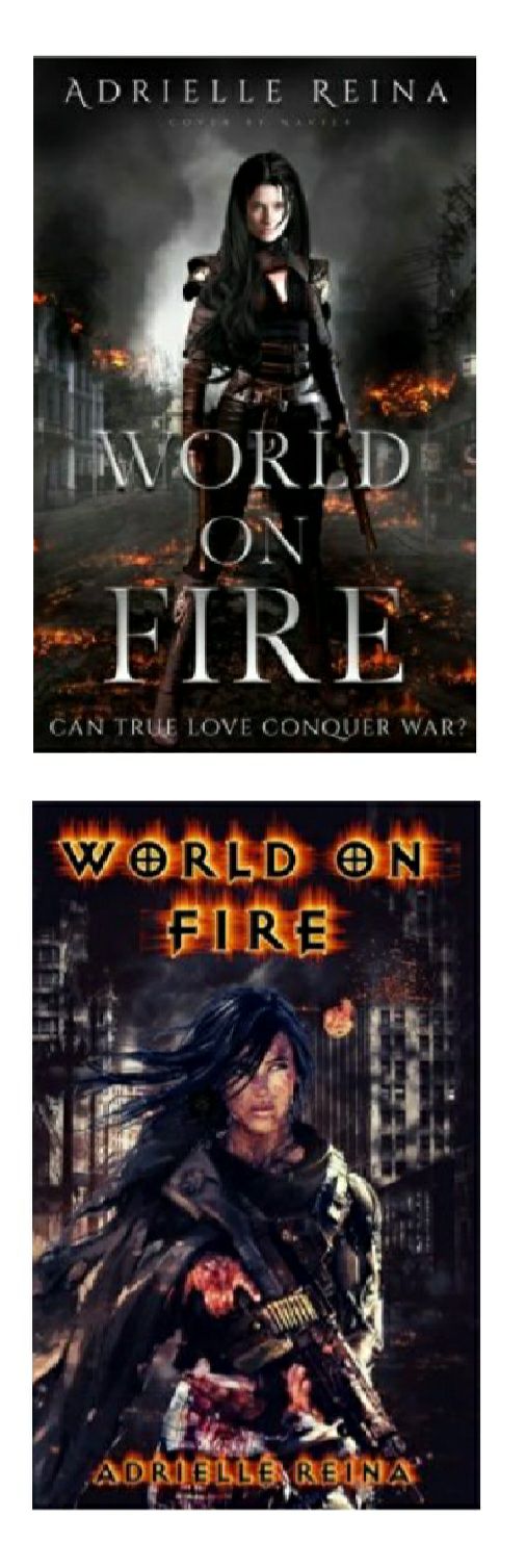
Typography (5/5)
Resolution (5/5
Color balance (5/5)
Spacing (5/5)
Total 20/20
"Out of the 3 covers I've seen, I was only able to take a screenshot of the last 2. The ones currently shown here are the best out of the 3. Both of them look flawless. The only difference is the typography: the cover above has a clean typography compared to the one below. The one below seems fitting to emphasize how the world is burning in the cover. Kudos to your designer."
Killer Love by _ashrosez_

Cover 1 of 2
Typography (5/5)
Resolution (5/5)
Color balance (4/5)
Spacing (4/5)
Total (18/20)
“1) I must admit that the cover above is really creative. The title is glamorous and I love the dark undertones, including the backdrop. The only pet peeve is that the author's name is too close to the title and it's also on the verge to be swallowed up by the background.”
Cover 2 of 2
Typography (4/5)
Resolution (4/5)
Color balance (3/5)
Spacing (3/5)
Total 14/20
“2) The cover below looks a bit dull when it comes to the lighting, and the scattered title is not aesthetically beneficial for the cover.”
Art of a Bleeding Heart by strawberry1d

Typography (3/5)
Resolution (4/5)
Color balance (4/5)
Spacing (4/5)
Total (15/20)
“Well, it's different. There is no denying it. The dim lighting of the protagonist makes him look as if he were lost in thought, which is a nice effect. The background is also gorgeous, but I don't think either of them go well together because the contrast of the lighting is too drastic the way I see it. The other thing that could be ruining your cover is having more than 2 different fonts. The title is nice and elegant but the word Heart is leaning far away to the right. Adding your watermark on the painting is a nice touch. The only thing that has to go is the CEO-series hanging at the bottom of the cover.”
Cold Faith by Nefelibatas_world
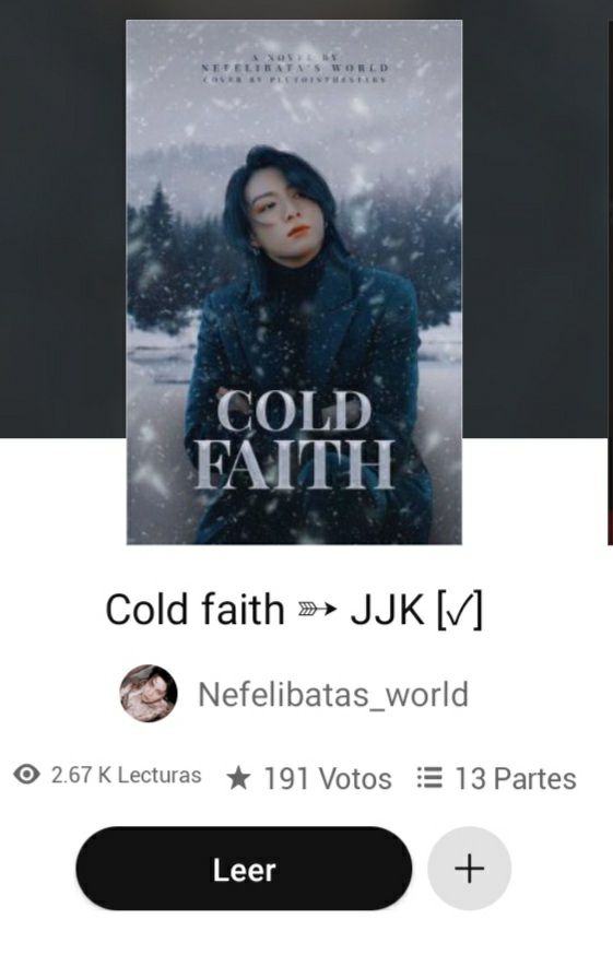
Typography (5/5)
Resolution (5/5)
Color balance (5/5)
Spacing (5/5)
Total (20/20)
“The cover is beautiful. The title matches the tone of the cover and I love it. The subtitle is barely readable, it's the only reason your cover lost only one point. Your designer did a fabulous job with the cover. Well done!”
Blood Tint On A Black Rose by Nefelibatas_world
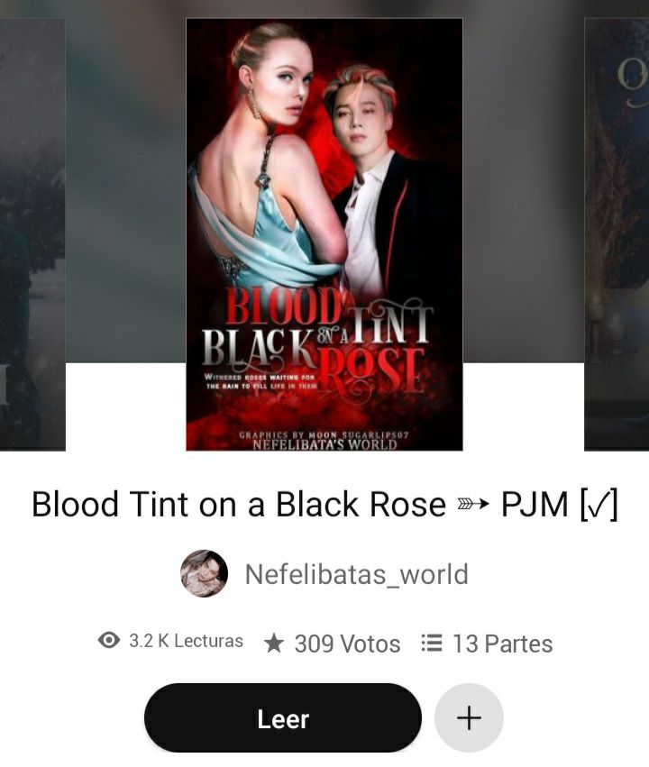
Typography (5/5)
Resolution (5/5)
Color balance (5/5)
Spacing (5/5)
Total (20/20)
“Not only the cover looks dramatic... it looks fantastic! The typography chosen — and the way it has been used — looks superb. The protagonists look elegant and unique, worthy of a good read.”
You Said It's True Love also by Nefelibatas_world
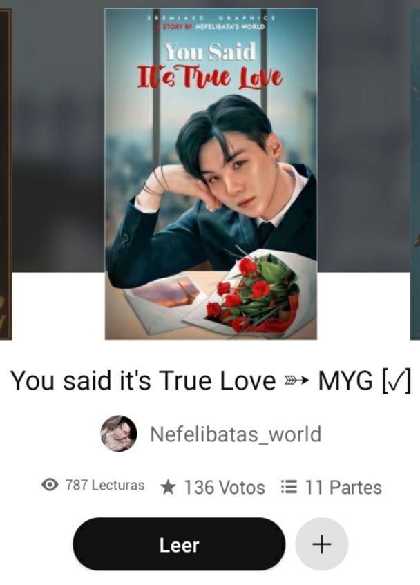
Typography (5/5)
Resolution (5/5)
Color balance (5/5)
Spacing (5/5)
Total (20/20)
“Excellent. There isn't another word that I could describe this cover.”
Roses And Flames by Nefelibatas_world
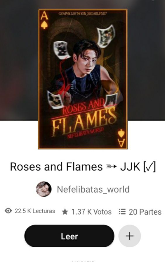
Typography (5/5)
Resolution (5/5)
Color balance (5/5)
Spacing (5/5)
Total (20/20)
“Fantastic. The blurred photographs are an amazing effect to set the backdrop to the cover. It promises action and drama. The title has a relevant yet classic vibe to it that makes the reader want to read the story.”
Usher Me, Asher by Nefelibatas_world
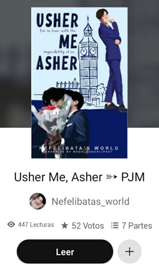
Typography (5/5)
Resolution (5/5)
Color balance (5/5)
Spacing (5/5)
Total (20/20)
“What I like about this cover is its simplistic typography and backdrop. It gives a feel good vibe that a reader would pick.”
The Blood Moon King by Nefelibatas_world
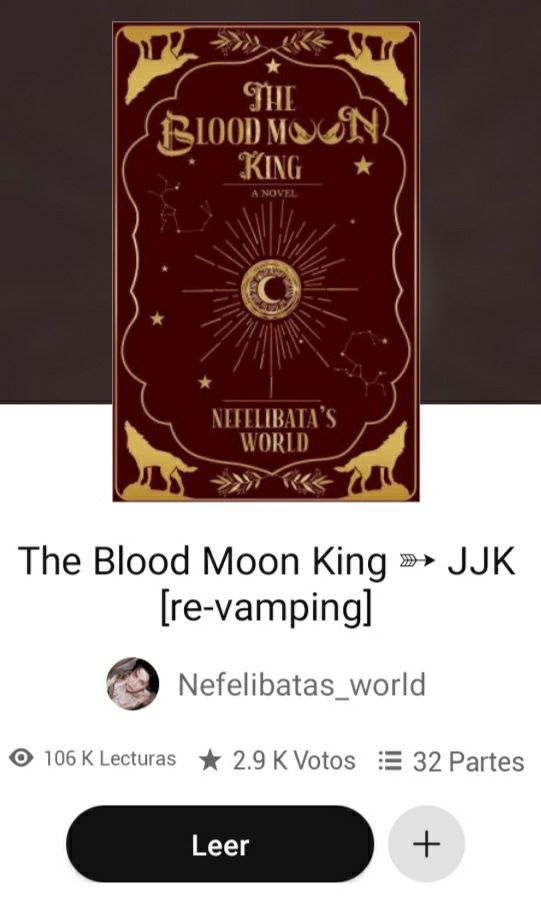
Typography (5/5)
Resolution (5/5)
Color balance (5/5)
Spacing (5/5)
Total (20/20)
“The cover looks magnificent. The typography chosen for Blood Moon gives the cover a magical appeal. The designs adorn the cover beautifully. Your graphic designer did a splendid job. Well done!”
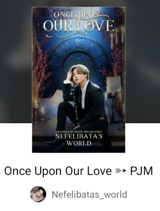
Once Upon Our Love by Nefelibatas_world
Typography (5/5)
Resolution (5/5)
Color balance (5/5)
Spacing (5/5)
Total (20/20)
“The cover is fabulously done. The font compliments the backdrop surrounding the cover. The blurred papers is a nice effect that ties the cover together along with the protagonist. Well done.”
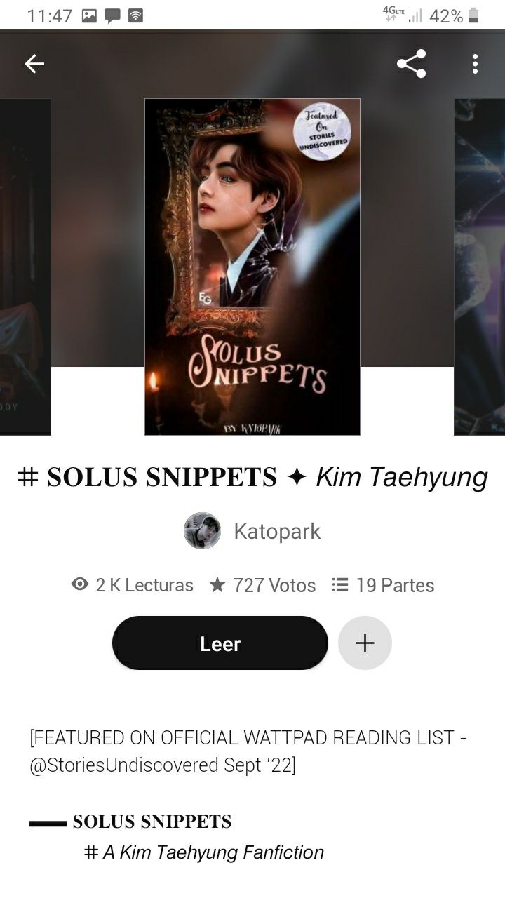
Solus Snippets by Katopark
Typography (5/5)
Resolution (5/5)
Color balance (5/5)
Spacing (5/5)
Total (20/20)
“Wow! The broken mirror and the actual blurred protagonist has a nice dramatic effect that I hadn't seen before in covers like this one. The designer did a fabulous job.”
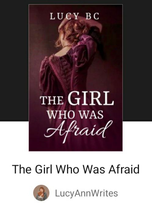
The Girl Who Was Afraid by LucyAnnWrites
Typography (5/5)
Resolution (5/5)
Color balance (5/5)
Spacing (5/5)
Total (20/20)
“The cover is well done. The title describes the protagonist indeed. The change is subtle, yet profound which deserves a good read.”
Lust and Torture by IcyMoonSword
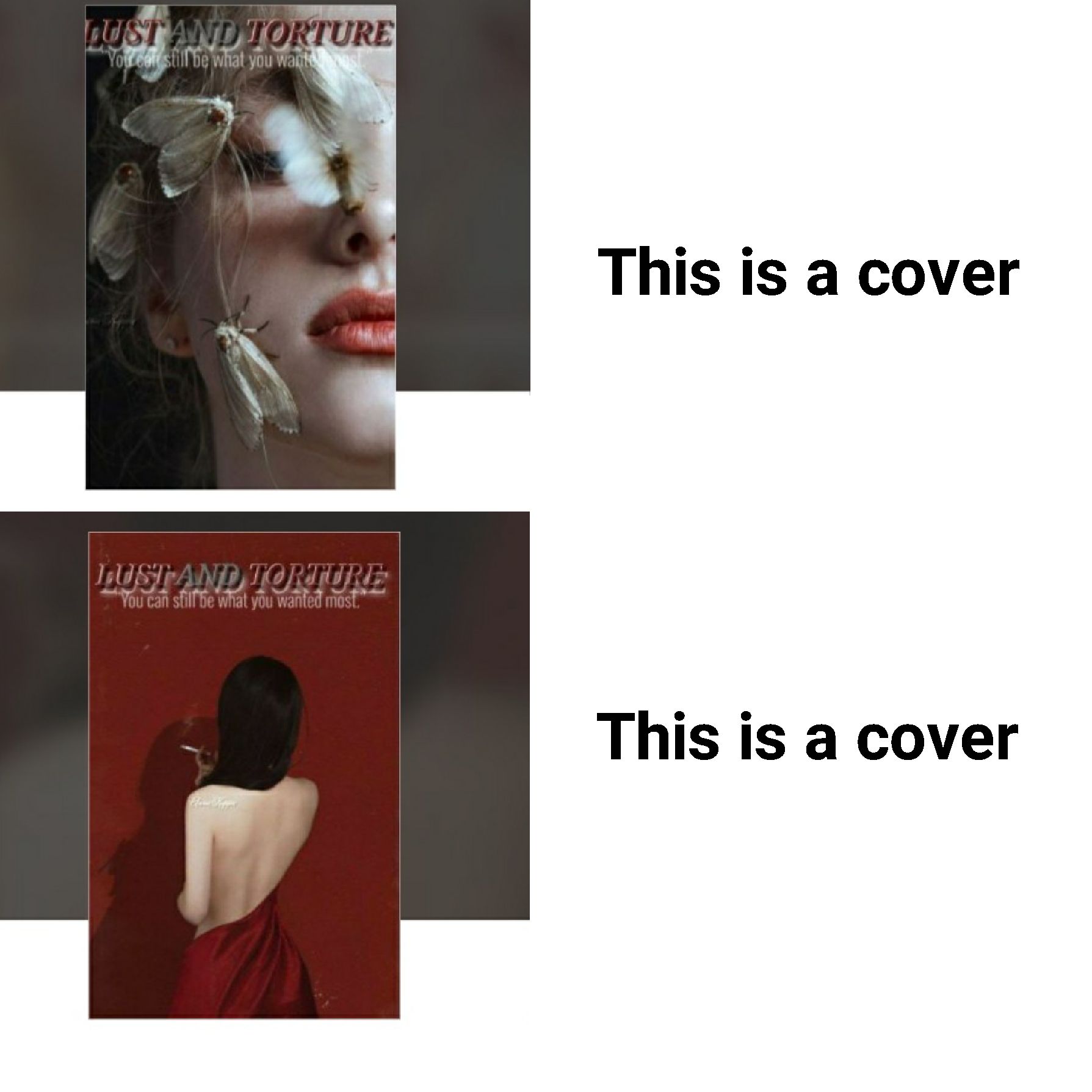
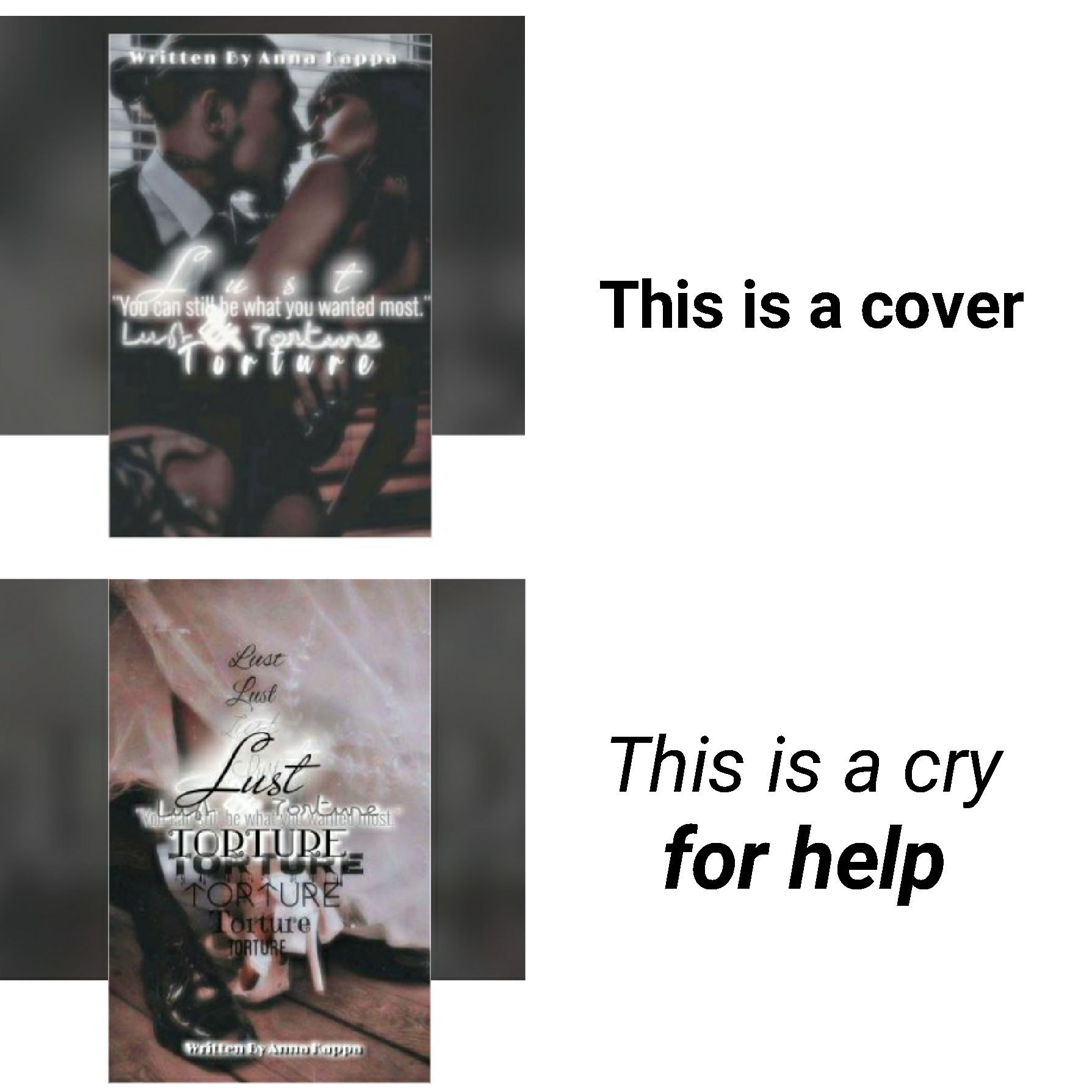
Cover 1 of 4
Typography (5/5)
Resolution (5/5)
Color balance (5/5)
Spacing (3/5)
Total (18/20)
“The cover is well done. The image symbolizes how the protagonist is the flame that attracts the moths, though her saddened expression make it seem that she is the one being consumed internally. The little pet peeve is the subtitle getting attached to the title.”
Cover 2 of 4
Typography (4/5)
Resolution (5/5)
Color balance (5/5)
Spacing (3/5)
Total (17/20)
“The image is nice and simple, the only thing that could be off is either the subtitle getting attached to the title or the author name getting swallowed up by the girl's shoulder.”
Cover 3 of 4
Typography (4/5)
Resolution (5/5)
Color balance (5/5)
Spacing (4/5)
Total 18/20
“The cover is well done, the only factors that are affecting this cover is that the title has too much luminosity, the & symbol is too shiny and messy.”
Cover 4 of 4
Typography (1/5)
Resolution (4/5)
Color balance (2/5)
Spacing (1/5)
Total 8/20
“Sadly, this isn't your best cover. This is a cry for help. You emphasized the Torture part way too much. The title is both poorly placed and scattered all in one. The subtitle is swallowed up by the title. If you had properly placed the subtitle above near the margin, kept the largest title out of all the repeated ones aligned in the middle and removed the scattered words your cover would've looked nice, fresh and pleasant to look at.”
Stuck with a Hellhound by Charming_liar
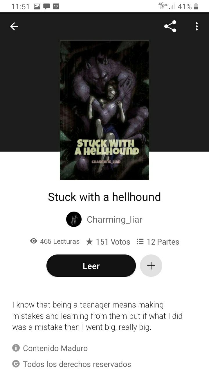
Typography (4/5)
Resolution (5/5)
Color balance (4/5)
Spacing (4/5)
Total (17/20)
“It's consistent, but I think the cover could be better. Consider changing the font (or the color of the font) if you want the book to have a darker tone. Also the title seems to be on the verge from merging.”
Bạn đang đọc truyện trên: Truyen247.Pro