Spirit Animal
I worked on this for @_music-is-art_ 's Art Contest. I don't usually draw animals, so this was a good practice for me, and actually turned out really well. The otter spirit animal is curious and holds onto its inner child, always seeking adventure and enjoyment in life. I walk a thin line between having the otter as my spirit animal and the deer, but I have a big affinity for otters so chose to draw one for this. I'm not quite as free a spirit as I would like to be. :"( But, is anyone?
Step 1: rough sketches
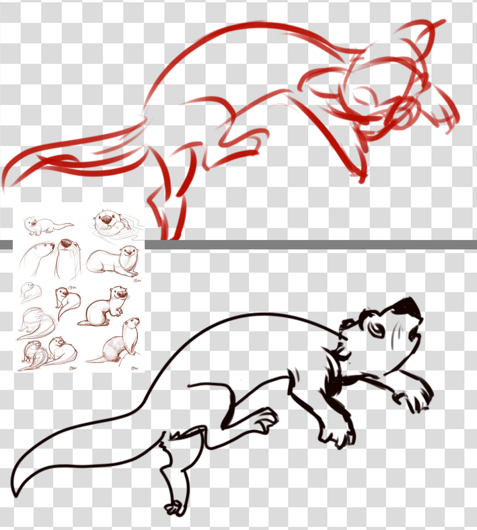
The image of otters in the middle there is the main reference I used (https://pin.it/yzr2lgz6fam3i4). I scrolled through a lot of picture of otter character designs and real nature photographs, but this is the one I mainly paid attention to.
Step 2: Cleaned lines. I won't include a progress image for this, because you can see my clean lines in the final image. Lines are my least favorite part! I did these in white for that spirit vibe.
Step 3: Character colors.
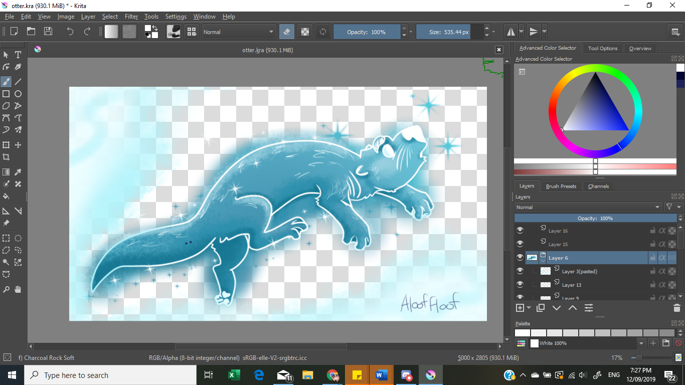
I colored the otter with a flat midtone blue color (which you see on the midline of the otter). In this image, I have just isolated the group, so you don't see the clean look of the colors here. I used the midtone layer as a base, then added shadow and highlight in separate alpha-locked layers using a paint-splatter textured brush.
Alpha-locked: only colors over what is in the layer beneath it. This means I don't have to worry about coloring outside of the lines when I am shading. ^^ idk how to explain it without a video.
In a layer BENEATH these three layers, I added light blue "glow" using an airbrush. (not seen in this image). I also added in sparkles using a default sparkle/star brush on Krita because I am basic. Also sketched in some clouds with a smoky texture brush.
Step 4: Background
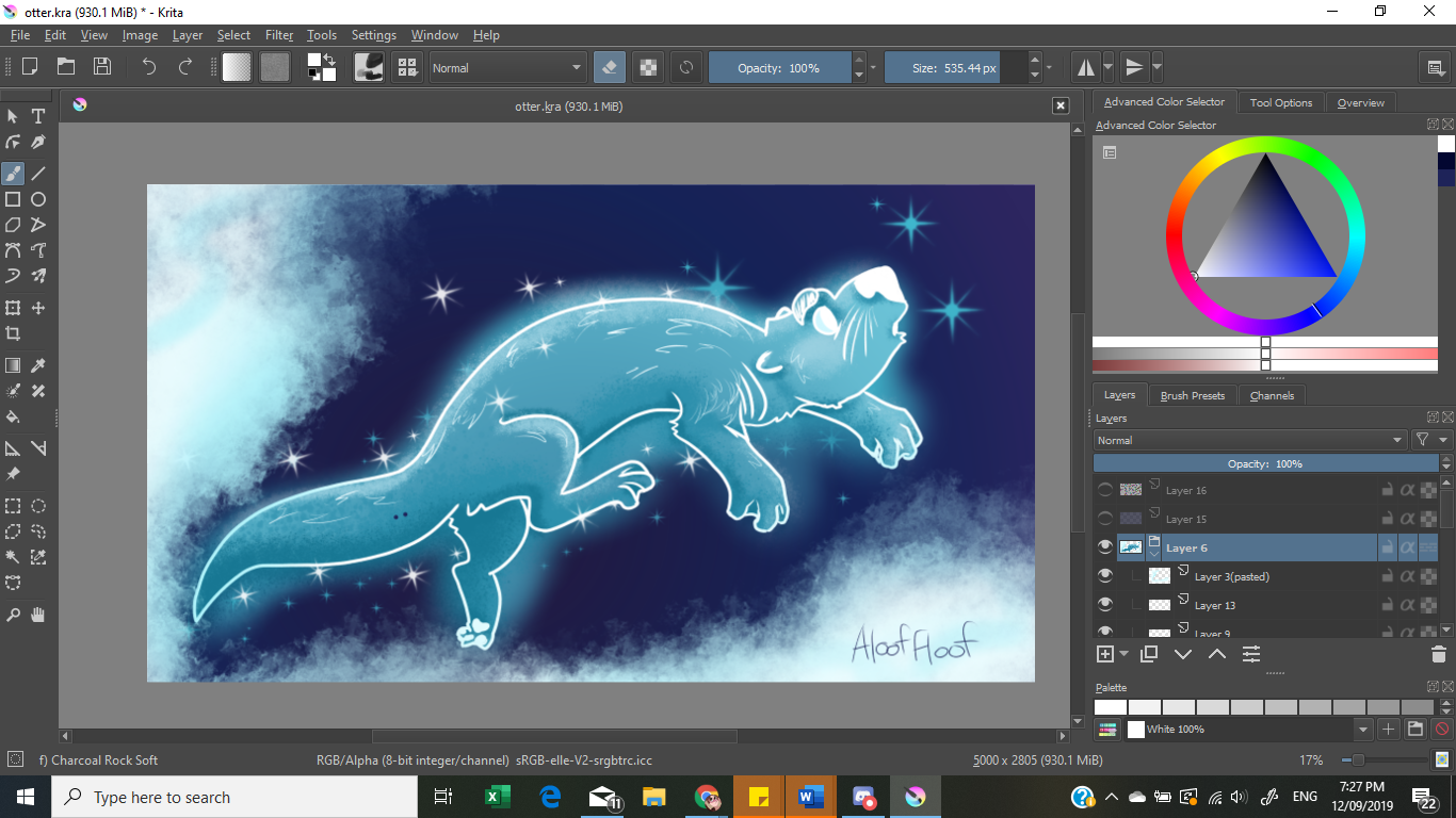
I hate backgrounds and generally suck at them and give up prematurely. This is a very simple background because it could be and I didn't want to push it further and ruin it.
In the background, there is a flat dark purple/deep blue color, and a purple-->light blue-->white gradient overlayed on top of it. I added more stars around the otter and gave some highlights to the clouds.
Step 5: Touch-Up
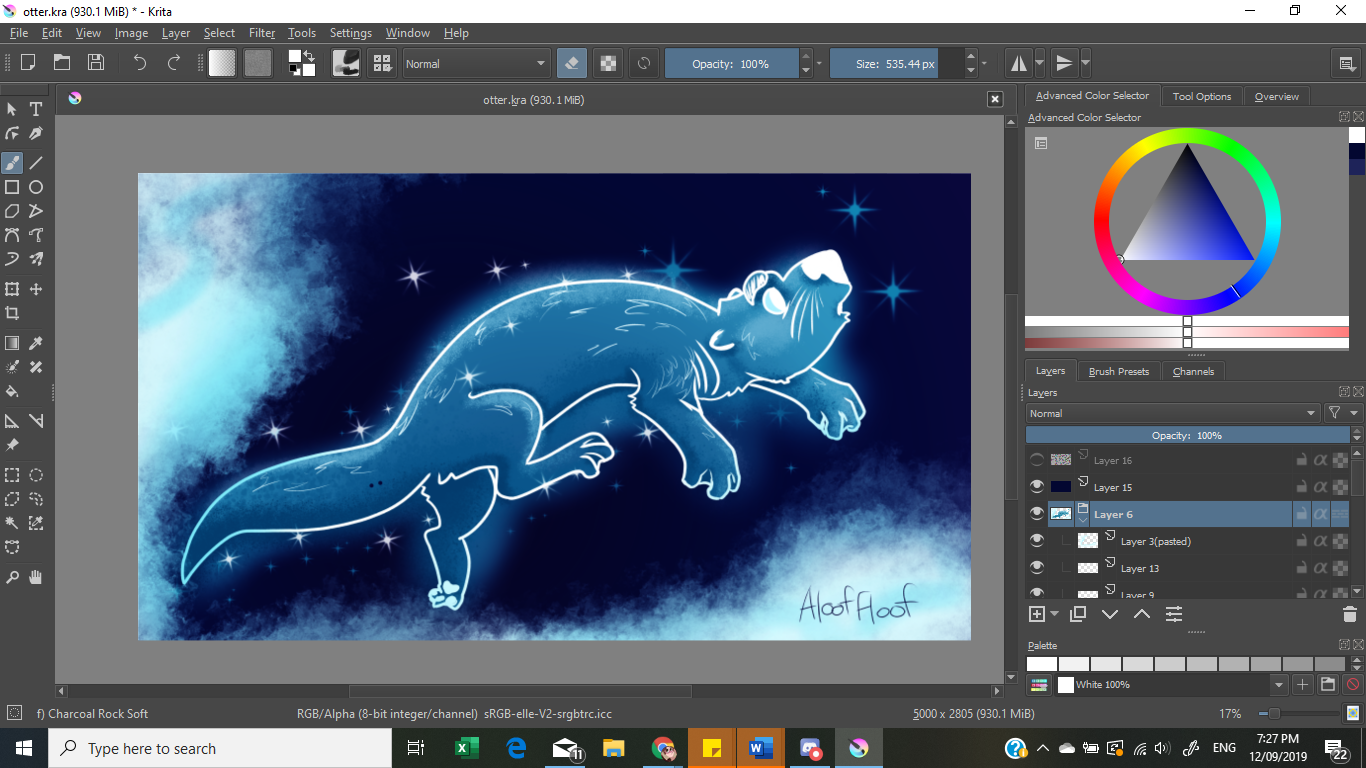
Scroll between this image and the last. Big difference in POP, yeah? This image pops way more because I overlayed a dark blue color over the top of the whole image. I'm really awful at color picking off the bat!
This, though, was too dark. Over the top over this and everything else, I added ANOTHER layer of white. I applied a noise filter to this layer, giving the image a texture that I love in my art.
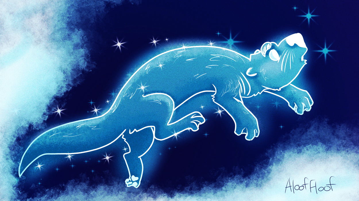
Here is the final product, without further adieu. (I also finally noticed the snakebite dots on the otter's tail >.<)
Thanks for having a look!
I know I could improve here with some more line width variation and a cleaner left front paw. Could also improve my background (lack of) skills. But, all in all, I'm happy with this! Best otter I've ever drawn, that's for sure!
Bạn đang đọc truyện trên: Truyen247.Pro