
When Designing
A/N- My favourite radio station :)
So you're given a prompt. Which could be anything.
Pay close attention to the title and genre if you've been supplied with them, cause these sum up the whole thing for you whether you know it or not. (unless you have a synopsis given)
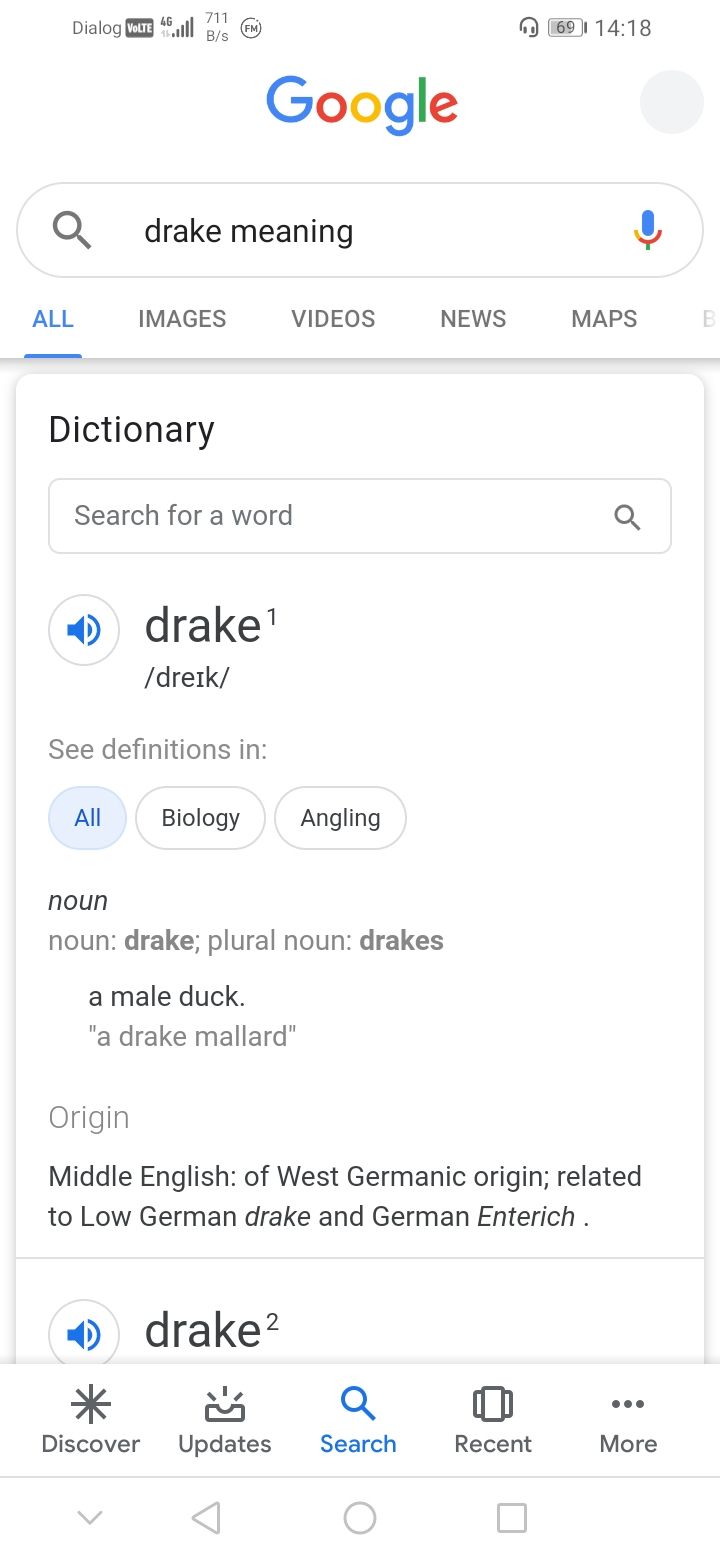
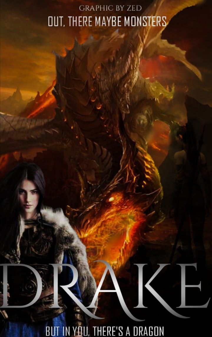
For example, at a contest I'd participated recently, we were supposed to choose an instrument from the list of different instruments given by the host and upon choosing the piano, I was given the word DRAKE to title my cover and to center my whole graphic around.
Now, the first thing which popped in my head was the artist and, no offence to his fans, but I was dejected. Then, the idea of a male duck sprang in my head and yet, I was like 'Tf bro?'
But then, I headed over to my mentor. Which is Google.
She gave me this.
I scrolled down.
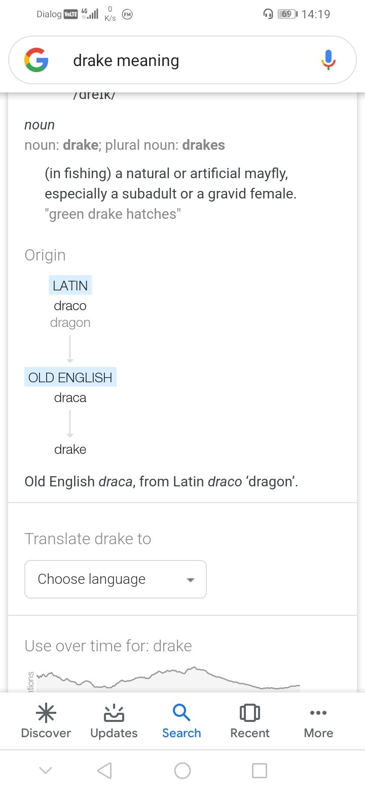
Jack pot 😉
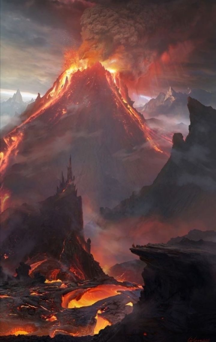
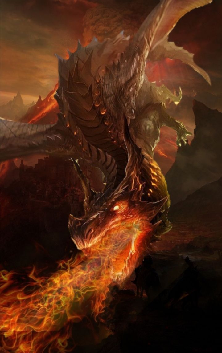
So I chose a few pics from Pinterest. Keep in mind, the main idea I had was the dragon which is fantasy. So, when searching them up, I looked for a dragon, fantasy backgrounds, some fire and some human. A girl.
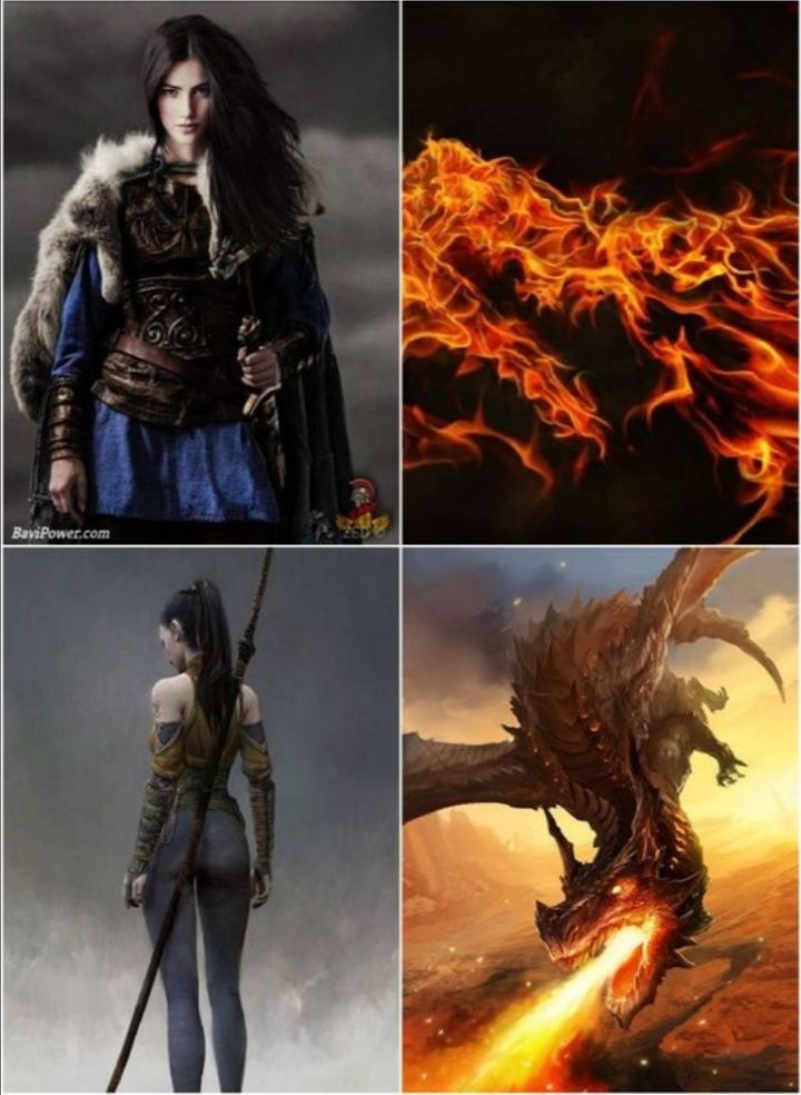
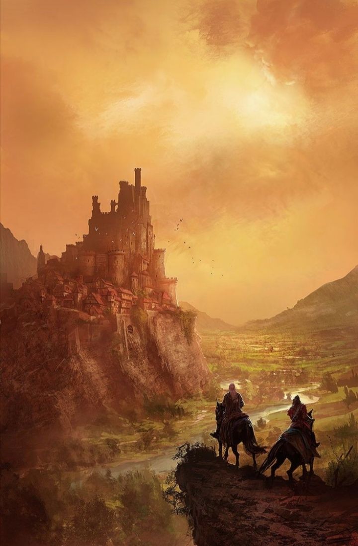
In case you were wondering why I had chosen fantasy backgrounds, it's to differentiate what I do from what another person would. As you can see, the pic of the dragon above has a different background, I trimmed him out using the scissor tool on Polish.
All you have to do is tap that Ai icon and the image would automatically trim for you. You might have to erase excess pieces or add some since the trimming isn't 100% perfect. You just have to tap that eraser icon which is blue.
- is to erase. You could adjust the size as you want. + is to add whatever :)
Once you're done don't forget to save it, so it falls as a sticker. Tap the top circular icon next to the arrow. Then you could directly paste it to the background.
Back to the back drop, I blended both of those above fantasy backgrounds together using the Double Exposure tool
You could adjust how you want it to appear.
Once the backgrounds have been blended and the picture you want has been trimmed, stick that trimmed picture on your background. This was how my dragon looked like in its new setting.
For further effect, I used the picture I had taken of fire and blended it with the overall image-

- tapping that icon. Once you do so, you could erase the corners of whatever picture you want to add and blend it with your overall picture :)
I hope this wasn't confusing 😐
Well then, after that is done, you're halfway done. If you feel like it, you could add other pictures, related to your graphic. Again, the same way as I'd said before (trimming)
In my case, I added a girl.
After you've got that out of the way, it's all on the font. Remember, the font has the ability to boost the quality of your image and screw it, so be careful when selecting the font. Always go with lettering which vibes to the overall theme. You could also make use of the gradient feature, it does wonders, trust me and REMEMBER, only include 2 types of fonts on your image to make it classy.
Or ISTG, it'll look bad. You don't want that.
Try to balance the picture as much as possible. If there's lettering at the bottom, have some at the top. Spread the letters, include your watermark and the author's name.
For an extra oomph, I filter mine through Adobe Photoshop Express.
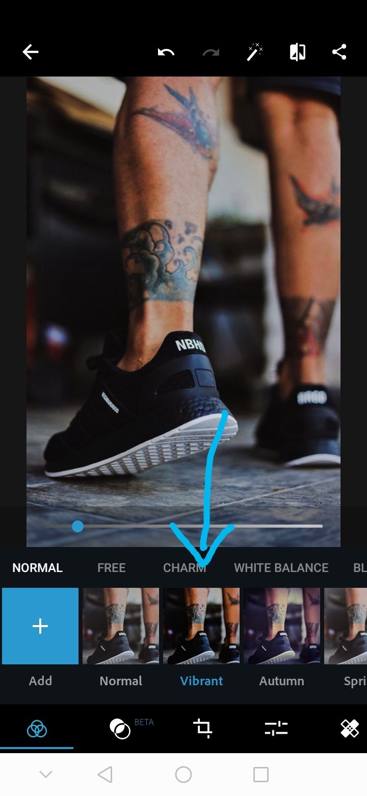
I usually use the vibrant filter. It gives more definition to the picture :)
Then, my dear reader, you're good to go! 😉
Let me know your thoughts and questions. I hope I explained well. If not, I'll be happy to clarify stuff for y'all :)
Bạn đang đọc truyện trên: Truyen247.Pro