I participated in my FIRST ever NATIONAL graphic design event and....
27. 08. 2021
F I R S T E V E R N A T I O N A L
graphic design event
For a preface, this event started yesterday and ended today. There were thousands of people from all over the nation of various schools and universities (for schools, it was from 8th grade and up). Our school was a part of it too, and for this particular event, I was an individual participant.
This is considered the BIGGEST IT and Ecommerce fest in the country and it was my first time participating in such a big thing. In fact, it was my first ever graphic design contest outside of wattpad lol.
Anyways, we had four rounds. Round 1 was a basic round, round 2 was an elimination round and only 13 out of thousands of people were selected. Round 3 was another elimination round where 5 out of the 13 were passed to go to the next round. Round 4 was the final round.
Note: the work of Round 3 and 4 will be displayed at the end of the chapter.
Amidst all this, an extremely popular graphic designer of our country was called up in the event to judge our round 3 submissions. It was such a miraculous moment for me!
Now, what happened there?
Round 1: We were asked to make a music poster. We had to mention the specifics such as featuring artists, date and venue, time etc. The title was given by the event heads. The amusing part here is that MY PHOTOSHOP CRASHED in this round and I couldnt save the thing so I had to snip a screenshot a send it to the event heads in such a terrible quality ;-;
Round 2: The topic this time was kinda baffling for me. Because first off, I never even thought it could ever be a part of graphic designing and little did I know it would be such a great deal that its considered a worthwhile topic for an elimination round. The topic was - to make a comic strip. I panicked here. This was such an unexpected topic. I didnt have a stylus or phone at that time so I had to find illustrations from freepik and all and combine them and everything. But welp, I apparently went through quite well xD
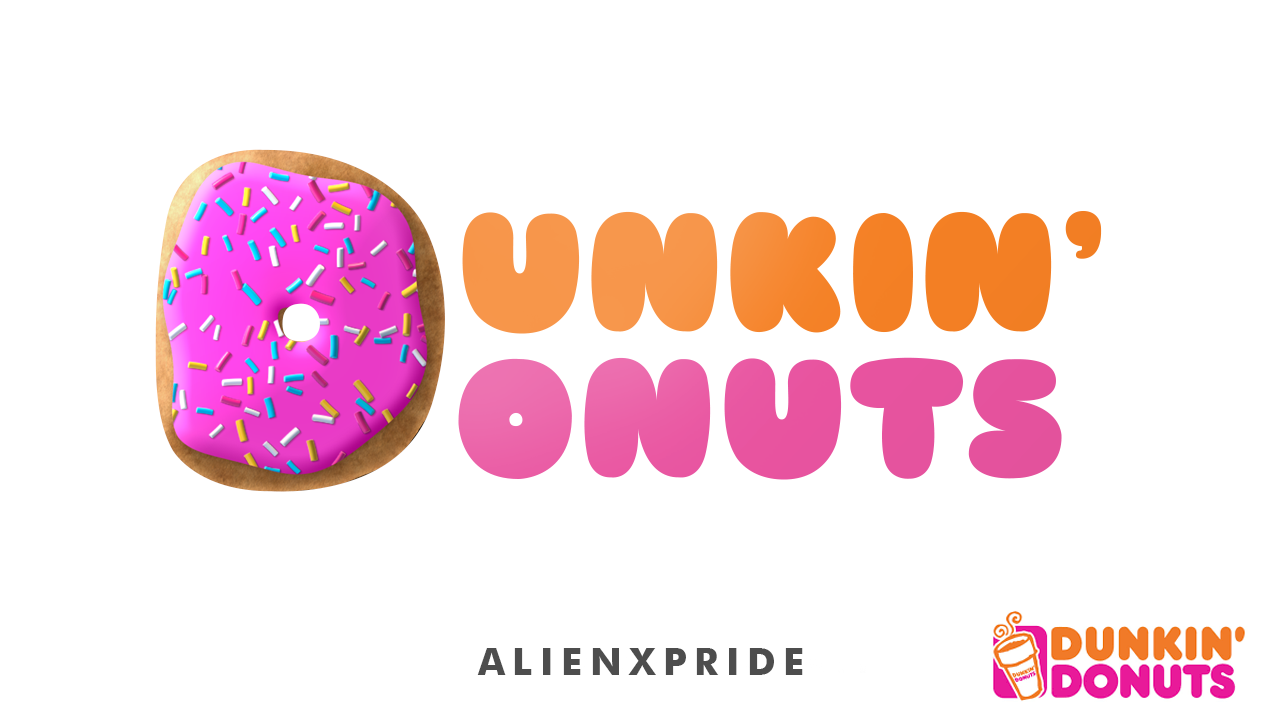
Round 3: This was rather an interesting one. We were asked to remodel an already existing logo. We were given a bunch of different logos via a google drive folder and were allowed to choose any one based on our preferences. I chose "Dunkin' Donuts". In this round, the renowned designer judged our stuff and I was one of his favourites here xD
Round 4, the FINAL round: The topic here was to redesign an already existing banner of any of the different events in this national program (for eg, mine was for designing; there was a quest one; then there was a one where you had to solve crime mysteries; there was one for chemistry and biology etc). I chose "Bloodwork" or the "solve crime mysteries" one.
Now here's the thing. The judges LOVED the realism in my submission. And I almost bagged the second position......but due to the low quality thing in the first round, my marks kinda went down for this one and I bagged the third position instead. The difference between the second and third was just of 1 mark, so that kinda was disappointing xD
But hey, overall, it was an amazingggg experience. Only the first two got the cash prize but the third's banner was used in their official insta account and all so thats that. I think as a first timer in such an event, I did pretty great. Who knows, maybe I'll achieve more the next time?
The first and second winners were both in 20's and the fact that the guy who came first did everything with his wacom and stylus is mind blowing. He earned his position. Compared to those people, me, a teenager who is not even 18 yet, did quite a cool effort i guess.
I just really like how people are now asking more about me and all, I guess they were fond of the last round's design. One of the judges legit apologized cuz he loved my work so much but he unfortunately couldn't make up for that 1 mark difference which is awwwwww.

Here is my remodelling of the logo of Dunkin' Donuts. The one on the bottom right is the original one.
A tip? When it comes to remodelling of logos, always try to keep some resemblance to the original one. Our brain likes new, but not too new. Thats one of the core reasons why BBC paid more than 500k for a new logo, only to do nothing but just remove the boxy thing.

And here is the "Bloodwork" one for the final round. They loved the details. Please note: this might seem a bit too wonky from pc or such devices. Best view from phones.
Hope you enjoyed this chapter/blog!
Bạn đang đọc truyện trên: Truyen247.Pro