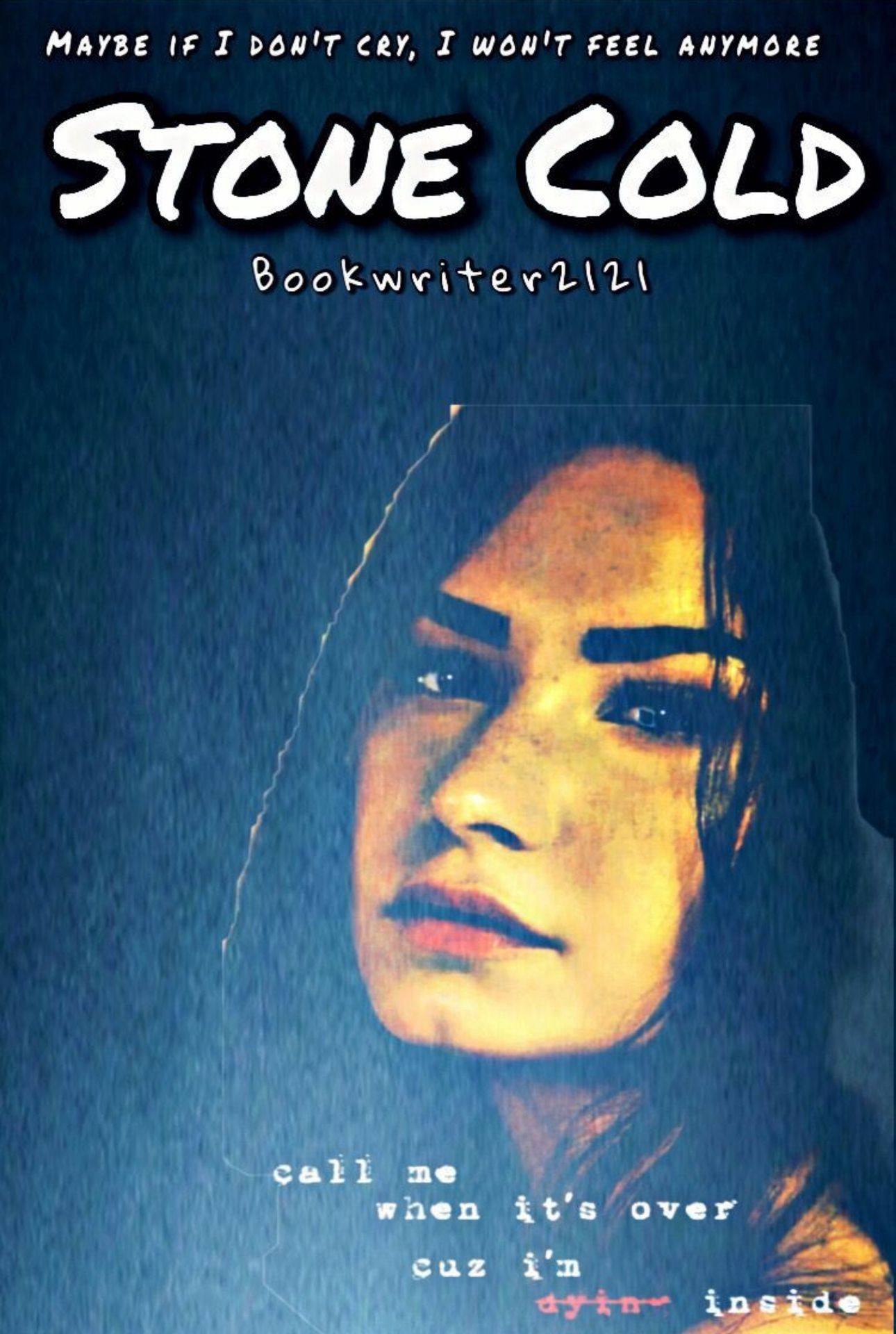
BATTLE VICTORS
Aaaaah! The moment you've all been waiting for has finally arrived!
Which soldier came out on top? Just so you know, it was not easy choosing the top 3. It really came down to the tiniest things.
Drumroll please!
🥁🥁🥁🥁🥁🥁🥁🥁🥁🥁🥁🥁🥁🥁🥁
1. nullities
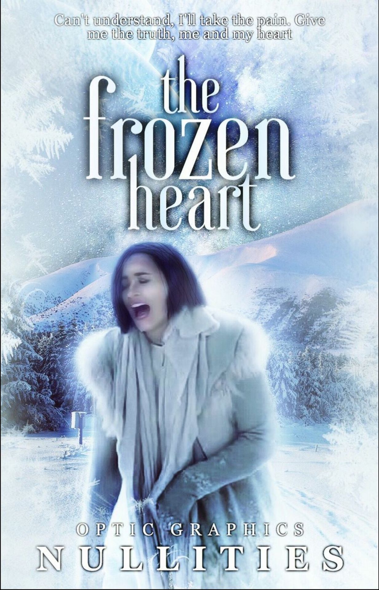
We absolutely loved the way you embodied the song in your cover, even sticking true to the music video. The editing was spot on as well. My personal favorite part was the way you staggered the title (Mac) and kept it all lowercase. Great job!

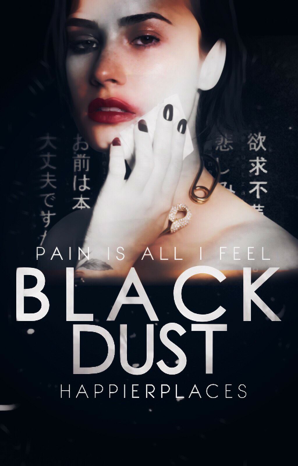
Wow. We were absolutely blown away by your manipulation skills. The fact that you were able to mix Demi's face and some of her hair over Scarlett Johansson's body is impressive, and we love the cover! It's great! The only thing was, we felt it didn't fit the vibe of the song as much. Demi is definitely a fighter, though, so the connection to her was met and overall you did a great job!
We both thought your cover was gorgeous. It's so aesthetically pleasing to look at, and the chinese characters in the background (hopefully they're chinese 😅) really make this stand out. We love the editing you did to her face as well. Great job!
4. chatoyants-
We really liked the text placement of everything, it balanced the cover out and was executed very well! We love how you made the authors name transparent to bring focus onto the title. The images you chose and the glossy effect looked really proffessional and caused your cover to stand out!
5. rawbars
Your cover looks very aesthetic, it's very pleasing to look at! Great picture chose and layering, and we really like the drawn on lines you added to the title, it balanced everything out! We love the title you chose as well.
6. @Geek-Godess225
We love the manipulation, but we didn't see the connection to the song. It gave off a vampire/werewolf vibe. It looks like a real life book cover, the editing was really nice and I could definitely picture it on a shelf. Great job!
7. isabelafalls
We love everything but the title choice. We see the connection to Demi but to the song, it was kind of missed. We love how you did the background, the glow you added to her looked really nice!
8. nayawrites_
Your cover was really cute! We liked the approach you took, and the picture chosen. We felt that you executed well!
9. TOETICTAC
We liked your cover, we liked the editing you did but the only issue was your title looked a little lost. We felt that if you had made it white, it would've stood out more. And also, you misspelled her name.
10. @thRealWhiskey
We liked your cover and it does look nice. There isn't any noticeable errors, but it didn't really have a wow factor.
11. p1nkbabe
We liked your cover overall. The only thing we didn't really like was the title text. It's really hard to make all caps cursive look nice. We do love how you did your authors name, though.
12. chris_hartley
We really like the picture choice and title placement. The only problem we have is font execution. The color and font choice of the text kind of threw us off. If you went with white text, it would've appeared more clean and uniform.
We really like the cover and approach that you chose. We love how you manipulated Demi's face onto the original picture. The only problem we have is the fonts chosen for the subtext. We feel that if you stuck to all caps, it would've come off as more professional.
14. -LilacsAndRoses
Love the picture you chose! Although, we wished it was blended into the background and less abrupt. There's an unspoken rule that you want to aim for just two fonts in a graphic to avoid it looking busy (there are exceptions.) And the fonts you chose didn't really fit the vibe we were going for.
There was an error in your username but we found the emphasis of Demi in your title, pretty creative! We like the photo of Demi but we think it would've looked better if she wasn't as transparent.
16. xFinitely
We saw great potential, but unfortunately the png was a little too... clunky which caused the cover to look a little sloppy.Maybe if you smoothed it into the background, it would've appeared more clean. We do like how you lowered the opacity on the text, though.
17. -simplywasted
We like the picture you chose, but we didn't like the font you chose. It gave off more cutesy vibes instead of "Stone Cold." Also, the authors name was cut off, which could easily have been fixed. Text placement is just as important as picture choice.
18. SunnyCup
We like how you added the stone texture to Demi's face, it was very creative and executed well. But we didn't like the text placement of the title and fonts chosen. We felt as if it would've looked better if you masked the text behind of Demi. Also, the color was kind of jarring. Instead of the sad, bitter, heartbroken vibe we were going for, it read more like evil, envious, sick.
19. hoesthetic-
We felt as if your cover had great potential. Unfortunately, your downfall was the pngs you added. You're gorgeous and it was definitely creative, but it was kind of unnecessary and we didn't really understand why you chose to add those. It kind of crowded Demi and just confused us.
20. NicoleDreamz
We feel as if the picture you chose had great potential, but what we didn't like was how you just slapped "Demi Lovato inspired theme" onto the cover. There wasn't really a connection there and it left us feeling cheated out of effort on your part.
21. darquesse_writer
We like that you chose stills from the video, but your downfall was that they were blended poorly. The obvious line differentiation couldn't be ignored.
22. xx_Chun-Li_xx
The png you chose didn't fit the vibe of "Stone Cold" at all. The shadow of the text was too large and harsh in our opinion. And the font chosen wasn't the best. Although, we did like the background you chose, the cover as a whole did not impress us.
ELIMINATED
Sadly, the time has come for elimination. :(
Honestly, there was nothing about this entry that we liked. We felt as if there were too many different fonts chosen and the ones you did choose didn't really fit the aesthetic of the cover. The png is low quality and wasn't really blended well into the background which caused the covers overall quality to go down.
For these reasons, we had to eliminate you :(
___________
Congratulations to everyone! It was so awesome seeing all of your entries!
Next round will be posted tonight!
-Tori and Mac💓
Bạn đang đọc truyện trên: Truyen247.Pro