
Make Your Cover Crush The Competition!
🗸 Does this cover communicate its content?
This should be a no-brainer. Above all us, when readers are searching for a read, they want to find a story that matches what they're looking for. Romance must sigh with romantic imagery. Thrillers must scream thrilling covers! Fantasy must roar with displays of fantastical realms!
If the reader opens your thriller-styled cover and finds a slow burn romance, they're going to be bored. This will lead to a low 'completed reads' rank for your chapters, which will hurt your tag rankings.
🗸 Is it eye-catching compared to other titles?
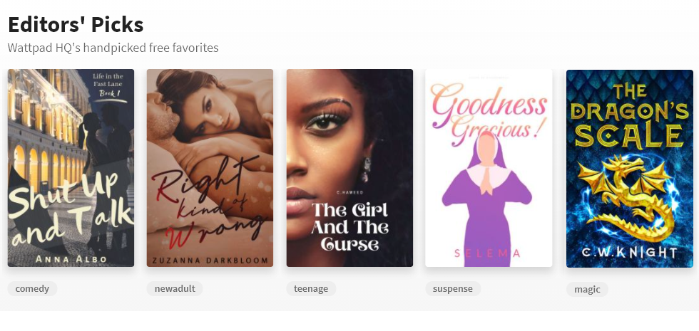
Let your eyes drift out of focus for a minute as you stare at these covers. Which one naturally draws your attention? I'm willing to bet for most of you, it's the farthest right one. That'd because it uses rich, primary colors. And do you know what else is important? It's this usually unnoticeable thing that humans love, and it's called contrast!
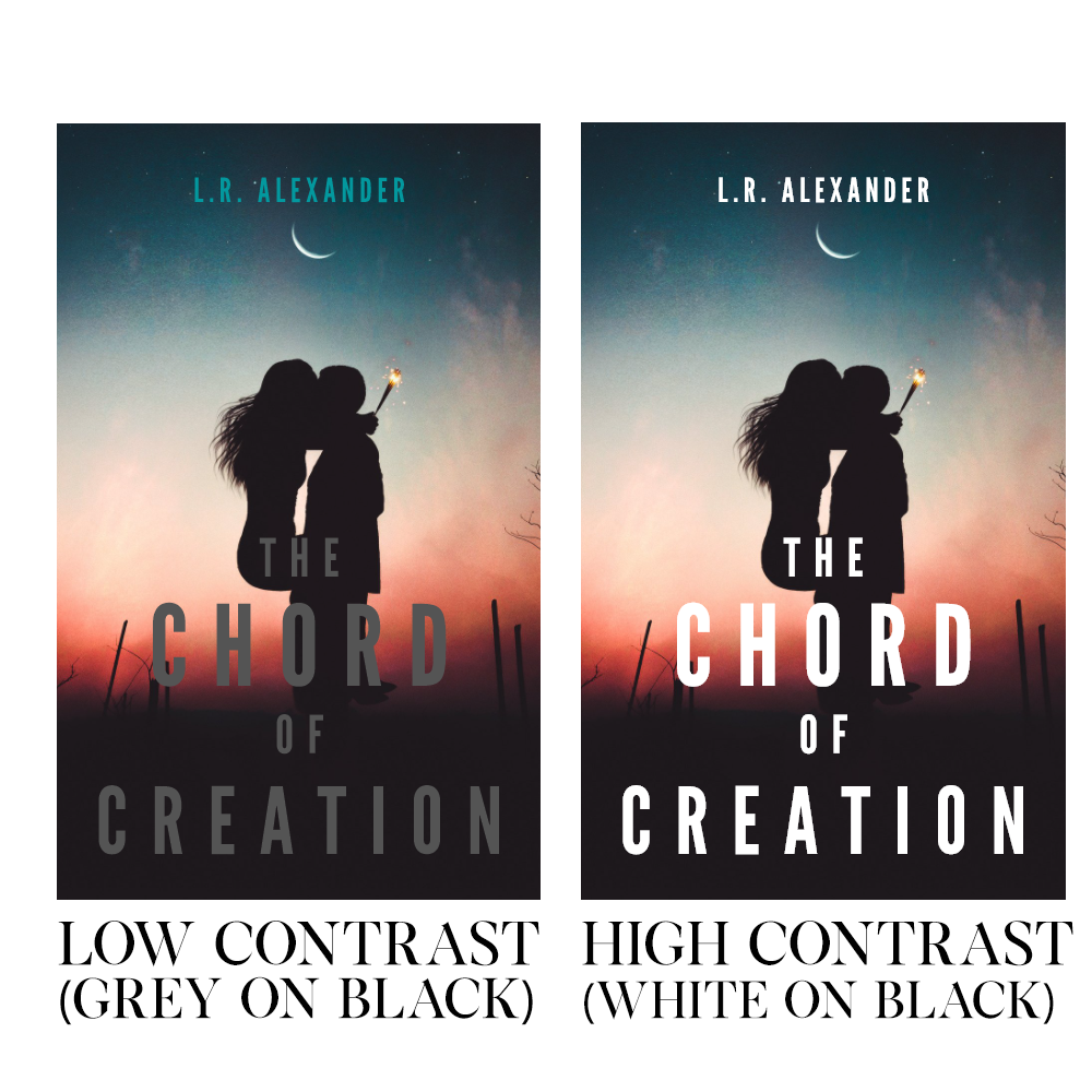
Notice the difference between the two covers? Which one is easier to see?
Remember, whether you're on the frontpage, or on a reading list, or in someone recommendations, you're going to be up against other covers. The reader has to pick one of them, and to get the advantage, yours has to be the most eye-catching around.
🗸 Does it pass the thumbnail test?
Wattpad on desktop is cruel to covers -- they get reduced to the resolution of a potato. But nothing compares to Wattpad mobile, a land of itsy bitsy covers and tiny whiny titles, where if your cover isn't at its best, all the elements on it are going to be little more than a blur.
How can you tell if your cover will survive? Well, let me introduce you to the thumbnail test!
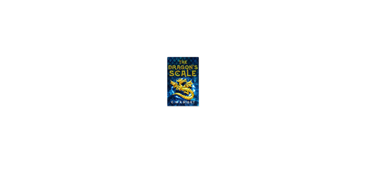
This is where we zap our covers with a ray-gun to shrink them to the size of a toothbrush head! Now, notice with the cover above, how its title, The Dragon's Scale, is still legible despite being one-eighths its original size? Notice how you can see the dragon, a big, bold, high contrast image? That's great! It means Wattpad mobile users (who, making up 84% of Wattpad readers back in 2014, almost certainly make up an even larger portion now) can still see it.
Because a cover you can't see is a cover you won't click on.
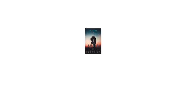
Notice how, with this cover, the main element (two silhouettes kissing) is nothing more than a black blob? And the title, without its high contrast, loses all visibility? Make sure the main element of your cover is large and prominent, and your titles are big and bright!
🗸 How curious does the cover make you?
Curiosity is a hard thing to measure. It's often subjective - what one person finds interesting, another person won't. But there is one reliable way of checking if you're making the reader curious, and that's by asking yourself, what questions am I making the reader ask?
Take a look at the cover below. Note the different elements on it.
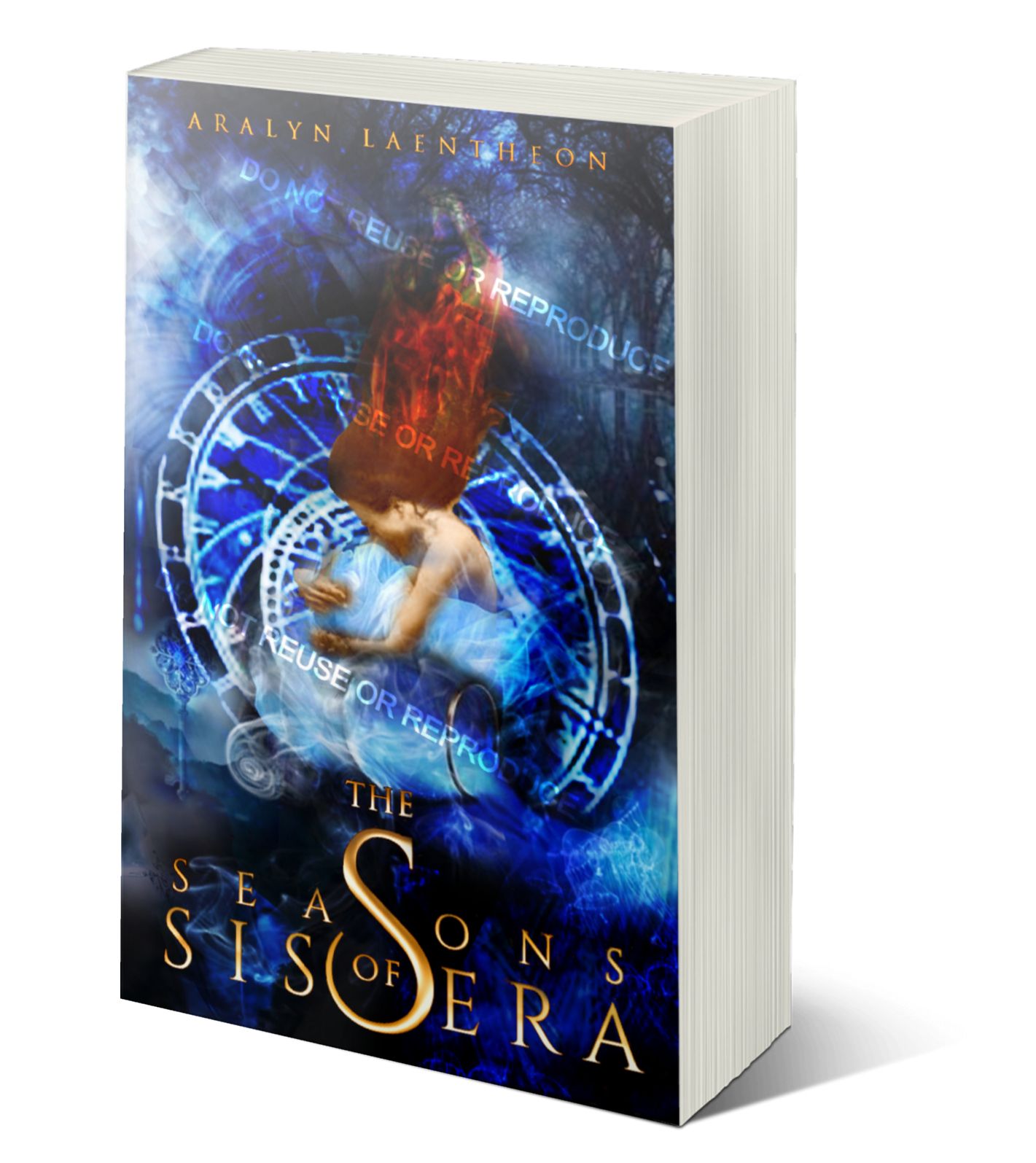
It's a cover that makes you ask, why is there a woman in front of a spiraling timepiece? Is she a time-traveller? Does she only have a certain amount of time to live? And why does it look like she's grimacing? I have to know more! Let me read this book!
🗸 Does it signal professionalism?
If it looks like the author doesn't care what goes on the cover, it'll seem like the author doesn't care about what's written in it, either. Sloppy covers indicate sloppy stories. Professional covers indicate professional stories. Ever hear the saying, never judge a book by its cover? Readers don't do that. If the cover is all they can see, they'll certainly judge your book by it!
Sometimes, it can be hard to tell if your cover looks professional or not, especially if you're the one whose made it. We get emotionally tied to our covers. So, try asking a friend for their honest opinion (and it must be honest) on the cover. They might tell you it looks great, or they might be the bearer of bad news...but either way, it's a win for you!
Bạn đang đọc truyện trên: Truyen247.Pro