𝐬𝐡𝐫𝐞𝐞.
𝙎𝙀𝙄𝙕𝙀 𝙏𝙃𝙀 𝘿𝘼𝙔
𝘢𝘤𝘤𝘰𝘶𝘯𝘵 𝘳𝘢𝘵𝘦𝘴
▃▃▃▃▃▃▃▃▃▃▃▃▃▃▃▃▃▃▃

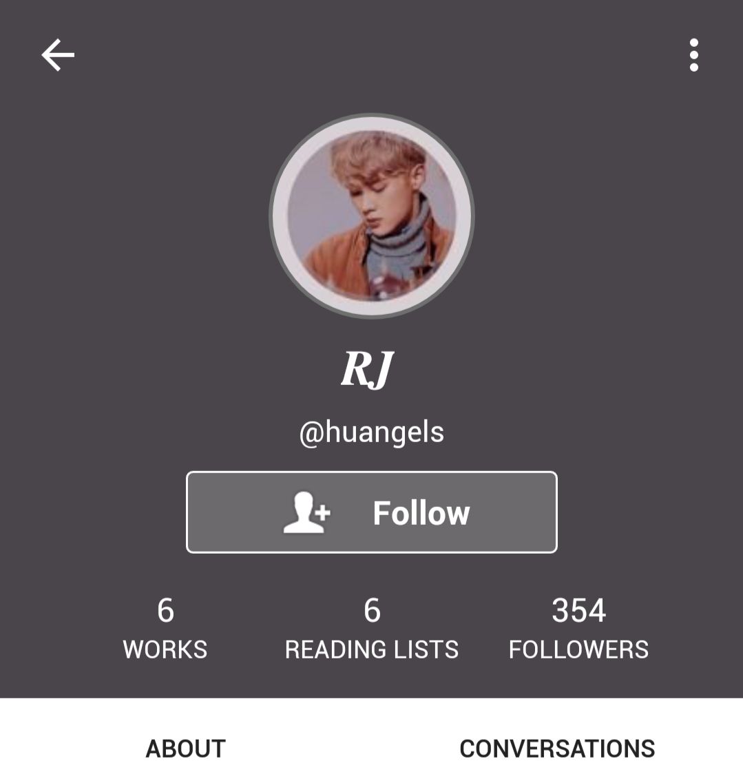
USERNAME
absolute genius of a username pun, i love it :")
( 10/10 )
DISPLAY NAME
not sure if it's your actual name, just a pen name or the initials of renjun but it looks good + nice choice of font!
( 10/10 )
ICON, HEADER
i like how you added a little pastel border around your icon, it's not much but it definitely spices it up !!
( 10/10 )
i can't tell if the header is the usual grey header but it does look darker than usual so im assuming it's a different one lol. it's simple which suits your aesthetic.
( 10/10 )
together they actually fit quite well as both have greyish undertones and keeps the theme going even tho they're not the same colour. it also helps bring out the icon more !!
( 5/5 )
BIO
i love the different fonts used and the bio is super short but contains just enough information for people who are passing by to know what kind of stuff you like and who you are! also love the use of mandarin characters because #proudchinese here lol (not from china tho cuz china govt sucks)
however it may seem a bit crowded despite the shortness since the different fonts are of different lines from each other. still very cute tho
( 9/10 )
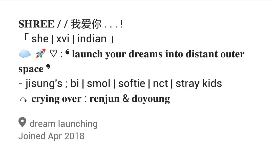
LOCATION
idk what that means but it sounds ethereal so it's all good
( 10/10 )
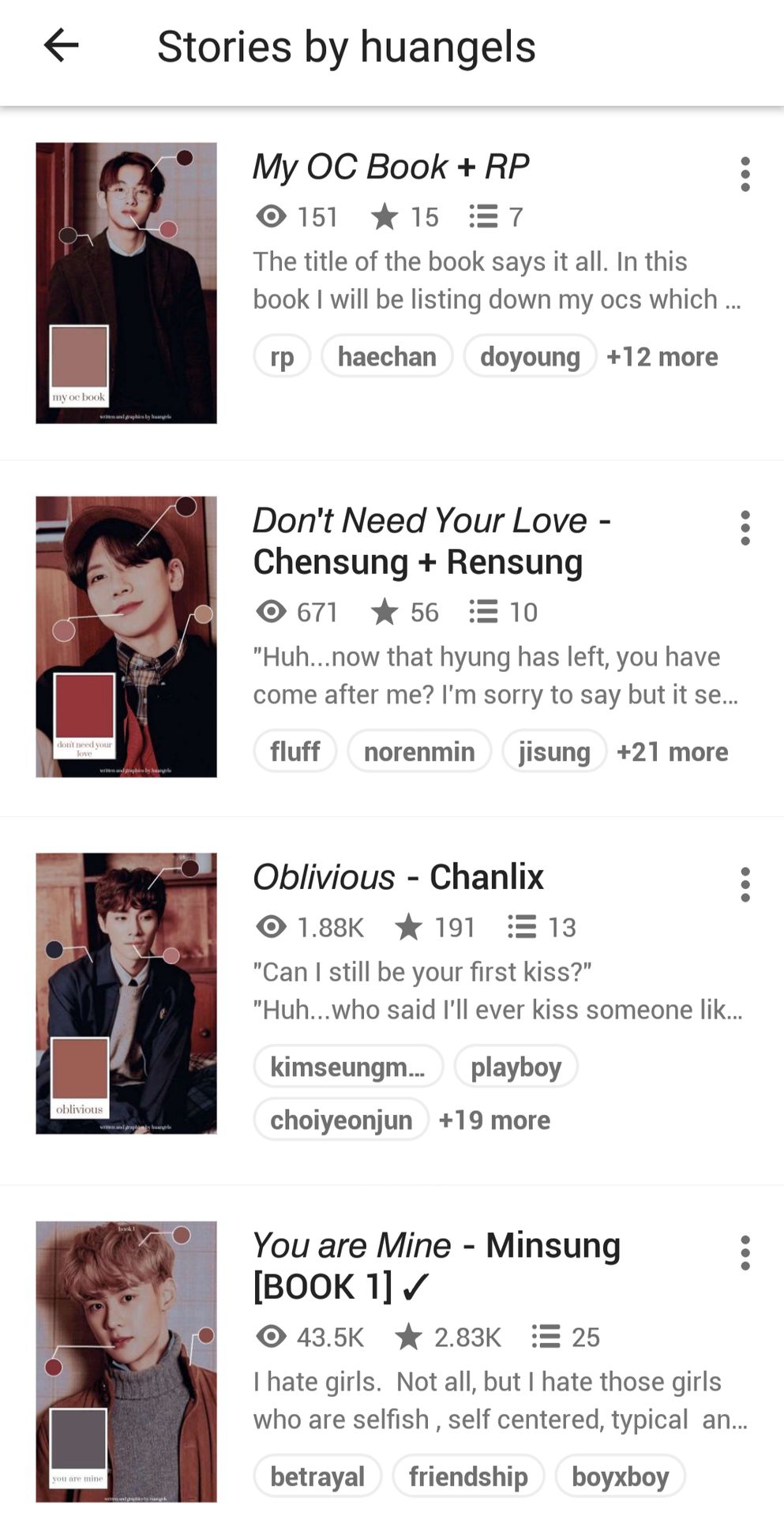
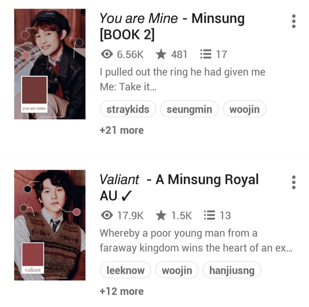
BOOK TITLES, BOOK COVERS
i love the different uses of fonts and i think the italics work very well for your titles. it's also consistent throughout all your books, however i'm not a big fan of the dash that is used to connect the title and subtitle, as well as the capitalization of each letter in the subtitle. i think it'd be nicer if you could change out the dash with another type of symbol. as for the title, I'd prefer if all were either capitalized or lowercase, or both but separated like:
YOU ARE MINE | minsung
YOU ARE MINE | MINSUNG
you are mine · minsung
You Are Mine - minsung
of course these are all just suggestions, it's up to you !!
( 7.5/10 )
book covers wise i love the type of design you went with because colour codings are the shit, plus the consistency !! only downside is that it bothers me how it's not the same colour scheme as your icon and theme
( 9/10 )
overall, i actually think the titles and covers match well together, just that it doesn't fit with the dreamy theme i feel you are going with
( 3.5/5 )
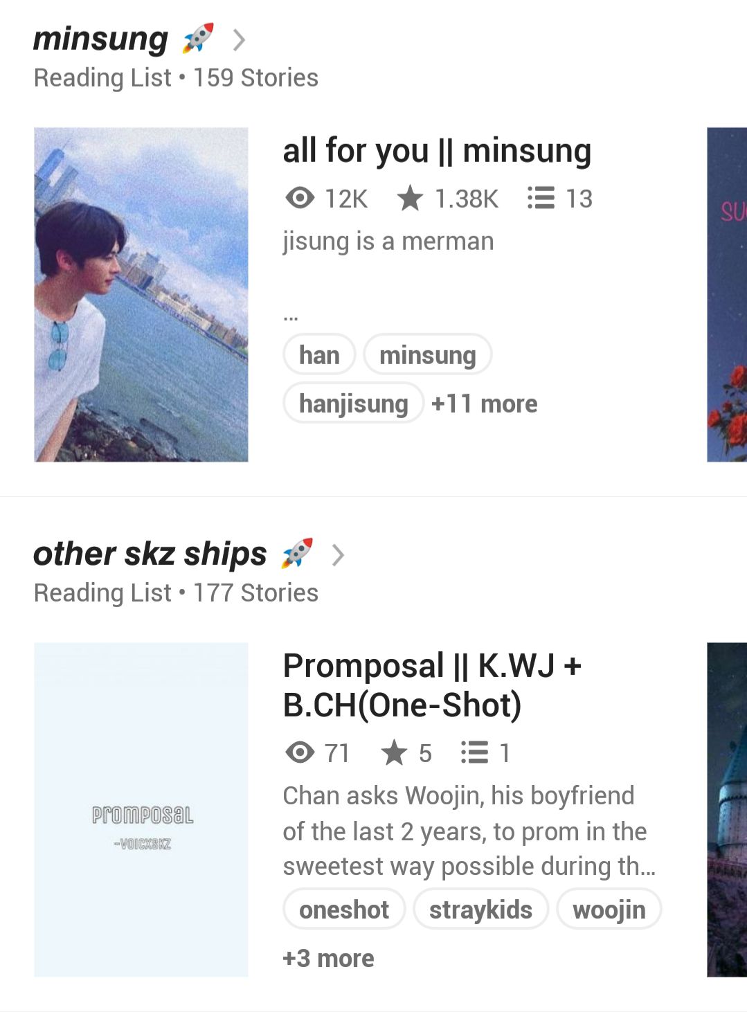

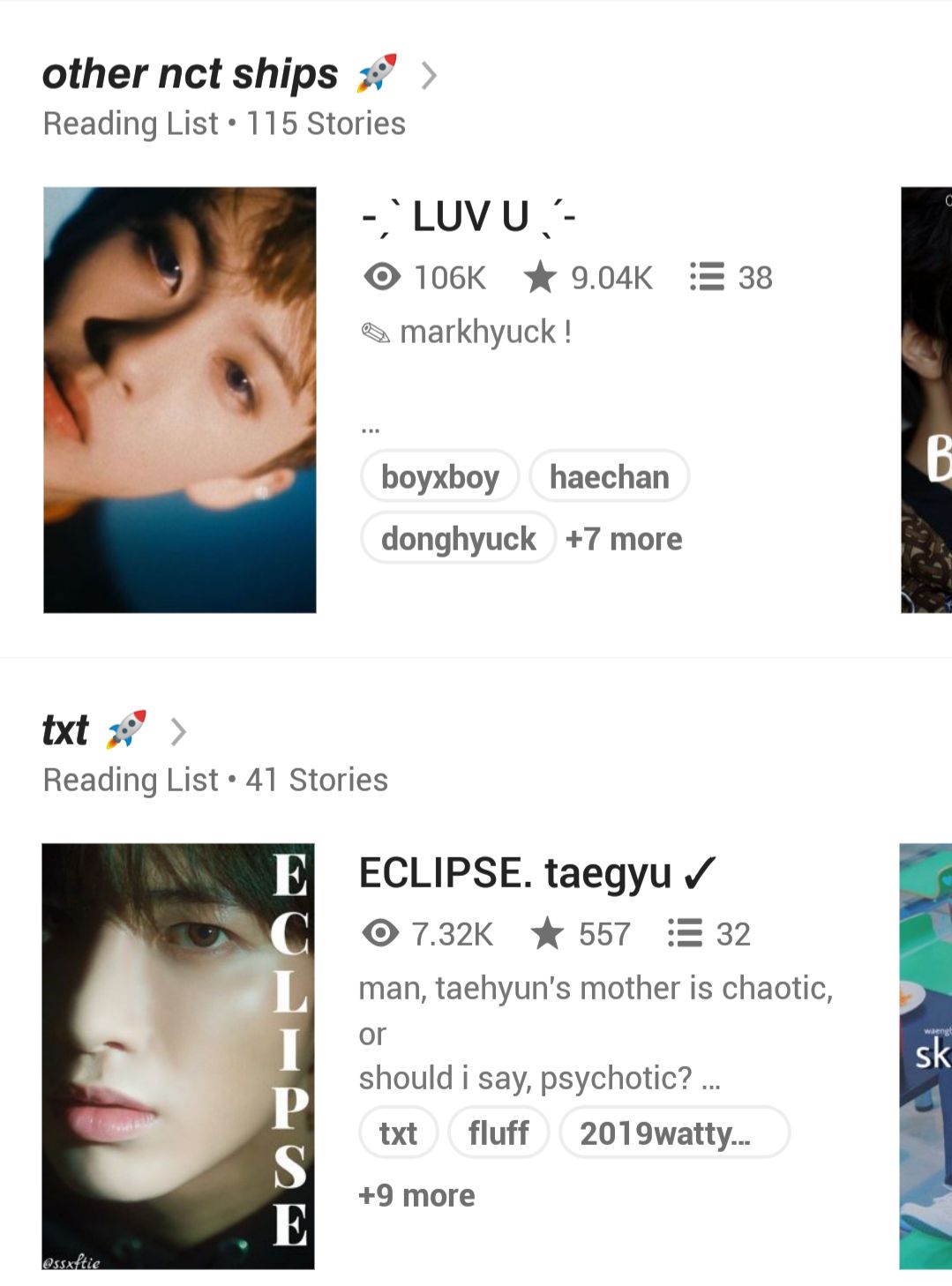
READING LISTS
they're simple with the just the names of the type of fiction what each lists contains but you find a wat to spice them up with different fonts and a little emoji which i adore !!
( 10/10 )
▃▃▃▃▃▃▃▃▃▃▃▃▃▃▃▃▃▃▃
RESULTS
= 94/100
( A+ )
▃▃▃▃▃▃▃▃▃▃▃▃▃▃▃▃▃▃▃
Bạn đang đọc truyện trên: Truyen247.Pro