𝐫𝐨𝐮𝐧𝐝 𝐭𝐰𝐨 𝐞𝐧𝐭𝐫𝐢𝐞𝐬 🤩🦗🦟🦗

thank you so much to all the participants and their entries !!
and now ,, the wonderful graphics !!
also, IM SO SORRY THESE ARE OUT LIKE FOUR DAYS LATE
and if you still have to finish a graphic [ i don't believe I'm waiting on anyone?? correct me if I'm wrong ] but I'll add to this chapter once you submit it in :))
[ imightbesleeping ]
[ 7 / 10 ]
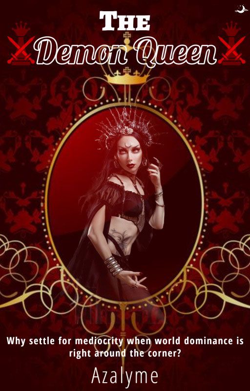
i love the cover design for this!! the mirror-like cover kinda captures vanity which is really cool bc you cant really convey that through most covers. the gold embellishing around the oval and the crown on top is so visually pleasing. and the background colors match so well!!
i love the variety of the fonts too, but maybe stick to one or two?? overall though, this is a really good cover, especially the simplicity of the fonts. it really makes you pay attention to the girl in the center and not on the actual text itself
rowan [ sifs_rowan_tree ]
[ 7 / 10 ]
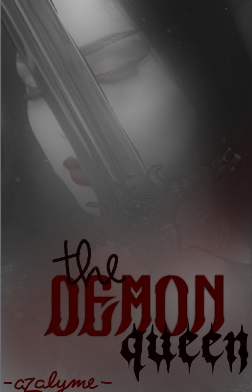
first of all, the font is amazing!! i love how the 'demon' is in red, it really brings focus to that part of the title and emphasizes the word. and i also love that you hand drew my username lmao its amazing!! your cursive is mwah, chefs kiss
and i especially love the photo that you chose for the background and the gradient thing you did to make the font more clear
the photo matches the theme of the story extremely well and the sword 😍 I LOVE IT
maybe you could make the photo clearer, but i understand what you did with making the font the main part of the cover if that makes sense
but seriously I LOVE THE FONT
sav [ Savannah1507 ]
[ 8 / 10 ]
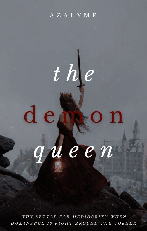
ANOTHER ONE OF MY FAVORITE PINTEREST PHOTOS
and i love how the photo in this is more background than main focus, which is also making the font more of the main focus. AND THE RED TEXT FOR THE 'DEMON'
the author name and subtitle fonts are so simple, which matches the entire clean aesthetic of the cover which is amazing :))
this is a personal preference, but like a red gradient border would look kinda cool??
nelisa [ black_nightbutterfly ]
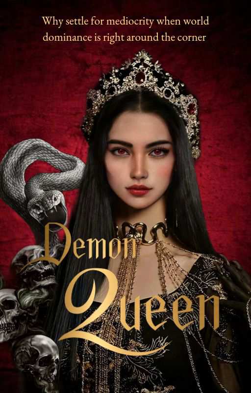
[ 8 / 10 ]
THE FONTT I LOVE IT
idk what font that is, but its amazing
i love how it looks beveled, but it's not, which is a really cool idea
and the photo too is amazing!! you chose an amazing artwork and the snake and skulls on the side are everything
i feel like its an amazing thing that i cant tell which parts of it you photoshop bc rn I'm just assuming its all one image, which I'm pretty sure it isn't?? idk you can correct me if I'm wrong but if they're all separate images, you did an amazing job with it!!
leni [ -grayslvr ]
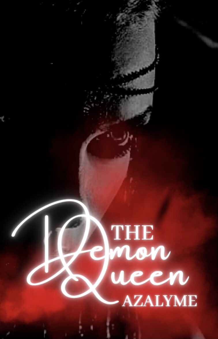
[ 7 / 10 ]
i love the glowy font!! smth about the glowy-ness of it against the red mist makes it look so alluring and mysterious
and i love the image you chose too!! if you stare directly into her eye, it feels like she's staring right into your which is amazingly creepy
and THE RED MIST
its a really cool idea how you added [??] it to make the text stand out [ I'm inferring I'm not sure if you added it or not ]
but overall, i love this cover tyy
ixory [ ixory_evanna_wright ]
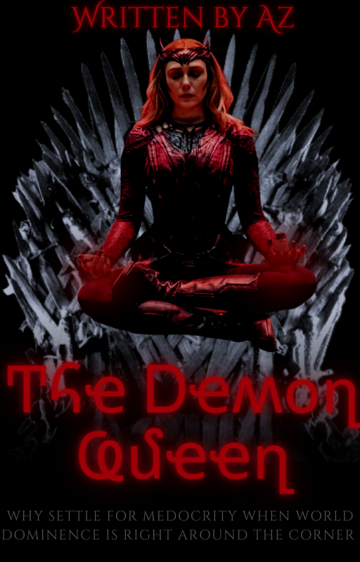
[ 7 / 10 ]
WANDA
thats the first thing i noticed about the cover, which makes her the center focus, so that's cool!! i love how there's a spiky crown-like thingy in the background and it makes the cover feel more 3d bc wanda's floating in FRONT of the spiky thing. it just gives it dimension
and the font matches wanda!! im not sure if you put a filter on wanda to make her more red, but either way, it really matches!! and the font on 'the demon queen' is so unique ive never seen that type font before!!
im just going to say, the black space behind everything
is
amazing
i love it lmao
glimmer [ chrxnicles- ]
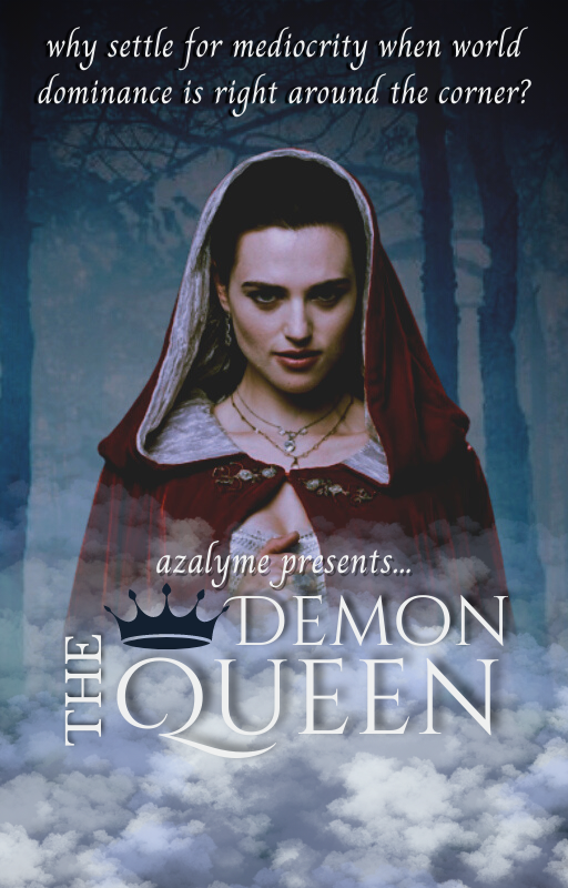
[ 7 / 10 ]
THE FONTNTTTSFDLSTS
the layout of the font is absolutely amazing i love it!! and the clouds underneath it too!! one thing i mightve changed would be to lower the text?? bc theres a lot of free space beneath it and utilizes the clouds more
but either way, i love love love the font layout. and the crown too lasjljsjfesj
the fc you found too is also super cool!! it definitely gives off slightly evil vibes, which is basically her whole character in the end
tysm for the entry!!
weiss [ weiiiss ]
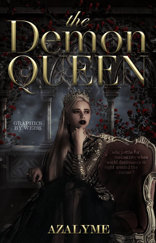
[ 10 / 10 ]
EVERYTHING
ITS ALL AMAZING I HAVE NO WORDS
i love how despite the different font styles, they all match with color and the same bevel effect!!
this cover is a balancing act with the girl on the throne and the text which is amazing!! like its perfectly half and half
speaking of the girl on the throne
SHE MATCHES SO WELL WITH EVERYTHING
she's practically radiating confidence!! the background toooo
you did the cover so well and the subtitles on the throne are an amazing touch!! ik how hard it is to fit cover, author, AND subtitle on a cover and you really did well with the placement!!
deanne [ -irxnblade ]
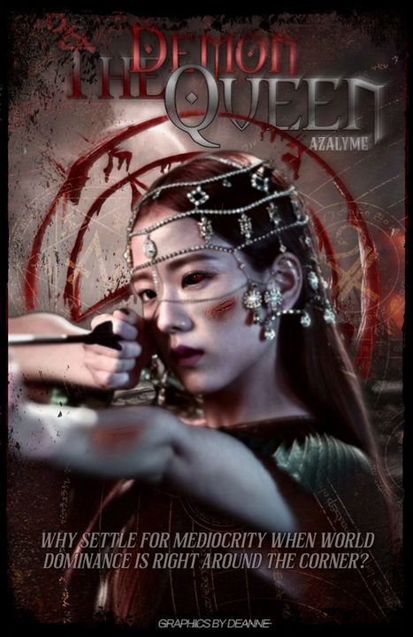
[ 9 / 10 ]
THE FONT AGAIN
the 3d effect and the layering on top of each other and the different styles that just compliment each other so well!! it's all amazing and perfect
and the overlay on the background or the top half of the cover, which although is barely there MAKES SO MUCH DIFFERENCE
the magic star thing and the symbols and stuff are super cool and arent clear enough to take focus from the main parts of the cover
but the fc you found and the bada**-ness of her is absolutely amazing
i love the red eye touch and the jewelry over her hair really shows that she's royalty, or a really rich person
AND THE ARMOR TOO
the amount of details in this is amazing
THE RED CIRCLE DSJFLSJ
the. border. i havent seen a border graphic in so so long and i love the vintage-y ness of it <33
there's too much stuff in this cover to compliment at once
serena [ awkwardgenz ]
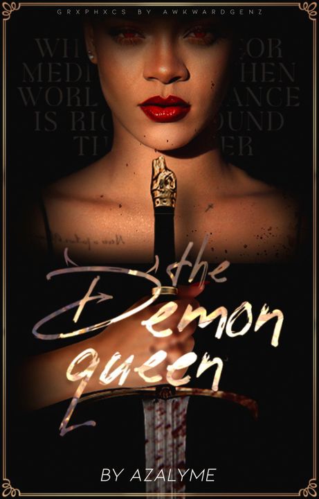
[ 9 / 10 ]
THE OVERLAY ON THE TEXTTTTT
oh wait and im just now noticing the devil horns and tail on the 'd' of demon WHAT THE HECK THAT IS AMAZING I LOVE THAT SO SO MUCH
the font too, i love the paint style of it. please teach me how to do that bc that is so cool
THE BORDER TOO WHAT its so simple and yet matches so so well with the overall cover
the faceclaim is so perfect for this cover. i love the sword and how her dress and top of her head and maybe hair are all blacked out, it really focuses on the face and sword, which is under the text, which makes it focus on THAT and this whole cover is just one element pointing to another which is so smart
also the subtitle thing beside the head are so cool
it's so subtle, but clearly there!! maybe i would make the actual words clearer, but either way its such an unique idea
jaya [ -pastelcxre- ]
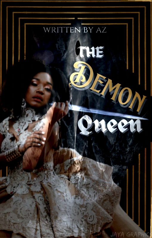
[ 9 / 10 ]
OH MY GODS THE AMOUNT OF OVERLAYS ON THIS CONGRATULATIONS THIS IS AMAZING LIKE OVERLAYS ARE MY WHOLE LIFE
okay, first of all, im just going to say the girl you chose is so beautiful and amazing bada**core type awesome
i love when images are over the border it just gives so much dimension
and the mountain range overlayyy i love it
and now, let me compliment your border BC IT FRICKING PARTS AT THE TEXt HOW COOL IS THAT
also i love how the fonts accomodate for the sword like tysm for your consideration
AND ALSO THE DIFFERENT COLORED FONT FOR 'DEMON' AGAIN
ALL THREE OF YOU ARE SO CREATIVE
hira [ hira_g6 ]
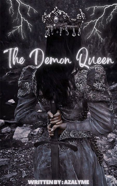
[ 8 / 10 ]
i. love. the. faceclaim.
or not really 'face'claim but whatever
SHE LOOKS SO COOL
the dress, the sword, the crown. everything about her screams warrior royalty
and i love how the text is so simplified, it brings all attention to the girl and background in general. but bc of the simplicity of the text, maybe you could have the 'written by azalyme' part match the font?? its, once again, another personal preference
BUT THE GLOW SJFLSJ
glow text is superior in certain circumstances, in which case, this is definitely one of those circumstances BC ITS SO PRETTY
kokomi [ qqcat_mew ]
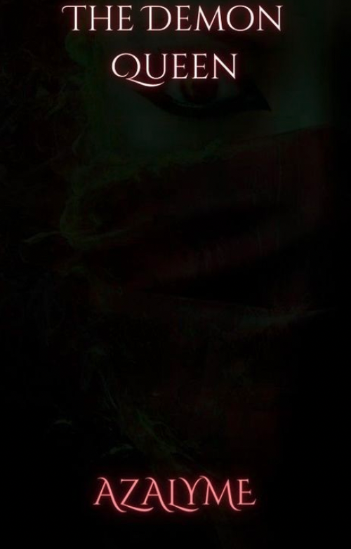
[ 7 / 10 ]
GLOW TEXT AGAIN. THANK YOU.
i love the font too!! it feels very 'arabian nights' for some reason. like if i look at that font, i think of that song.
and the girl in the background is super cool!! she's kinda shrouded in mystery bc she's BARELY there, but maybe you could lower her a bit so the text isn't directly over her eye and lighten the background a bit??
jasmine [ -fcirydvst ]
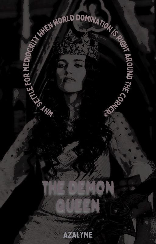
[ 8 / 10 ]
THE MONOTONEEE
i love it and the round curve thing for the subtitle, its like a border for your fcs face, which makes that the center of attention despite the entire image being in black and white
the title could be a bit bigger?? but despite that i love the white drop shadow!! and the color choice for your fonts go so well with the b&w theme!!
also, AMAZING FACECLAIM
ita [ juneandfalls ]
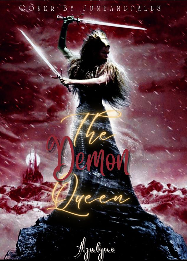
[ 9 / 10 ]
THE AMOUNT OF ACTION IN THIS OH MY GODS
we love a queen who wields two swords
it's seriously super cool, especially after reading trials of apollo, it made me fall in love with the idea of fighting with two weapons idk why but yeah, theres a small fact
she's standing on top of a tiny mountain AND FOR SOME REASON I DIDNT NOTICE THIS BEFORE BUT THE CASTLE IN THE BACKGROUNDD its spectacular [ there, some variations bc i suck at synonyms ]
and the visible wind / snowww it definitely raises the dynamic of the background alone!!
maybe you could make the font colors match the background a bit [ bc theres just some random gold but you can do whatever you want ] BUT I LOVE THE FONT YOU CHOSE FOR 'DEMON' and another person who did a different color for that word lmao
y'all are creative
BUT YES THE GLOW FONT
layla [ wolves_run_in_packs ]
[ 8 / 10 ]
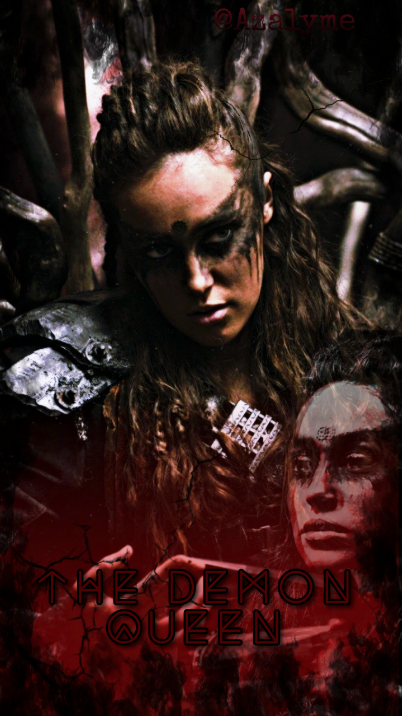
THE FACECLAIM OH MY GODS people are so good at finding images
also i love how the two images kinda look like its the same girl!!
but she looks super cool and like she's preparing for battle and the overlay of the second girl is super cool too!!
and the gradient to red is also a very cool idea :DD
maybe one thing i would do is to change the color for the font to white so it's more visible, but other than that, this cover is amazing :)) tysm for the entry
[ onemorechapter- ]

[ 9 / 10 ]
BRO OK THIS IS AMAZING MY BRAIN IS LOWKEY FRIED RN SO ILL STILL TRY MY BEST WITH THE OPINION STUFF
ok you slayed it with the background the girl matches the theme so well and she definitely gives off creepy type vibes. the color scheme is also perfect and the textttt i love the effect thing you did on the 'demon' lettering which is so cool and i love the simple font i think its cinzel decorative idk i cant think in fonts but the subtitle too!!! its perfect and just LDJSLJDS it curves and like squiggles [ ?? ] so well!!
beautiful beautiful cover and literally nothing against it except that the font could be lowered a bit?? but that's pErsSONAl prERveRENce so its fine either way :))
[ @bloominginmythology ]

[ 9 / 10 ]
ok slay this is so good my dads telling me to get off the ipad so imma do this quick
holy gods i love the font and fc its amazing the colors ahhh and the font style that you did, absolutely amazing
love the background love the swords ok bye im being pressured to get off byeeeee

tysm for readinggg
cal xx
Bạn đang đọc truyện trên: Truyen247.Pro