Critique: -Pikablu
Nice picture so far, but it can be better:
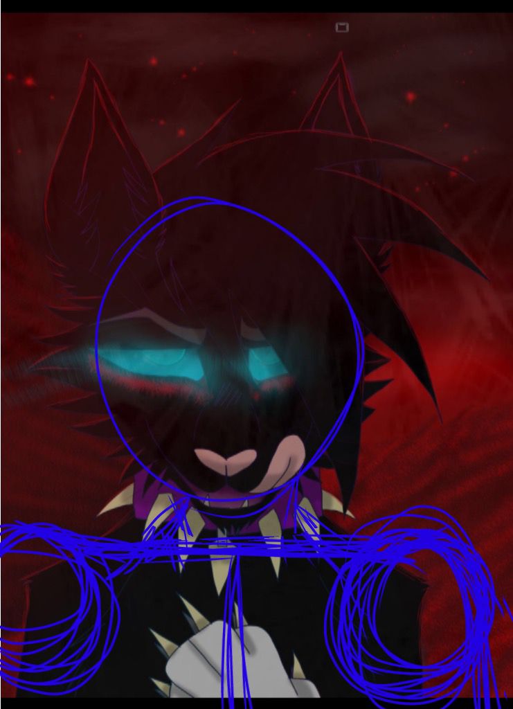
Anatomy could use a little work.
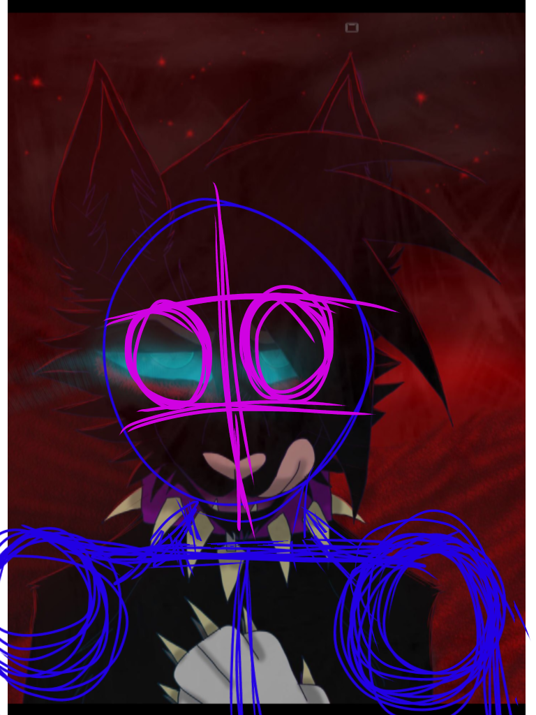
Here are the facial proportions. They aren't "exact, exact" but it will do. The eyes are a bit too big.
It seems like it's going off onto the extensional fur, which is unnatural.
There's also shading. If coloring, use the entirety of hues (ie The color wheel digitally, so if orange is the base, yellow is lighting, red is shading ) instead of the Values! (The box/black to white/yellow to a darker yellow) This is more so a personal preference, due to the fact using hues to shade pop out more.
There's also this:
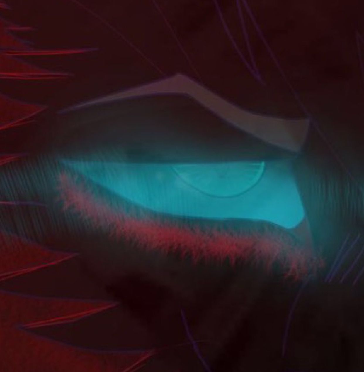
The red brush you used to add lighting to the underside of the eyes. I think you should've used a different brush, or lined it then used a blur tool or sketching like that. It looks kinda silly with this brush.
His hair is way too big. I get its seemingly your style but you need to be proportional.
Fix the claws, they're too triangular.
Bạn đang đọc truyện trên: Truyen247.Pro